138 Years of Popular Science
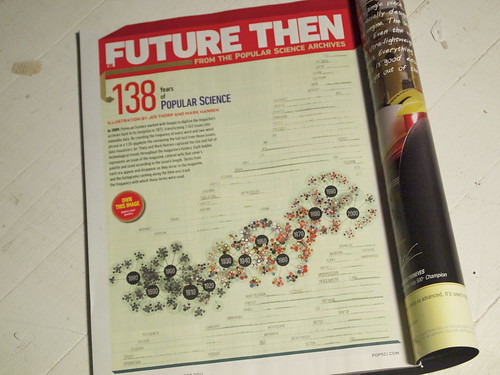
Near the end of this summer, I was asked by the publishers of Popular Science magazine to produce a visualization piece that explored the archive of their publication. PopSci has a history that spans almost 140 years, so I knew there would be plenty of material to draw from. Working with Mark Hansen, I ended up making a graphic that showed how different technical and cultural terms have come in and out of use in the magazine since its inception.
The graphic is anchored by a kind of molecular chain – decade clusters in turn contain year clusters. Every atom in these year clusters is a single issue of the magazine, and is shaded with colours extracted from the issue covers via a colour clustering routine. The size of the issue-atoms is determined by the number of words in each issue.
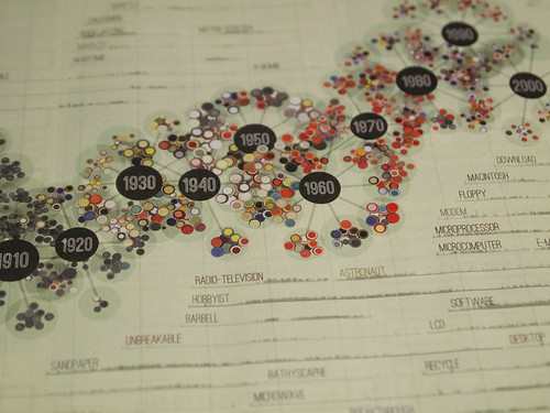
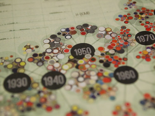
Surrounding this chain are about 70 word frequency histograms showing the issue-by-issue usage of different terms (like ‘software’ or ‘bakelite’). I used a simple space-filling algorithm to place these neatly around the molecule chain, and to stack them so that one histogram begins shortly after another ends. This ended up resulting in some interesting word chains that show how technology has progressed – some that make sense (microcomputer to e-mail) and some what are more whimsical (supernatural to periscope to datsun to fax).
Picking out interesting words from all of the available choices (pretty much the entire dictionary) was a tricky part of the process. I built a custom tool in Processing that pre-visualized the frequency plots of each word so that I could go through many, many possibilities and identify the ones that would be interesting to include in the final graphic. This is a really common approach for me to take – building small tools during the process of a project that help me solve specific problems. For this visualization, I actually ended up writing 4 tools in Processing – only one of which contributed visually to the final result.
My working process is riddled with dead-ends, messy errors and bad decision...
0 comments:
Post a Comment