Via former lab member Alex Kuhl. Interesting color deficiency study applied to van gogh. Best, Ben ---------- Forwarded message ----------Posted this to my Twitter feed, but thought I'd send this along to you guys in case you don't catch it on there. http://asada0.tumblr.com/post/11517603099/the-day-i-saw-van-goghs-genius-in-a-new-light
Friday, January 13, 2012
Viz: Politico analyzing Facebook user data to measure political sentiment
Even private posts.
The Verge - All Posts
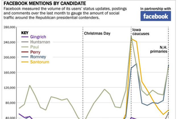
Facebook just made another move that might upset those concerned with the privacy of their data. The social media giant has started providing politics publication Politico with information on users sentiment towards the Republican presidential candidates as we approach the January 21st South Carolina primary. Politico exclusively receives mentions of the political candidates through posts and comments on Facebook — including material that users have marked as private, according to All Things D. However, Facebook claims it uses automated tools to send information to Politico without any personally identifying information and that no Facebook employees actually read the posts. In addition to Facebook-mined data, the company will also be...
Thursday, January 12, 2012


Viz: Embracing Uncertainty in Two-Line Charts
I like Robert's alternative. As he says, we need to show the undecided.
Embracing Uncertainty in Two-Line Charts
As we’re heading towards elections again, there is a chart type that is as unavoidable as political ads, baby-kissing, and smear campaigns: line charts showing polling data. The most common pitch two candidates against each other, and often make a big deal out of the fact that the lines cross. Not only are these charts misleading in the way they depict the choice, they also hide an important fact: the number of undecided voters.
The following image shows slightly different data, but the idea is the same. The data is from a long-running Gallup poll about job approval ratings of President Obama, from early 2009 to the end of 2011. Each data point is actually a three-day average. Blue shows approval, green disapproval.

There is a clear trend here that shows approval dropping from very high in early 2009 to just below 50% in mid-2010. From there, things get murkier. The blue and green lines cross, then continue for a while, then cross again. There’s clearly a lot of noise, but every inversion looks like a big event.
The thing that also stands out is the symmetry: since there are (apparently) only two choices, the disapproval percentage is always going to be 100% minus the approval percentage. That is visually very appealing, but it also creates the illusion of two independent values, shown as different lines, being in much more agreement than would be expected. There is also a lot of noise in the regions where the lines cross or are close to crossing, which make it hard to see what is going on.
An Alternative
How else could the data be shown? In particular, what else is there to show about this data? There are two aspects to the data that are getting lost in the line chart above: the number of undecided people, and the fact that the numbers have to add up to 100%. It also makes sense to reduce the noise and make it easier to see the trend, especially in parts where the approval and disapproval numbers are very close together.
Here is my alternative. It is a stacked area chart that contains the approval at the bottom, the undecided percentage in the middle, and the disapproval on top. The colors were chosen deliberately to be easy to interpret (red is bad, blue is like above and it’s also the color of the Democratic Party), and the undecided layer is actually transparent.

Tuesday, January 10, 2012
Find: Teaching with Mobile
In class quizzing using phones. Good idea!
Teaching with Mobile
Ever wish you could get your students to stop texting and start using their phones productively in the classroom? Do you ever wish for an easy and quick way to measure what your students have learned? If so, you’ll be excited to learn that we recently open-sourced our internal Quiz & Poll App for Android. Developed by our internal learning systems team, “Quiz & Poll” enables educators to engage and challenge their students inside the classroom (using polls) and outside the classroom (using quizzes).Tool: How the world was open sourced
Google doodle source code.
I’m one of those people who is more comfortable with 80 monospaced characters endlessly repeated than with a paintbrush. Earlier this year I worked with Sophia Foster-Dimino from the Google doodle team on a doodle celebrating Stanisław Lem, my favorite sci-fi writer and philosopher.

How the world was open sourced
Once in awhile at Google our illustrators get excited about lasers, Morse code, H. G. Wells’s The War of the Worlds – and then come up with beautiful Google doodles that find their way onto our homepage. Sometimes our programmers also get excited and team up with the illustrators, and that’s how we found ourselves with Google doodles celebrating Les Paul’s guitar, Pac-Man, Jules Verne’s bathyscaphe, and even your own customized turkey that you could then share on Google+.I’m one of those people who is more comfortable with 80 monospaced characters endlessly repeated than with a paintbrush. Earlier this year I worked with Sophia Foster-Dimino from the Google doodle team on a doodle celebrating Stanisław Lem, my favorite sci-fi writer and philosopher.

Subscribe to:
Posts (Atom)