Tuesday, July 31, 2012

Data: Introducing the Multi-Channel Funnels Reporting API

Introducing the Multi-Channel Funnels Reporting API

Author Photo
By John Huang, Software Engineer


Cross-posted from the Google Analytics Blog

Measuring how marketing efforts influence conversions can be difficult, especially when your customers interact with multiple marketing channels over time before converting. Last fall, we launched Multi-Channel Funnels in Google Analytics, a new set of reports that help shed light on the full path users follow to conversion, rather than just the last click. One request we’ve had since the beginning was to make this data available via an API to allow developers to extend and automate use cases with the data. So today we’re releasing the new Google Analytics Multi-Channel Funnels Reporting API.

The API allows you to query for metrics like Assisted Conversions, First Interactions Conversions, and Last Interaction conversions, as well as Top Paths, Path Length and Time Lag, to incorporate conversion path data into your applications. Key use cases we’ve seen so far involve combining this conversion path data with other data sources, such as cost data, creating new visualizations, as well as using this data to automate processes such as bidding.

For example, Cardinal Path used the new Multi-Channel Funnels API, Analytics Canvas ETL (Extract, Transform, Load) and Tableau Software to help their client, C3 Presents, uncover how time and channels affected Lollapalooza ticket sales in an analysis dubbed “MCF DNA.” The outcome was a new visualization, similar to a DNA graph, that helped shed light on how channels appeared throughout the conversion funnel.
Monday, July 30, 2012

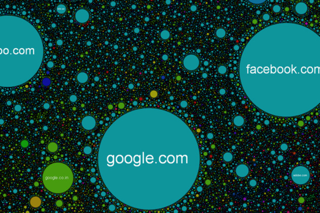
Viz: The Internet Map - a visual representation of the relationship between 350,000 websites

The Internet Map: a visual representation of the relationship between 350,000 websites

internet map cropped


Imagine the web as a giant galaxy where the planets are sites clustered together by likeness, and what you might get is something like The Internet Map. Representing over 350,000 websites from 196 countries and all domain zones at the end of 2011, the map displays over 2 million site links based on topical similarities. Each site is represented by a circle, with size depending on the amount of traffic, and the space between each is determined by frequency, or strength, of the link created when user's jump from one website to another. If you want to get into the fine details of how the map's layout is calculated, the group behind the project has provided a few very technical mathematical and engineering resources. Feel free to move around...

Data: US Census Bureau releases public API for mobile and web developers

Cool. More please. 

US Census Bureau releases public API for mobile and web developers

us census api

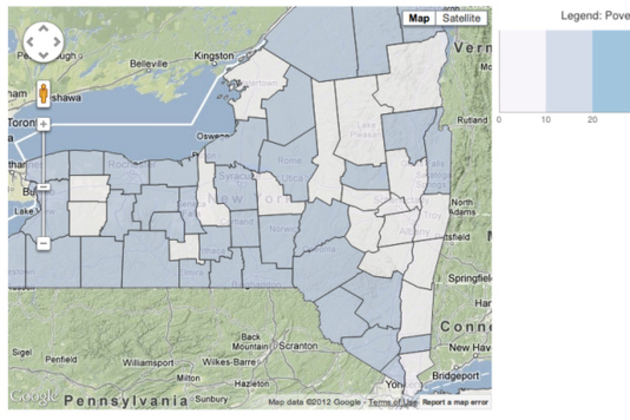
The US Census Bureau has released its very first public API, allowing developers to create web and mobile apps based on the government's collection of demographic and economic statistics. The Bureau launched the API Thursday, alongside a new "app gallery" website where users can view and download apps that have already been built.

With the API, developers will have access to two sets of statistical databases: the 2010 Census, and the 2006-2010 American Community Survey. The former includes the latest data on population, age, sex, race, and home ownership, while the latter offers more socio-economic statistics, covering fields like education, income, and employment.

The Census Bureau is encouraging developers to create apps that are...