Saturday, February 4, 2012

Find: Device Usage on the Social Web

Great information. Tells us something about how people use their devices, not just when. 

Eg desktops are work machines, tablets are pleasure. Tabs and consoles have surprisingly similar usage patterns. Phones, tabs and consoles reach much more deeply into our personal lives than pcs. 

Don't like having to divide by 7 in the chart though. Think, please!

Oh and, what's up with gamers on Thursday at 5?

bitly blog
We use our phones differently than our laptops, and our tablets differently than our gaming devices. We decided to take a deep look into the bitly data to figure out exactly how differently, and we found some surprises!

We analyzed the bitly data for the entire year of 2011 to understand how people use different hardware devices, and how this changes the way that people consume information. We looked at two types of data, the raw numbers and the use percentages (to make different platforms with wildly varying usage levels easy to compare). Web browsers were still the primary tool for accessing online content, followed by smart phones, tablets and gaming machines.

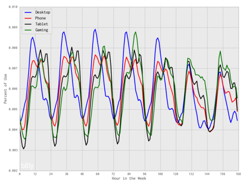
How are bitly links used across different platforms?

Desktop computers are most heavily used on weekdays before noon. Phone traffic peaks at roughly the same time. Tablets are most used at Tuesday at 5pm. Gaming devices (Nintendo DS, Nintendo Wii, Playstation), Thursday at 5pm.

One of the most interesting patterns is the peak, small valley and then another peak that both phones and tablets exhibit. The second peak is roughly at the same level Monday through Thursday, but drops off on Friday and doesn’t appear on the weekends.  This pattern is shifted over for tablets, with the second peak occurring later in the evening. This reflects the aggregate behavior patterns with these devices, showing us when the world is sleeping, eating, and taking a mid-afternoon coffee break.

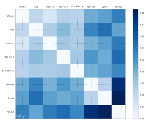
Which platforms have similar usage patterns?

In the above plot, similar behavior is colored white; very different behavior is colored dark blue. From this plot we can see three surprising insights:

  • Windows and Linux users behave similarly on the social web! Geeks aren’t that different from the rest of the world. :)
  • Mac OS X is used more like a mobile device than either Windows or Linux on the desktop.
  • The Kindle is used in a very different manner to engage with the social web. We find that the majority of Kindle usage is much later in the evening than other devices.

From this data, we can say that device should definitely be a consideration when you create and share content on the social web. Think carefully about the physical context of how people will read your content! If you’re making a tablet application, make sure you test it with someone late at night lying in bed, and if you’re making an early-morning newsletter, you know exactly what time and device to target it at.

This post lovingly crafted by the bitly science team.
Find: Unicode over 60 percent of the web

Good bye ASCII. 

Google
Computers store every piece of text using a “character encoding,” which gives a number to each character. For example, the byte 61 stands for ‘a’ and 62 stands for ‘b’ in the ASCII encoding, which was launched in 1963. Before the web, computer systems were siloed, and there were hundreds of different encodings. Depending on the encoding, C1 could mean any of ¡, Ё, Ą, Ħ, ‘, ”, or parts of thousands of characters, from æ to 品. If you brought a file from one computer to another, it could come out as gobbledygook.

Unicode was invented to solve that problem: to encode all human languages, from Chinese (中文) to Russian (русский) to Arabic (العربية), and even emoji symbols like or
; it encodes nearly 75,000 Chinese ideographs alone. In the ASCII encoding, there wasn’t even enough room for all the English punctuation (like curly quotes), while Unicode has room for over a million characters. Unicode was first published in 1991, coincidentally the year the World Wide Web debuted—little did anyone realize at the time they would be so important for each other. Today, people can easily share documents on the web, no matter what their language.

Every January, we look at the percentage of the webpages in our index that are in different encodings. Here’s what our data looks like with the latest figures*:

*Your mileage may vary: these figures may vary somewhat from what other search engines find. The graph lumps together encodings by script. We detect the encoding for each webpage; the ASCII pages just contain ASCII characters, for example. Thanks again to Erik van der Poel for collecting the data.

Thursday, February 2, 2012

Viz: Yikes! Animation Charts Modern Global Warming

Green Blog: Animation Charts Modern Global Warming
NYT > Science
In the animation, reds indicate temperatures that were higher than average during a baseline period of 1951-1980, and blues indicate lower temperatures.

Monday, January 30, 2012

Viz: Yikes! Animation Charts Modern Global Warming

NYT > Science
In the animation, reds indicate temperatures that were higher than average during a baseline period of 1951-1980, and blues indicate lower temperatures.