Saturday, January 21, 2012

Find: @seismologists collect #data, 140 characters at a time

Twitter and phones collect quake data. 

Ars Technica

On August 23, 2011, a magnitude 5.8 earthquake centered 40 miles northwest of Richmond, Virginia had the East Coast abuzz. As you’d expect, social media lit up as people reported the experience. You can actually see the travel of the seismic waves if you map out the tweets containing the word "earthquake." While that’s no match for the beautiful data recorded by the EarthScope seismic network, some researchers see the beginnings of a data revolution.

Count Richard Allen, a seismologist at the University of California-Berkeley, among those who want to ride the wave. In a perspective article published in Science, he argues that crowdsourced earthquake data is a potential gold mine.

Thursday, January 19, 2012

Find: WebKit in Your Living Room

The Netflix Tech Blog

Hi, it's Matt Seeley, engineer on the device UI team at Netflix.  My team uses WebKit, JavaScript, HTML5 and CSS3 to build user interfaces for the PlayStation 3, Wii, Blu-ray players, Internet-connected TVs, phones and tablets.

Recently I spoke at the HTML5 Dev Conf about WebKit-based UI development on consumer electronics.  I discussed:
  • Responding to user input quickly while deferring expensive user interface updates
  • Managing main and video memory footprint of a single page application
  • Understanding WebKit's interpretation and response to changes in HTML and CSS 
  • Achieving highest possible animation frame rates using accelerated compositing
Watch the video presentation from the conference:

Slides are also available in PDF

Astute readers will realize that portions of the content are also suitable for mobile and desktop development. It's all about building great user interfaces that take best possible advantage of the device.

Interested in joining our team? We're hiring!

Sent with Reeder

Wednesday, January 18, 2012

Data: Vehicles involved in fatal crashes

FlowingData
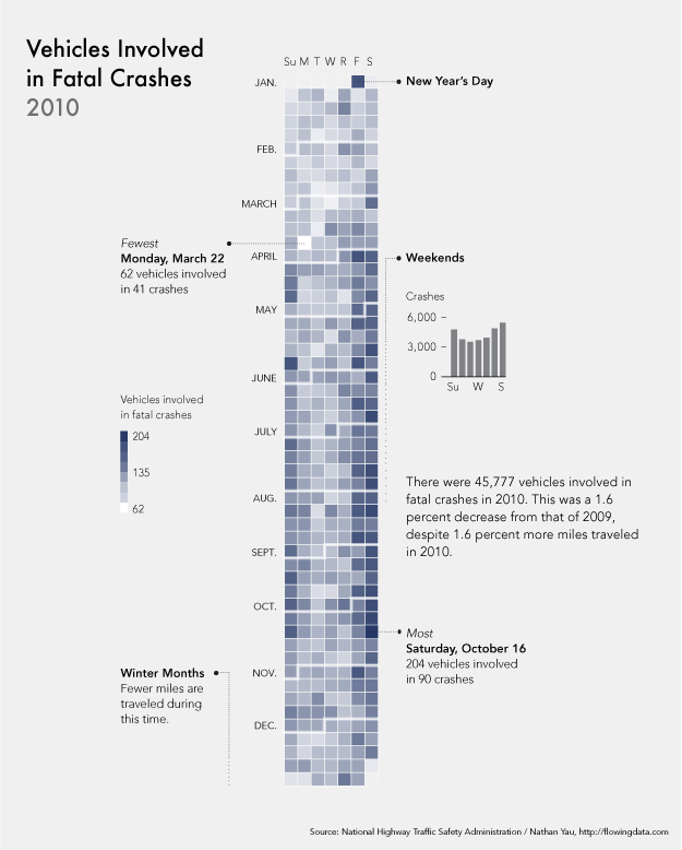
Vehicles involved in fatal crashes
After seeing this map on The Guardian, I was curious about what other data was available from the National Highway Traffic Safety Administration. It turns out there's a lot and it's relatively easy to access via FTP. What's most surprising is that it's detailed and fairly complete, with columns for weather, number of people involved, date and time of accidents, and a lot more.
The above shows vehicles involved in fatal crashes in 2010 (which is different from number of crashes or number of fatalities). This data was just released last month, at the end of 2011 oddly enough. It's a calendar view with months stacked on top of one another and darker days indicate more vehicles involved.
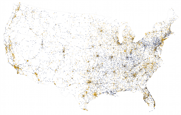
Nearly every single data point also has location attached to it, so I tried some mapping, but they look like population density more or less. Here's one that shows crashes that occurred on local roads (orange) and those on freeways, highways, etc (blue). Road patterns start to come out for the major interstates.


Viz: Amazon recommendation network

FlowingData

Amazon recommendation network

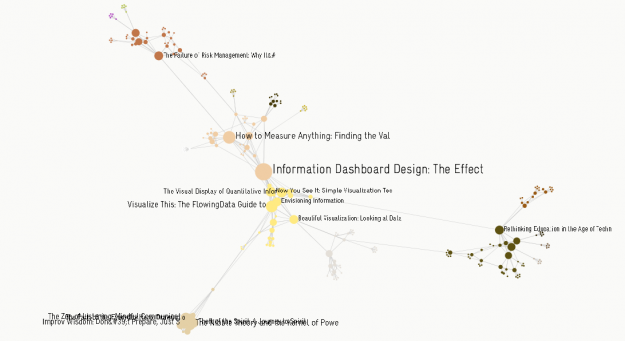
Whenever you look at an item on Amazon, the site recommends related items that you might be interested in. So in a way, these items are connected by how people buy. Artist and designer Christopher Warnow uses the metaphor to create a network of Amazon products, where each node represents an item, and connections, or edges, represent common bonds of recommendations. Simply enter an Amazon link, and Warnow's software generates a network.

For example, the image above is the network for Edward Tufte's Visual Display of Quantitative Information, although Stephen Few's Information Dashboard Design seems to have more connections for some reason. My quick guess is that book's that are less niche have more connections, because when I entered Visualize This, the network was pretty small. Although I would've thought that Tufte's book would have a larger network than Few's.

In any case, the application and Processing code is free to play with. Warnow uses Gephi for network connections and grouping. Or if you don't feel like downloading a 60mb file, you can just watch it in action in the video below.

You might also be interested in Yasiv. It's a web app with a similar idea, but not quite as slick of an implementation.

[Christopher Warnow via Datavisualization]

Sent with Reeder

Viz: Spot visualizes tweet commonalities

Not a lot new here. 

FlowingData

Spot words

Twitter is an organic online location, full of retweets, conversations, and link sharing. Jeff Clark tries to show these inner workings with his newest interactive, Spot. Enter a query in the field on the bottom left, and Spot retrieves the most recent 200 tweets. You then can choose among five views: group, words, timeline, users, and source.

Each tweet is represented by the tweeter's profile picture, and they rearrange themselves as you switch between views. The latter three views, timeline, users, and source, arrange tweets into bar charts. Fairly straightforward.

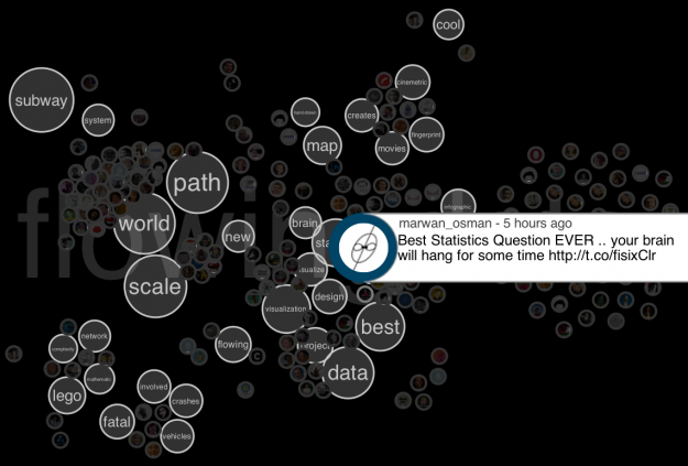
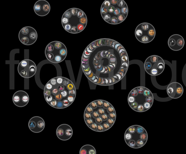
Spot gets interesting with the first two views though, groups and words. Tweets are arranged based on the words they use.

Above, for example, is the word view on the search "flowingdata." Tweets cluster around words like world and data. Below is the same search, but with the groups view. Users who tweeted similar text (usually retweets) are grouped together. What jumped out at me was the group on the bottom with a single user's face. That turned out to be a spammer.

Give it a try for yourself here.