Looks like a nice dataset.
The changing hue of movie posters

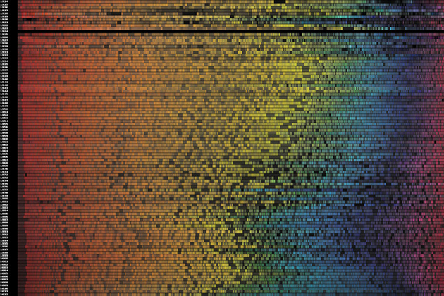
A couple of weeks ago, software engineer Vijay Pandurangan had a theory. He decided that movie posters have, over the years, become more dark and more blue. Rather than moving on with his life, he decided to analyze the color data from 35,000 posters produced from 1914 to present day. The result, which you see above, shows that his theory was correct.
At the top of the image you'll see data from 1914 and at the bottom that from present day. Pandurangan also produced an interactive version that gives detailed statistics for each year, as well as a clearer graphic that doesn't take image brightness into account. You can find both, along with an explanation of his process for creating the visualizations, on his blog.