Showing posts with label visualizations. Show all posts

Tuesday, January 1, 2013

Viz: The Census Dotmap contains one black dot for every person in the US, and nothing else

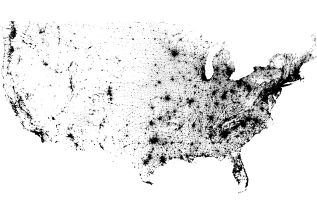
The Census Dotmap contains one black dot for every person in the US, and nothing else

Census Dotmap

There are 308,450,225 dots on the map you see above. One for every person living in the United States, based on data from the 2010 Census. It doesn't seem plausible when you're looking at the entire country; metropolitan areas seem to be represented by indistinct swaths of black rather than tiny dots. But zoom in and even the most populated cities are finely broken down. There are no state borders, city lines, or individual roads represented on the Census Dotmap, as creator Brandon Martin-Anderson calls it. Nor is there any topographic data integrated here, yet the exhaustive reference still manages to offer a good sense of areas where nature prevents settlement. In fact, it lines up wonderfully with stunning imagery of Earth at night...

Thursday, October 18, 2012

Find: NYT Viz - How States Votes Have Shifted

Interesting visualization of bipolar values over time. Careful design here. 

Over the Decades, How States Have Shifted

An interactive graphic shows the political evolution of each state from 1952 through 2008 and the states' current standing in the FiveThirtyEight forecast.

Monday, September 10, 2012

Viz: Facebook Freakonomics - a new tool to map the world's friendships

Facebook Freakonomics: a new tool to map the world's friendships

facebook freakonomics mapping world's friendships

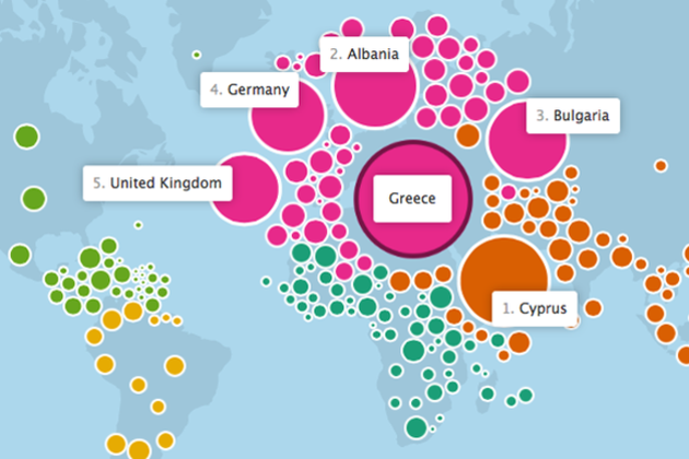
Last November, Facebook flipped Stanley Milgram's "six degrees of separation" theory on its head and showed that we're a lot closer than you might think. Today, Facebook launched a new interactive map of the world's friendships — a partnership with the data visualization wizards at the Stamen design studio — that illustrates some of the ways we're connected. The map uses an often-amorphous blob of bubbles representing the world's countries to show which ones share the most friendships, and many times, even explain why.

Monday, September 3, 2012

Viz: Amazon creates Presidential Election heat map based on political book purchases

Amazon creates Presidential Election heat map based on political book purchases

Amazon election heat map

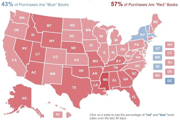
Everyone from Microsoft to Twitter to YouTube has taken to providing their own unique spin on covering the election, and Amazon is no different. The company has released a "2012 Election Heat Map" that shows what kinds of political books Americans are buying. Amazon took its 250 top-selling political books and characterized each one as either red (Republican Party), blue (Democratic party), or neutral, and then determined where those books have been purchased and shipped in the last 30 days. The result is a map that shows whether states are more red or blue based on their reading habits — at the time of writing Republican-leaning books were leading the way, accounting for 57 percent of purchases. Of course, as Amazon points out, "books...

Sunday, August 26, 2012

Viz: examining Wake county school superintendent Tata’s State of the Schools Speech with word clouds

Tata’s State of the Schools Speech, Visualized

If you thought school politics was difficult to understand before, check out this word cloud we created from the superintendent’s State of the Schools speech.

Tata’s speech Thursday focused mostly on school performance, as you can see with the prominence of the word “schools” in the word cloud. He also addressed the need for a school construction bond next year and stressed that new standardized tests, called the Common Core, might hit Wake with a reality check.

Combined Speech Many Eyes

Nerd note: We made the clouds using Many Eyes, by inputting the entire text of Tata’s speech. We then eliminated for redundancies like “schools” and “school.” We also eliminated words that didn’t seem to have much meaning like “get” and “year.”

Sunday, August 19, 2012

Find: Novel text analysis uses PageRank to identify influential Victorian authors

Novel text analysis uses PageRank to identify influential Victorian authors


A literature professor has developed software using Google's PageRank algorithm that has identified Jane Austen and Walter Scott as the most influential authors of the 1800s.

Matthew Jockers of the University of Nebraska analysed 3,592 digitized novels published in the UK, Ireland and the US between 1780 and 1900 using a combination of Google's algorithm, machine learning and a series of techniques used in computational text analysis including stylometry, corpus linguistics and network analysis.

After ensuring the gender balance was split roughly evenly, Jockers went about using his software to extract thematic data&mdsah;this included the frequency of specific words or groups of words. Network software was then used to categorize and rank this data—Jockers began with a network consisting of 12,902,464 rows and three columns, with a source book allotted to the first column, a target book to the second and the third used to calculate the distance between the two (i.e. how many similarities they share according to the thematic data). After narrowing these data sets down to 6,447,640, the information was imported into network analysis software Gephi and PageRank was used to help identify down those novels which had the most links to future tomes, as well as the strongest links to those tomes.

Wednesday, August 15, 2012

Viz: Distant Shape - 10 Years of Daring Fireball

Viz: Visualizing Hadoop with HDFS-DU

Visualizing Hadoop with HDFS-DU

We are a heavy adopter of Apache Hadoop with a large set of data that resides in its clusters, so it’s important for us to understand how these resources are utilized. At our July Hack Week, we experimented with developing HDFS-DU to provide us an interactive visualization of the underlying Hadoop Distributed File System (HDFS). The project aims to monitor different snapshots for the entire HDFS system in an interactive way, showing the size of the folders and the rate at which the size changes. It can also effectively identify efficient and inefficient file storage and highlight nodes in the file system where this is happening.

HDFS-DU provides the following in a web user interface:

  • A TreeMap visualization where each node is a folder in HDFS. The area of each node can be relative to the size or number of descendents

  • A tree visualization showing the topology of the file system
  • HDFS-DU is built using the following front-end technologies:

    • D3.js: for tree visualization

  • JavaScript InfoVis Toolkit: for TreeMap visualization
  • Details

    Below is a screenshot of the HDFS-DU user interface (directory names scrubbed). The user interface is made up of two linked visualizations. The left visualization is a TreeMap and shows parent-child relationships through containment. The right visualization is a tree layout, which displays two levels of depth from the current selected node in the file system. The tree visualization displays extra information for each node on hover.

    You can drill down on the TreeMap by clicking on a node, this would create the same effect as clicking on any tree node. There are two possible layouts for the TreeMap. The default one encodes file size in the area of each node. The second one encodes number of descendents in the area of each node. In the second view it's interesting to spot nodes where storage is inefficient.

    Find: visualizing the evolution of the web

    Behind the scenes: visualizing the evolution of the web

    Dero

    Sergio

    This guest post is by Sergio Alvarez, Vizzuality, and Deroy Peraza, Hyperakt, in collaboration with Min Li Chan, Chrome Team

    At Google I/O this year, we launched a new version of The Evolution of the Web, a project visualizing the history and pace of innovation in web technologies and browsers. The Evolution of the Web traces how web technologies have evolved in the last two decades and highlights the web community’s continuous efforts to improve the web platform and enable developers to create new generations of immersive web experiences. In collaboration with the Google Chrome team, the team at Hyperakt designed the interactive visualization while Vizzuality built it using HTML5, SVG, and CSS3.

    The visualization included 43 web technology "strands" across 7 browser timelines to represent major developments on the web platform. On hover or tap, each strand is highlighted to reveal intersections that tell the story of when browser support was implemented for each new web technology. To provide additional context, we developed a secondary visualization to illustrate the growth of Internet users and traffic.

    Sunday, August 12, 2012

    Viz: Tracking athletes' Twitter mentions over the Olympics

    Tracking athletes' Twitter mentions over the Olympics

    New York Times Twitter olympics mentions infographic


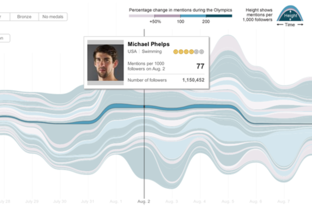
    The New York Times is back with another excellent infographic about the 2012 Olympics in London — this time showing Twitter activity on athletes' accounts. The graphic visualizes the number of mentions 140 verified accounts received over the games so far per 1,000 followers, honing in on when different athletes' mindshare peaked on Twitter. So, who won? Malaysian track cyclist Azizulhasni Awang (@AzizulAWANG) looks to have received the the most mentions per 1,000 followers (2,308) after his public apology for failing to obtain any medals. Michael Phelps' mentions, meanwhile, were dwarfed by his over 1,000,000 follower count.

    Monday, August 6, 2012

    Viz: Google visualizes arms trade

    Pretty, but does it inform? 

    A new way to visualize the global arms trade

    Did you know that 60 percent of all violent deaths are due to small arms and light weapons? Small arms, such as revolvers, assault rifles and light machine guns, and ammunition represent a $8.5 billion industry, and three quarters of the world’s small arms lie in the hand of civilians—more than 650 million civilian arms. As part of the Google Ideas initiative on illicit networks, we’ve created an interactive data visualization of global small arms and ammunition trading to better understand and map the global arms trade.

    The tool was produced by Google’s Creative Lab team in collaboration with the Igarape Institute. More than 1 million data points on imports and exports of small arms, light weapons and ammunition between 1992 and 2010 and across 250 states and territories across the world were provided by the Peace Research Institute Oslo (PRIO) small arms database. The visualization reveals patterns and trends in imports and exports of arms and ammunition across the world, making it easy to explore how they relate to conflicts worldwide. More of the implications of this data are discussed in this video from the INFO summit hosted by Google Ideas last month:


    You can explore these data points by zooming in and out of the globe, clicking on any country to readjust the view, and using the histogram tool at the bottom to see trading patterns over the years. You can see, for example, that the scale of the global trade in ammunition rivals the scale of trade in actual weapons, an insight underexplored by policymakers today in conflict prevention and resolution.


    We built this visualization using the open source WebGL Globe on Google’s Chrome Experiments site; since it is open sourced, we hope to see others use the globe as a platform for bringing other complex datasets to life.

    Posted by Scott Carpenter, Deputy Director, Google Ideas

    Viz: Usain Bolt vs. 116 years of Olympic sprinters

    These are very sweet. 

    Usain Bolt vs. 116 years of Olympic sprinters

    Usain Bolt New York Times visualization

    The New York Times has published an incredible series of visualizations, using 3D models to compare today's top sprinters, swimmers, and long jumpers with athletes from every Olympic Games since 1896. The standout is a video analyzing Usain Bolt's blistering 9.63-second performance in the 100m dash last night, showing just how far ahead he is, not only of the current crop, but also of the top sprinters of yesteryear.

    If Thomas Burke, gold medallist at the first modern Olympics in Athens, ran last night, he would have been more than 18m from the finish line as Bolt crossed it — he would even have been beaten by last-placed Asafa Powell, whose groin injury forced him to jog across the line in a disappointing 11.99 seconds. But it's not...

    Sunday, August 5, 2012

    Viz: of coffee aromas, using a sunburst chart

    Vittles Film + Counter Culture Coffee = Cafe Sense


    I’m glad I ran into the guys of Vittles Film at the Indy Weekly Awards outing this weekend.  It was gorgeous weather and lots of people jammed into the American Tobacco Historic District with vendors set up showing off their flair.  As I was walking around congratulating the recent winners I stopped at a tent because I noticed a small postcard with a coffee tasting wheel advertising a documentary called “Cafe Sense”.  I had heard about this documentary through Counter Culture Coffee but had yet to watch it.  First, its a great documentary and you should check it out below or at their website here  http://www.vittles.us/.  Second, support what they are doing.  Their craft is excellent and their story telling is superb.  Hats off Vittles crew, I hope we meet again very soon! 

    Monday, July 30, 2012

    Viz: The Internet Map - a visual representation of the relationship between 350,000 websites

    The Internet Map: a visual representation of the relationship between 350,000 websites

    internet map cropped


    Imagine the web as a giant galaxy where the planets are sites clustered together by likeness, and what you might get is something like The Internet Map. Representing over 350,000 websites from 196 countries and all domain zones at the end of 2011, the map displays over 2 million site links based on topical similarities. Each site is represented by a circle, with size depending on the amount of traffic, and the space between each is determined by frequency, or strength, of the link created when user's jump from one website to another. If you want to get into the fine details of how the map's layout is calculated, the group behind the project has provided a few very technical mathematical and engineering resources. Feel free to move around...

    Monday, July 9, 2012

    Viz: Twitter data on soda or pop?

    Aggregating Twitter data to answer the age-old question: soda or pop?

    via dl.dropbox.com

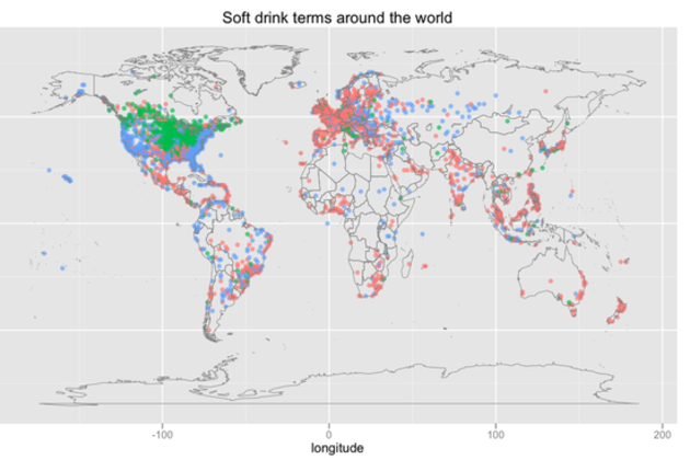
    As more people move their conversations online and into the public eye via social networks, gathering information about regional dialects becomes easier than ever. Twitter data scientist Edwin Chen collected and analyzed tweets across the world to map one of the most well-known markers of linguistic difference: how people refer to soft drinks. First, he sampled messages tagged with a location, filtering them for "soda," "pop," or "coke." Then, he used other words in the sentence to make sure they referred to drinks ("drink a pop," for example) and to filter out specific references to Coke as a brand. Lastly, he aggregated the tweets by location and mapped them.

    The results are much the same as in similar older work.. In the US, "pop" is...

    Tuesday, June 19, 2012

    Viz: The changing hue of movie posters

    Looks like a nice dataset. 

    The changing hue of movie posters

    movie poster colors

    A couple of weeks ago, software engineer Vijay Pandurangan had a theory. He decided that movie posters have, over the years, become more dark and more blue. Rather than moving on with his life, he decided to analyze the color data from 35,000 posters produced from 1914 to present day. The result, which you see above, shows that his theory was correct.

    At the top of the image you'll see data from 1914 and at the bottom that from present day. Pandurangan also produced an interactive version that gives detailed statistics for each year, as well as a clearer graphic that doesn't take image brightness into account. You can find both, along with an explanation of his process for creating the visualizations, on his blog.

    Monday, May 21, 2012

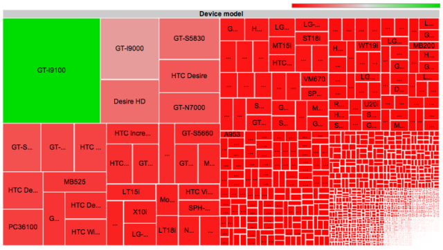
    Viz: Android fragmentation -- one developer encounters 3,997 devices

    That's a lotta versions on android! 

    Android fragmentation: one developer encounters 3,997 devices


    A map of all the thousands of separate device models that downloaded OpenSignalMaps in a six month period.


    Viz: political polarization visualized -- it's real, and it's the right that's moved

    These folks are doing great work, and their simple plots are very powerful. 

    Polarization is Real (and Asymmetric)

    Revised 16 May 2012

    Christopher Hare is a PhD student in Political Science at the University of Georgia.

    Nolan McCarty is the Susan Dod Brown Professor of Politics and Public Affairs and Chair of the Department of Politics at Princeton University.

    Keith T. Poole is Philip H. Alston Distinguished Chair, Professor of Political Science at the University of Georgia and Professor Emeritus at the University of California, San Diego.

    Howard Rosenthal is Professor of Politics at New York University and the Roger Williams Straus Professor of Social Sciences, Emeritus, at Princeton University.

    The recent outburst of scholarly and popular interest in political polarization has attracted attention to the methods we use to measure this phenomenon. One frequently voiced concern (see a recent column by Sean Trende) is that Congress may not have polarized as we have claimed in publications and blogs stretching as far back as 1984. The concern is that the meaning of ideological (NOMINATE) scores are tied to the legislative and historical context of the roll call votes that are used to estimate them. For example, the content of roll calls votes cast by members of 90th Senate that dealt with the Vietnam War, civil rights, and funding for LBJ’s “Great Society” programs are quite different than those votes cast in the current Senate. Thus, being the most conservative Senator (with a score of 1.0) in 1968 would mean something different than having an identical 1.0 score in 2012.

    #more 

    Indeed, temporal comparisons should not be made for ideal points generated from static scaling methods. Static methods (like W-NOMINATE) treat each legislative session separately and there is no valid way to compare the scores of legislators from different years. However, we developed a dynamic methodology, DW-NOMINATE (McCarty, Poole and Rosenthal 1997), to allow for over-time comparisons of legislator ideological positions. The key innovation is the use of “bridge” legislators — members of Congress (MCs) who have served in multiple sessions — to compare the positions of legislators who have never served together.


    A sports analogy to the overlapping cohorts method is the “common opponents” statistic. If we want to compare two teams who have not played each other, we compare their performances against a common opponent(s). Likewise, MCs who have not served together can be compared with the use of a “bridge” legislator who has served with both. For example, if we know that Sen. George McGovern (D-SD) is more liberal than Sen. Patrick Leahy (D-VT), and that Sen. Leahy is more liberal than Sen. Max Baucus (D-MT), then we can say that Sen. McGovern is more liberal than Sen. Baucus. Though intransitivities may arise cases involving 3 or more sports teams, Poole shows in his 2007 Pub...
    Friday, April 27, 2012

    Viz: trayvon's spread across the us in social media

    bitly blog

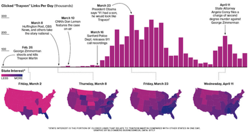
    On February 26th, Trayvon Martin was shot by George Zimmerman in Sanford, FL. Martin, 17, was walking home after purchasing a snack from a local convenience store. 

    Recently, Bitly collaborated with Bloomberg Businessweek on a visualization showing how the media’s coverage of the shooting went from local to national. We explored how various responses to the event (the release of the 911 tapes, President Obama’s public comments) caused spikes in traffic to online articles related to Trayvon.


    #more 

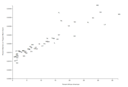
    In mid-April Bill Cosby commented that debate of the shooting should not focus on the role race played, but on the role of guns. Using Bitly data we explored how race was correlated with attention paid to the Martin event. US Census data provided the percentage of African-Americans for each state. We plotted these percentages against the attention each state gave to the event from February 26 through April 21. 

    We utilized linear regression to model the data. The resulting line had an R-Square value of 0.86. The greatest outlier was the state of Florida (which is reasonable given the local nature of the story). As you can see from the graph, there is a direct correlation between the racial makeup of a state and the amount of attention that state has paid to the story. While Mr. Cosby may want the story to be focused on guns, the data shows that race has been the focus.

    We studied this particular story because of the media impact and because we are investigating how stories and ideas spread through social media. We would love to hear your thoughts and questions!

    Sent with Reeder

    Viz: Is it Legal to Wear Headphones When You're Driving?

    Lifehacker

    Ever Wonder If It's Actually Legal to Wear Headphones When You're Driving? You know you're supposed to go hands-free with your phone in the car, but did you know in some states it's illegal to wear headphones when you're driving? Is your state one of those? We teamed up with the American Automobile Association (AAA) to get to the bottom of the issue. Find out where you can rock out while you drive and where you should make sure your earbuds are out before you head down the highway.

    It's not exclusively a hands-free phone issue, of course. You may also have wondered if you can wear headphones and listen to music while driving—maybe because your radio was broken, or you wanted to listen to something on your phone but had no way to hook it up to your speakers, or maybe because you saw someone else driving with earbuds in and wondered "Hey, is that legal?!"

    In some states, wearing headphones is perfectly legal; in others, it's 100% illegal; and in many states, the law is a little less clear cut—for example, in some states it's only legal to wear headphones in one ear, but not two.

    Click your state on the interactive map below to see what the law says where you live.

    Is It Legal to Wear Headphones While Driving?

          Mostly legal          Mostly illegal          It's complicated

    Ever Wonder If It's Actually Legal to Wear Headphones When You're Driving?

    Click on any state for details

    Our interactive map requires JavaScript; which appears to be disabled in your browser. Here's a non-interactive image instead. Ever Wonder If It's Actually Legal to Wear Headphones When You're Driving?


    #more 

    If the map above isn't displaying correctly in your browser or you just want a copy to save for later, click here to download the map as an image instead.

    Many thanks to the AAA for their help with this post. They point out—and we agree—that regardless of the legality of wearing headphones in your state, listening to music on headphones while driving is a distraction, and can impair your ability to hear the sirens from emergency vehicles nearby and other important traffic sounds that would be audible if you were only listening to the radio. They point out that a headphone cable across your lap could become tangled and present a steering hazard. Whatever you choose to do, make sure you take the law, your safety, and the safety of others on the road into account first.

    Sent with Reeder