Showing posts with label visualization. Show all posts
Showing posts with label visualization. Show all posts
Wednesday, November 28, 2012

Tuesday, November 27, 2012
Find: Beautiful and meaningful - Watch the beauty of public transit unfold in New York, Boston, and other cities around the world
Watch the beauty of public transit unfold in New York, Boston, and other cities around the world
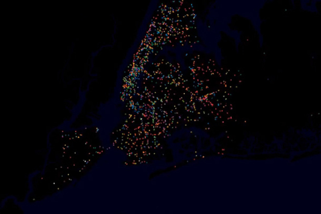
YouTube user STLTransit has a wonderful collection of videos that visualize the movements of the public transit systems of various locations — turning public transit data into a flowing display of a city's daily life. Each video shows the ebb and flow of traffic during a single day, with various transit systems like bus and rail shown in different colors. The result is a brief but exciting glimpse at our world — a satellite's view of a city's living protoplasm on the streets below.
Monday, November 12, 2012
Spotted: how people choose summarizing phrases - Descriptive keyphrases for text visualization
“Without the clutter of unimportant words”: Descriptive keyphrases for text visualization
Jason Chuang, Christopher D. Manning, Jeffrey HeerKeyphrases aid the exploration of text collections by communicating salient aspects of documents and are often used to create effective visualizations of text. While prior work in HCI and visualization has proposed a variety of ways of presenting keyphrases, less attention has been paid to selecting the best descriptive terms. In this article, we investigate the statistical and linguistic properties of keyphrases chosen by human judges and determine which features are most predictive of high-quality descriptive phrases. Based on 5,611 responses from 69 graduate students describing a corpus of dissertation abstracts, we analyze characteristics of human-generated keyphrases, including phrase length, commonness, position, and part of speech.Monday, August 6, 2012
Find: Introducing new Fusion Tables API
Introducing new Fusion Tables API
By Warren Shen, Google Fusion Tables teamAmidst all the excitement of I/O followed by the July 4th holiday in the U.S., many developers missed the announcement of the new Fusion Tables API. The new API includes all of the functionality of the existing SQL API, plus the ability to read and modify table and column metadata as well as the definitions of styles and templates for data visualization. This API is also integrated with the Google APIs console which lets developers manage all their Google APIs in one place and take advantage of built-in reporting and authentication features.
With this launch, we are also announcing a six month deprecation period for the existing SQL API. Since the new API includes all of the functionality of the existing SQL API, developers can easily migrate their applications using our migration guide.For a detailed description of the features in the new API, please refer to the API documentation.
Posted by Ashleigh Rentz, Editor Emerita
Wednesday, June 13, 2012
Tuesday, June 5, 2012
Spotted: A new technique for comparing averages in visualizations
Comparing averages in time series data
Michael Correll, Danielle Albers, Steven Franconeri, Michael GleicherVisualizations often seek to aid viewers in assessing the big picture in the data, that is, to make judgments about aggregate properties of the data. In this paper, we present an empirical study of a representative aggregate judgment task: finding regions of maximum average in a series. We show how a theory of perceptual averaging suggests a visual design other than the typically-used line graph. We describe an experiment that assesses participants' ability to estimate averages and make judgments based on these averages. The experiment confirms that this color encoding significantly outperforms the standard practice.
Sunday, June 3, 2012
Competition: International Science & Engineering Visualization Challenge
Help people understand science with apps, games, or visuals.
Friday, May 18, 2012
Viz interaction that isn't an afterthought -- Semantic interaction for visual text analytics
Finally a viz paper with interaction front and center.
Semantic interaction for visual text analytics
Alex Endert, Patrick Fiaux, Chris NorthVisual analytics emphasizes sensemaking of large, complex datasets through interactively exploring visualizations generated by statistical models. For example, dimensionality reduction methods use various similarity metrics to visualize textual document collections in a spatial metaphor, where similarities between documents are approximately represented through their relative spatial distances to each other in a 2D layout. This metaphor is designed to mimic analysts' mental models of the document collection and support their analytic processes, such as clustering similar documents together. However, in current methods, users must interact with such visualizations using controls external to the visual metaphor, such as sliders, menus, or text fields, to directly control underlying model parameters that they do not understand and that do not relate to their analytic process occurring within the visual metaphor.
Thursday, May 10, 2012
Spotted: Strategies for crowdsourcing social data analysis -- taming the Turk
ACM CHI
Wesley Willett, Jeffrey Heer, Maneesh AgrawalaWeb-based social data analysis tools that rely on public discussion to produce hypotheses or explanations of the patterns and trends in data, rarely yield high-quality results in practice. Crowdsourcing offers an alternative approach in which an analyst pays workers to generate such explanations. Yet, asking workers with varying skills, backgrounds and motivations to simply "Explain why a chart is interesting" can result in irrelevant, unclear or speculative explanations of variable quality. To address these problems, we contribute seven strategies for improving the quality and diversity of worker-generated explanations. Our experiments show that using (S1) feature-oriented prompts, providing (S2) good examples, and including (S3) reference gathering, (S4) chart reading, and (S5) annotation subtasks increases the quality of responses by 28% for US workers and 196% for non-US workers.
Wednesday, April 18, 2012
Job: ARA is hiring
Folks, a former student of mine has a few job opportunities at ARA locally.
Best,
Ben
---------- Forwarded message ----------
From: Christopher Sexton ARA/SED <csexton@ara.com>
From: Christopher Sexton ARA/SED <csexton@ara.com>
Hi Ben –
Our company is doing some hiring right now, specifically in the group that I work in. If you’ve got any bright students looking for full time jobs after graduation, I’d love to talk to them.
Specifically, I’m involved with the hiring for 3 postings: SED-2012-101, SED-2012-112 and SED-2012-113.
http://www.ara.com/Careers/ara-job-search.htm
Here’s a short blurb – we’re hiring at a few different levels (junior entry to more experienced).
Applied Research Associates, Inc. (ARA), a national leader in scientific and engineering research and development, is seeking a staff software developer to join our Decision Systems Group in Raleigh, NC. The selected candidate will develop, code, test, and debug new software or enhancements to existing software under direction from senior developers/engineers. Our development approach fosters communication and collaboration across multiple scientific disciplines, and provides all members of our teams opportunities to contribute creatively to our projects. The successful applicant must have skills in analysis and design of software components in an object-oriented environment. This position supports ARA’s growing work in application development for national vulnerability and event analysis.
Position Requirements:
- Understanding of the application development life cycle
- Proficient with C++, Java, and object-oriented analysis & design (OOAD)
- Possession of an Active DoD Secret Security Clearance or the ability to obtain one
- Strong oral presentation and written communication skills
Position Preferences:
- Knowledge of and experience working in a Scrum and/or XP software development environment
- Experience developing Qt and/or MFC GUIs
- Experience using modern software configuration management tools (e.g., Rational ClearCase, SVN, Git)
- Experience using OpenSceneGraph and/or OpenGL
- Experience with GIS Toolkits
- Experience using XML SDKs
- Experience in physics-based modeling, simulation, or distributed component technologies
|
| Chris G Sexton Staff Software Developer Applied Research Associates, Inc. office: 919.582.3300, direct: 919.582.3318 |
Saturday, April 14, 2012
Find: A google event at the convergence of visualization and journalism
Wish I could be there.
Google
Today, roughly 200 reporters, editors and technologists are gathering at the Googleplex in Mountain View for our first TechRaking summit. Co-hosted with the Center for Investigative Reporting, the oldest nonprofit investigative reporting organization in the United States, this gathering is meant to inspire muckraking by exploring tools that help reporters tell stories with greater interactivity, opportunities for long-form journalism to thrive in new mediums, best practices for verifying information and fact-checking online and much more throughout the course of the day. Think of it as the intersection of science and art when it comes to converting information into knowledge.#more
Here are a few of the highlights in store:


- The Center for Investigative Reporting will discuss its new Knight Foundation-funded investigative news channel on YouTube that will be a hub of investigative journalism. Expected to launch in July, the channel will feature videos from major broadcasters and independent producers globally—both nonprofit and for-profit—and is an example of the power of collaborations that can serve the public.
- The Google Fusion Tables team will discuss tips and tricks for data-driven journalists with Wendy Levy and Jeremy Rue during an afternoon breakout discussion. In another step toward making it easier for people in any industry to discover, manage and visualize data, this morning we announced a new interface for Fusion Tables, which helps you better explore and collaborate on data, includes more visualizations under the “experimental” tab and has a new Fusion Tables API for developers.
- Richard Gingras, head of news product at Google, is kickstarting the day with a series of questions for journalists, newsrooms and technologists to consider. Mary Himinkool, who leads global entrepreneurship, is delivering a rapid-fire seven-minute look at lessons learned from entrepreneurs around the world, and Brian Rakowski from Chrome is sharing the process involved in rethinking the modern browser.
TechRaking was born out of a lunchtime conversation at NewsFoo, another unconventional conference focused on moving forward the future of journalism and technology. We look forward to seeing the ideas and outcomes that emerge and develop from today.
Posted by Sean Carlson, Global Communications & Public Affairs
Sent with Reeder
Saturday, April 7, 2012
Spotted: A Space-Filling Visualization Technique for Multivariate Small-World Graphs
A new space filling graph visualization technique.
IEEE TVCG
We introduce an information visualization technique, known as GreenCurve, for large multivariate sparse graphs that exhibit small-world properties. Our fractal-based design approach uses spatial cues to approximate the node connections and thus eliminates the links between the nodes in the visualization. The paper describes a robust algorithm to order the neighboring nodes of a large sparse graph by solving the Fiedler vector of its graph Laplacian, and then fold the graph nodes into a space-filling fractal curve based on the Fiedler vector. The result is a highly compact visualization that gives a succinct overview of the graph with guaranteed visibility of every graph node. GreenCurve is designed with the power grid infrastructure in mind. It is intended for use in conjunction with other visualization techniques to support electric power grid operations. The research and development of GreenCurve was conducted in collaboration with domain experts who understand the challenges and possibilities intrinsic to the power grid infrastructure. The paper reports a case study on applying GreenCurve to a power grid problem and presents a usability study to evaluate the design claims that we set forth. Sent with Reeder
Wednesday, April 4, 2012
Find: Ambient Devices CEO Pritesh Gandhi on 'glanceable' data
On information that is simple and elegant.
The Verge - All Posts

We're perpetually bombarded with information, 24 hours a day. That's just our connected reality now, and there's very little hope of escaping it. On Valentine's Day, I penned an editorial on how I believe that the secret to distilling this information — the key to preventing humans from collapsing under the ever-growing weight of this data — has been right under our noses for years.
They're called "glanceable" devices, and Massachusetts-based Ambient Devices has been developing them for over a decade. The company spun out of a project at MIT's famed Media Lab with the goal of integrating data points into our lives in a natural, organic way. Ambient's path to building a real business has been an unusual one, producing oddities...
Friday, February 24, 2012
Spotted: PrePrint: Automated Box-Cox Transformations for Improved Visual Encoding
With Bill Cleveland, a pioneer in statistical graphics.
IEEE CS TVCG
This concept of pre-conditioning data (utilizing a power transformation as an initial step) for analysis and visualization is well established within the statistical community and is employed as part of statistical modeling and analysis. Such transformations condition the data to various inherent assumptions of statistical inference procedures, as well as making the data more symmetric and easier to visualize and interpret. In this paper, we explore the use of the Box-Cox family of power transformations to semi-automatically adjust visual parameters. We focus on time series scaling, axis transformations and color binning for choropleth maps. We illustrate the usage of this transformation using various examples, and discuss the value and some issues in semi-automatically using these transformations for more effective data visualization. Skimmed: Interactive Dynamics for Visual Analysis
Nice survey of visual analytics.
ACM Queue
A taxonomy of tools that support the fluent and flexible use of visualizations Thursday, February 2, 2012
Viz: Yikes! Animation Charts Modern Global Warming
Green Blog: Animation Charts Modern Global Warming
NYT > Science
In the animation, reds indicate temperatures that were higher than average during a baseline period of 1951-1980, and blues indicate lower temperatures.Monday, January 30, 2012
Viz: Yikes! Animation Charts Modern Global Warming
NYT > Science
In the animation, reds indicate temperatures that were higher than average during a baseline period of 1951-1980, and blues indicate lower temperatures.
Subscribe to:
Posts (Atom)