Wednesday, November 28, 2012
Tuesday, November 27, 2012
Find: Beautiful and meaningful - Watch the beauty of public transit unfold in New York, Boston, and other cities around the world
Watch the beauty of public transit unfold in New York, Boston, and other cities around the world
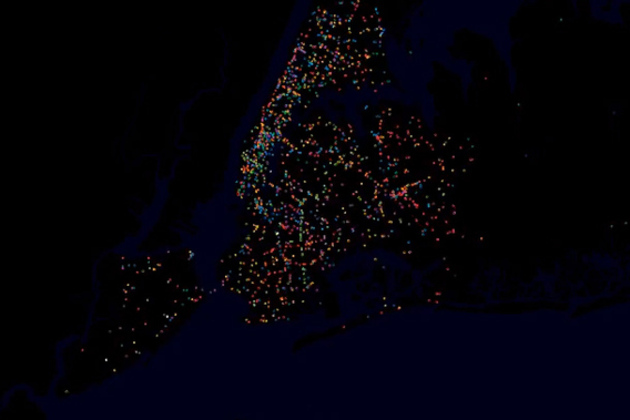
YouTube user STLTransit has a wonderful collection of videos that visualize the movements of the public transit systems of various locations — turning public transit data into a flowing display of a city's daily life. Each video shows the ebb and flow of traffic during a single day, with various transit systems like bus and rail shown in different colors. The result is a brief but exciting glimpse at our world — a satellite's view of a city's living protoplasm on the streets below.
Monday, November 26, 2012
Find: Robert Kosara's visualization history
Robert Kosara (@eagereyes)New on eagereyes: The Changing Goals of Data Visualization eagereyes.org/criticism/chan… |
Monday, November 12, 2012
Spotted: how people choose summarizing phrases - Descriptive keyphrases for text visualization
“Without the clutter of unimportant words”: Descriptive keyphrases for text visualization
Jason Chuang, Christopher D. Manning, Jeffrey HeerKeyphrases aid the exploration of text collections by communicating salient aspects of documents and are often used to create effective visualizations of text. While prior work in HCI and visualization has proposed a variety of ways of presenting keyphrases, less attention has been paid to selecting the best descriptive terms. In this article, we investigate the statistical and linguistic properties of keyphrases chosen by human judges and determine which features are most predictive of high-quality descriptive phrases. Based on 5,611 responses from 69 graduate students describing a corpus of dissertation abstracts, we analyze characteristics of human-generated keyphrases, including phrase length, commonness, position, and part of speech.Thursday, October 18, 2012
Find: NYT Viz - How States Votes Have Shifted
Interesting visualization of bipolar values over time. Careful design here.
Over the Decades, How States Have Shifted
An interactive graphic shows the political evolution of each state from 1952 through 2008 and the states' current standing in the FiveThirtyEight forecast.Friday, September 21, 2012
Find: Build apps for elections with the Google Civic Information API
Google Code Blog Build apps for elections with the Google Civic Information API

By Chetan Sabnis, Google Politics & Elections Team
Cross-posted from the Google Politics & Elections Blog
Google’s mission is to organize the world’s information and make it universally accessible and useful. To make it easier for you to build apps with voting information on the web, we are releasing our new Google Civic Information API. The API enables you to look up comprehensive voting information for an individual U.S. address, including polling place, early vote sites, contests, and local election official contact information. By releasing this API, we hope to unleash the creativity of the Internet and help you build innovative products that push civic information to your communities in interesting ways.
As you know, this type of information can change frequently as we get closer to Election Day, and we will make every effort to ensure we're returning timely and accurate data. We have also included contact information for local election officials in the API so voters can find the most accurate information.
#more
While this API only includes voting information for elections in the U.S., we plan to expand to other countries and include other types of civic information. Please join the Google Civic Information API Forum for updates on the data available and check out the Google Politics & Elections page to find more information about the work we are doing around the election and our international elections programs.

You can get started here through the Google APIs Explorer. The API is available now, but please note that full information isn't yet available for the November 6th General Election. We expect to be able to provide full live data around the middle of October, as it becomes available. For now, we recommend building your applications using the test data we provide. We'll be using the API to power our own election tools over the coming weeks, including an embeddable app anyone can use on their site, and we're looking forward to seeing the applications you come up with!
The Civic Information API replaces our previous Google Election Center API, which will be turned down after January 1, 2013.
For questions, comments, and to showcase your apps using the API, we encourage you to use the Google Civic Information API Forum.
Chetan Sabnis is a software engineer on the Google Politics & Elections team. In his spare time, Chetan enjoys solving logic puzzles and crosswords.
Posted by Scott Knaster, Editor
Monday, September 10, 2012
Viz: Facebook Freakonomics - a new tool to map the world's friendships
Facebook Freakonomics: a new tool to map the world's friendships
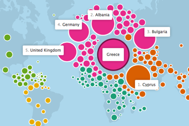
Last November, Facebook flipped Stanley Milgram's "six degrees of separation" theory on its head and showed that we're a lot closer than you might think. Today, Facebook launched a new interactive map of the world's friendships — a partnership with the data visualization wizards at the Stamen design studio — that illustrates some of the ways we're connected. The map uses an often-amorphous blob of bubbles representing the world's countries to show which ones share the most friendships, and many times, even explain why.
Monday, September 3, 2012
Viz: Amazon creates Presidential Election heat map based on political book purchases
Amazon creates Presidential Election heat map based on political book purchases
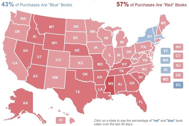
Everyone from Microsoft to Twitter to YouTube has taken to providing their own unique spin on covering the election, and Amazon is no different. The company has released a "2012 Election Heat Map" that shows what kinds of political books Americans are buying. Amazon took its 250 top-selling political books and characterized each one as either red (Republican Party), blue (Democratic party), or neutral, and then determined where those books have been purchased and shipped in the last 30 days. The result is a map that shows whether states are more red or blue based on their reading habits — at the time of writing Republican-leaning books were leading the way, accounting for 57 percent of purchases. Of course, as Amazon points out, "books...
Sunday, August 26, 2012
Viz: examining Wake county school superintendent Tata’s State of the Schools Speech with word clouds
Tata’s State of the Schools Speech, Visualized
If you thought school politics was difficult to understand before, check out this word cloud we created from the superintendent’s State of the Schools speech.
Tata’s speech Thursday focused mostly on school performance, as you can see with the prominence of the word “schools” in the word cloud. He also addressed the need for a school construction bond next year and stressed that new standardized tests, called the Common Core, might hit Wake with a reality check.


Nerd note: We made the clouds using Many Eyes, by inputting the entire text of Tata’s speech. We then eliminated for redundancies like “schools” and “school.” We also eliminated words that didn’t seem to have much meaning like “get” and “year.”
Sunday, August 19, 2012
Find: Novel text analysis uses PageRank to identify influential Victorian authors
Novel text analysis uses PageRank to identify influential Victorian authors

A literature professor has developed software using Google's PageRank algorithm that has identified Jane Austen and Walter Scott as the most influential authors of the 1800s.
Matthew Jockers of the University of Nebraska analysed 3,592 digitized novels published in the UK, Ireland and the US between 1780 and 1900 using a combination of Google's algorithm, machine learning and a series of techniques used in computational text analysis including stylometry, corpus linguistics and network analysis.
After ensuring the gender balance was split roughly evenly, Jockers went about using his software to extract thematic data&mdsah;this included the frequency of specific words or groups of words. Network software was then used to categorize and rank this data—Jockers began with a network consisting of 12,902,464 rows and three columns, with a source book allotted to the first column, a target book to the second and the third used to calculate the distance between the two (i.e. how many similarities they share according to the thematic data). After narrowing these data sets down to 6,447,640, the information was imported into network analysis software Gephi and PageRank was used to help identify down those novels which had the most links to future tomes, as well as the strongest links to those tomes.
Thursday, August 16, 2012
Find: Twitter revs up mTurk with Clockwork Raven
Looks handy!
Crowdsourced data analysis with Clockwork Raven
Today, we’re excited to open source Clockwork Raven, a web application that allows users to easily submit data to Mechanical Turk for manual review and then analyze that data. Clockwork Raven steps in to do what algorithms cannot: it sends your data analysis tasks to real people and gets fast, cheap and accurate results. We use Clockwork Raven to gather tens of thousands of judgments from Mechanical Turk users every week.
Motivation
We’re huge fans of human evaluation at Twitter and how it can aid data analysis. In the past, we’ve used systems like Mechanical Turk and CrowdFlower, as well as an internal system where we train dedicated reviewers and have them come in to our offices. However, as we scale up our usage of human evaluation, we needed a better system. This is why we built Clockwork Raven and designed it with several important goals in mind:
Wednesday, August 15, 2012
Cassovary: A Big Graph-Processing Library
Cassovary: A Big Graph-Processing Library
We are open sourcing Cassovary, a big graph-processing library for the Java Virtual Machine (JVM) written in Scala. Cassovary is designed from the ground up to efficiently handle graphs with billions of edges. It comes with some common node and graph data structures and traversal algorithms. A typical usage is to do large-scale graph mining and analysis.
At Twitter, Cassovary forms the bottom layer of a stack that we use to power many of our graph-based features, including "Who to Follow" and “Similar to.” We also use it for relevance in Twitter Search and the algorithms that determine which Promoted Products users will see. Over time, we hope to bring more non-proprietary logic from some of those product features into Cassovary.
Please use, fork, and contribute to Cassovary if you can. If you have any questions, ask on the mailing list or file issues on GitHub. Also, follow @cassovary for updates.
-Pankaj Gupta (@pankaj)
Viz: Visualizing Hadoop with HDFS-DU
Visualizing Hadoop with HDFS-DU
We are a heavy adopter of Apache Hadoop with a large set of data that resides in its clusters, so it’s important for us to understand how these resources are utilized. At our July Hack Week, we experimented with developing HDFS-DU to provide us an interactive visualization of the underlying Hadoop Distributed File System (HDFS). The project aims to monitor different snapshots for the entire HDFS system in an interactive way, showing the size of the folders and the rate at which the size changes. It can also effectively identify efficient and inefficient file storage and highlight nodes in the file system where this is happening.
HDFS-DU provides the following in a web user interface:
- A TreeMap visualization where each node is a folder in HDFS. The area of each node can be relative to the size or number of descendents
HDFS-DU is built using the following front-end technologies:
- D3.js: for tree visualization
Details
Below is a screenshot of the HDFS-DU user interface (directory names scrubbed). The user interface is made up of two linked visualizations. The left visualization is a TreeMap and shows parent-child relationships through containment. The right visualization is a tree layout, which displays two levels of depth from the current selected node in the file system. The tree visualization displays extra information for each node on hover.

You can drill down on the TreeMap by clicking on a node, this would create the same effect as clicking on any tree node. There are two possible layouts for the TreeMap. The default one encodes file size in the area of each node. The second one encodes number of descendents in the area of each node. In the second view it's interesting to spot nodes where storage is inefficient.
Find: visualizing the evolution of the web
Behind the scenes: visualizing the evolution of the web
 |
| Dero |
 |
| Sergio |
This guest post is by Sergio Alvarez, Vizzuality, and Deroy Peraza, Hyperakt, in collaboration with Min Li Chan, Chrome Team
At Google I/O this year, we launched a new version of The Evolution of the Web, a project visualizing the history and pace of innovation in web technologies and browsers. The Evolution of the Web traces how web technologies have evolved in the last two decades and highlights the web community’s continuous efforts to improve the web platform and enable developers to create new generations of immersive web experiences. In collaboration with the Google Chrome team, the team at Hyperakt designed the interactive visualization while Vizzuality built it using HTML5, SVG, and CSS3.

The visualization included 43 web technology "strands" across 7 browser timelines to represent major developments on the web platform. On hover or tap, each strand is highlighted to reveal intersections that tell the story of when browser support was implemented for each new web technology. To provide additional context, we developed a secondary visualization to illustrate the growth of Internet users and traffic.
Sunday, August 12, 2012
Viz: Tracking athletes' Twitter mentions over the Olympics
Tracking athletes' Twitter mentions over the Olympics
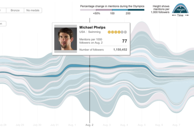
The New York Times is back with another excellent infographic about the 2012 Olympics in London — this time showing Twitter activity on athletes' accounts. The graphic visualizes the number of mentions 140 verified accounts received over the games so far per 1,000 followers, honing in on when different athletes' mindshare peaked on Twitter. So, who won? Malaysian track cyclist Azizulhasni Awang (@AzizulAWANG) looks to have received the the most mentions per 1,000 followers (2,308) after his public apology for failing to obtain any medals. Michael Phelps' mentions, meanwhile, were dwarfed by his over 1,000,000 follower count.
Saturday, August 11, 2012
Find: Census Bureau releases 'America's Economy' app for Android
Good idea.
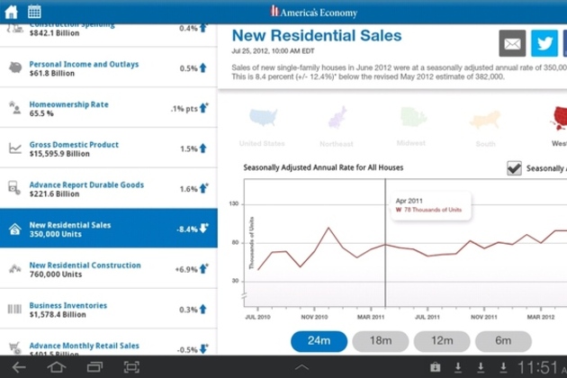
Statistics on the go: Census Bureau releases 'America's Economy' app for Android
The US Census Bureau just released its public API last month, and now the agency has released the America's Economy app for Android phones and tablets with an iOS version in the works. By combining its own data with that of the Bureau of Economic Analysis and the Bureau of Labor Statistics, the Census Bureau's app will track real-time trends in "employment, housing construction, international trade, personal income, retail sales and manufacturing." The app was created as part of the Census Bureau's Web Transformation Project to help federal employees and the general public access accurate data about the US' socioeconomic health. Both tablet and phone versions of the app are available in the Google Play store now.
Monday, August 6, 2012
Viz: Google visualizes arms trade
Pretty, but does it inform?

We built this visualization using the open source WebGL Globe on Google’s Chrome Experiments site; since it is open sourced, we hope to see others use the globe as a platform for bringing other complex datasets to life.
A new way to visualize the global arms trade
Did you know that 60 percent of all violent deaths are due to small arms and light weapons? Small arms, such as revolvers, assault rifles and light machine guns, and ammunition represent a $8.5 billion industry, and three quarters of the world’s small arms lie in the hand of civilians—more than 650 million civilian arms. As part of the Google Ideas initiative on illicit networks, we’ve created an interactive data visualization of global small arms and ammunition trading to better understand and map the global arms trade.The tool was produced by Google’s Creative Lab team in collaboration with the Igarape Institute. More than 1 million data points on imports and exports of small arms, light weapons and ammunition between 1992 and 2010 and across 250 states and territories across the world were provided by the Peace Research Institute Oslo (PRIO) small arms database. The visualization reveals patterns and trends in imports and exports of arms and ammunition across the world, making it easy to explore how they relate to conflicts worldwide. More of the implications of this data are discussed in this video from the INFO summit hosted by Google Ideas last month:
You can explore these data points by zooming in and out of the globe, clicking on any country to readjust the view, and using the histogram tool at the bottom to see trading patterns over the years. You can see, for example, that the scale of the global trade in ammunition rivals the scale of trade in actual weapons, an insight underexplored by policymakers today in conflict prevention and resolution.

We built this visualization using the open source WebGL Globe on Google’s Chrome Experiments site; since it is open sourced, we hope to see others use the globe as a platform for bringing other complex datasets to life.
Posted by Scott Carpenter, Deputy Director, Google Ideas
Data: Reese News launching Roll Call
Reese News launching Roll Call
UNC's online news service is launching a new tool to help reporters, wonks and voters keep track of legislation.Find: Introducing new Fusion Tables API
Introducing new Fusion Tables API
By Warren Shen, Google Fusion Tables teamAmidst all the excitement of I/O followed by the July 4th holiday in the U.S., many developers missed the announcement of the new Fusion Tables API. The new API includes all of the functionality of the existing SQL API, plus the ability to read and modify table and column metadata as well as the definitions of styles and templates for data visualization. This API is also integrated with the Google APIs console which lets developers manage all their Google APIs in one place and take advantage of built-in reporting and authentication features.
With this launch, we are also announcing a six month deprecation period for the existing SQL API. Since the new API includes all of the functionality of the existing SQL API, developers can easily migrate their applications using our migration guide.For a detailed description of the features in the new API, please refer to the API documentation.
Posted by Ashleigh Rentz, Editor Emerita
Competition: Google Places API Developer Challenge 2012
Deadline 10/31
The power of places and big data for good: Google Places API Developer Challenge 2012

By Carlos Cuesta, Google Maps API Product Marketing Manager
Cross-posted with the Google Geo Developers Blog
How would you make your community or local government run better? In our first Google Places API Developer Challenge, we’re inviting developers around the world to make something that improves their communities or governments by using the Google Places API and its database of places and tools. The developers of the winning applications will receive a VIP experience at Google I/O 2013.
You might create an app or site that solves health problems, understands crime patterns, or improves commerce. You can use any platform as long as you build with the Google Places API and it benefits your community or government. We’re looking for your best and most innovative ideas.
Built on the comprehensive global database of more than 95 million places that powers Google Maps, the Google Places API enables you to search for information about a variety of nearby places such as establishments, geographic locations and prominent points of interest. You can re-rank place results based on user check-ins, and create new places specific to your app.
To help you develop your ideas and build better apps, we’ve been working with local government officials in Austin, Boston, Chicago, London, Louisville, New York City, Philadelphia, Portland, San Francisco, and Seattle along with the White House to surface a wide variety of data sets for your apps. You can find these data sets and more on the Google Places API Challenge site at http://developers.google.com/challenge and hear more about what cities have to say about the challenge here. You can also follow updates and hangouts about the challenge on +Google Maps API.
The submission window opens on August 15th and closes on October 31st, 2012.
We look forward to seeing what can happen when your imagination and the Google Places API come together!
Viz: Usain Bolt vs. 116 years of Olympic sprinters
These are very sweet.  The New York Times has published an incredible series of visualizations, using 3D models to compare today's top sprinters, swimmers, and long jumpers with athletes from every Olympic Games since 1896. The standout is a video analyzing Usain Bolt's blistering 9.63-second performance in the 100m dash last night, showing just how far ahead he is, not only of the current crop, but also of the top sprinters of yesteryear.
Usain Bolt vs. 116 years of Olympic sprinters
The New York Times has published an incredible series of visualizations, using 3D models to compare today's top sprinters, swimmers, and long jumpers with athletes from every Olympic Games since 1896. The standout is a video analyzing Usain Bolt's blistering 9.63-second performance in the 100m dash last night, showing just how far ahead he is, not only of the current crop, but also of the top sprinters of yesteryear.If Thomas Burke, gold medallist at the first modern Olympics in Athens, ran last night, he would have been more than 18m from the finish line as Bolt crossed it — he would even have been beaten by last-placed Asafa Powell, whose groin injury forced him to jog across the line in a disappointing 11.99 seconds. But it's not...
Find: Amazon launches rental service for paper textbooks
Amazon launches rental service for paper textbooks
 Juggernaut Amazon is striking another blow at the traditional textbook industry by offering semester-long rentals of physical books. The listings for a number of textbooks now include a "rent" option that's usually around $50 for a title that sells for $170. According to Amazon's FAQ, the books are rented out by the semester (counted as 130 days), with one 15-day extension allowed. Textbooks are shipped at standard prices, and the cost of returning them is paid by Amazon. Depending on their luck, renters might receive a book that's new or one that's gently used.
Ebay's Half.com and other sites rent textbooks at roughly similar prices, but Amazon's ubiquity means it's likely to make the practice more mainstream. While Amazon also offers a...
Sunday, August 5, 2012
Viz: of coffee aromas, using a sunburst chart
Vittles Film + Counter Culture Coffee = Cafe Sense

I’m glad I ran into the guys of Vittles Film at the Indy Weekly Awards outing this weekend. It was gorgeous weather and lots of people jammed into the American Tobacco Historic District with vendors set up showing off their flair. As I was walking around congratulating the recent winners I stopped at a tent because I noticed a small postcard with a coffee tasting wheel advertising a documentary called “Cafe Sense”. I had heard about this documentary through Counter Culture Coffee but had yet to watch it. First, its a great documentary and you should check it out below or at their website here http://www.vittles.us/. Second, support what they are doing. Their craft is excellent and their story telling is superb. Hats off Vittles crew, I hope we meet again very soon!
Tuesday, July 31, 2012
Data: Introducing the Multi-Channel Funnels Reporting API
Introducing the Multi-Channel Funnels Reporting API

By John Huang, Software Engineer
Cross-posted from the Google Analytics Blog
Measuring how marketing efforts influence conversions can be difficult, especially when your customers interact with multiple marketing channels over time before converting. Last fall, we launched Multi-Channel Funnels in Google Analytics, a new set of reports that help shed light on the full path users follow to conversion, rather than just the last click. One request we’ve had since the beginning was to make this data available via an API to allow developers to extend and automate use cases with the data. So today we’re releasing the new Google Analytics Multi-Channel Funnels Reporting API.
The API allows you to query for metrics like Assisted Conversions, First Interactions Conversions, and Last Interaction conversions, as well as Top Paths, Path Length and Time Lag, to incorporate conversion path data into your applications. Key use cases we’ve seen so far involve combining this conversion path data with other data sources, such as cost data, creating new visualizations, as well as using this data to automate processes such as bidding.
For example, Cardinal Path used the new Multi-Channel Funnels API, Analytics Canvas ETL (Extract, Transform, Load) and Tableau Software to help their client, C3 Presents, uncover how time and channels affected Lollapalooza ticket sales in an analysis dubbed “MCF DNA.” The outcome was a new visualization, similar to a DNA graph, that helped shed light on how channels appeared throughout the conversion funnel.
Monday, July 30, 2012
Viz: The Internet Map - a visual representation of the relationship between 350,000 websites
The Internet Map: a visual representation of the relationship between 350,000 websites
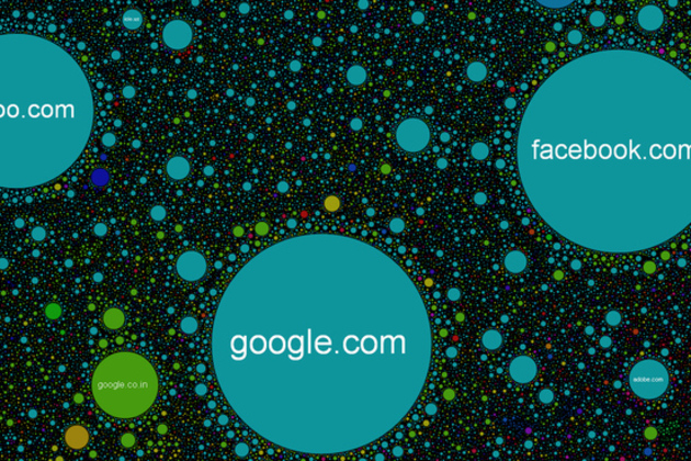
Imagine the web as a giant galaxy where the planets are sites clustered together by likeness, and what you might get is something like The Internet Map. Representing over 350,000 websites from 196 countries and all domain zones at the end of 2011, the map displays over 2 million site links based on topical similarities. Each site is represented by a circle, with size depending on the amount of traffic, and the space between each is determined by frequency, or strength, of the link created when user's jump from one website to another. If you want to get into the fine details of how the map's layout is calculated, the group behind the project has provided a few very technical mathematical and engineering resources. Feel free to move around...
Data: US Census Bureau releases public API for mobile and web developers
Cool. More please.
 The US Census Bureau has released its very first public API, allowing developers to create web and mobile apps based on the government's collection of demographic and economic statistics. The Bureau launched the API Thursday, alongside a new "app gallery" website where users can view and download apps that have already been built.
US Census Bureau releases public API for mobile and web developers
The US Census Bureau has released its very first public API, allowing developers to create web and mobile apps based on the government's collection of demographic and economic statistics. The Bureau launched the API Thursday, alongside a new "app gallery" website where users can view and download apps that have already been built.With the API, developers will have access to two sets of statistical databases: the 2010 Census, and the 2006-2010 American Community Survey. The former includes the latest data on population, age, sex, race, and home ownership, while the latter offers more socio-economic statistics, covering fields like education, income, and employment.
The Census Bureau is encouraging developers to create apps that are...
Friday, July 20, 2012
Web development opportunity at Rally Software
A job opportunity for students in webdev.
Benjamin Watson
Director, Design Graphics Lab | Associate Professor, Computer Science, NC State Univ.
Benjamin Watson
Director, Design Graphics Lab | Associate Professor, Computer Science, NC State Univ.
919-513-0325 | designgraphics.ncsu.edu | @dgllab
---------- Forwarded message ----------
From: Amy Benjamin <abenjamin@rallydev.com>
Date: Fri, Jul 20, 2012 at 11:02 AM
Subject: Referrals for Rally Software--Developers
To: bwatson@ncsu.edu
Hi Ben,
I noticed your information on the NC State website and was wondering if you might be able to help me out. We're actively hiring for developers in our Raleigh office and it sounds like you may have a strong network of local professionals and students who could be a fit for our opportunity. I've included a link the job description below to provide additional color around the specifics of who / what we're searching for here.Additional information on the job description: http://hire.jobvite.com/j/?cj=oRVxWfwZ&s=NC_State_ProfessorsIf you have a quick moment to review the job spec and think about anyone you know who may be a fit, I'd greatly appreciate it! Also, we're anticipating potential developer internships in the next few months--can I reach out to you regarding those as well?
From: Amy Benjamin <abenjamin@rallydev.com>
Date: Fri, Jul 20, 2012 at 11:02 AM
Subject: Referrals for Rally Software--Developers
To: bwatson@ncsu.edu
Hi Ben,
I noticed your information on the NC State website and was wondering if you might be able to help me out. We're actively hiring for developers in our Raleigh office and it sounds like you may have a strong network of local professionals and students who could be a fit for our opportunity. I've included a link the job description below to provide additional color around the specifics of who / what we're searching for here.Additional information on the job description: http://hire.jobvite.com/j/?cj=oRVxWfwZ&s=NC_State_Professors
Thanks in advance for your time, and let me know if I can ever return the favor.Cheers,
AmyAmy Benjamin
Recruiting Consultant
Rally Software Development
AmyAmy Benjamin
Recruiting Consultant
Rally Software Development
One more very big reason to join Rally: Rally Software Named Denver Post’s “Top Workplaces 2012” Winner
Friday, July 13, 2012
Find: jQuery 2.0 JavaScript framework to drop support for IE 6, 7, and 8
jQuery 2.0 JavaScript framework to drop support for IE 6, 7, and 8
The developers behind the popular jQuery JavaScript library recently published a blog entry with details about the project’s development roadmap. In the note, they announced plans to drop support for legacy versions of Microsoft’s Internet Explorer Web browser in jQuery 2.0
The 2.0 update is expected to release next year. Web developers need not worry, however, because the jQuery team has a plan to ensure that old versions of IE are still supported. A separate 1.9 release to be issued in parallel will leave legacy IE support intact.
The jQuery library is extremely popular among Web developers and is used on some of the largest sites on the Internet. It provides a number of convenience methods and utility functions that dramatically simplify DOM manipulation and other tasks that are common in modern Web applications.
Monday, July 9, 2012
Viz: Twitter data on soda or pop?
Aggregating Twitter data to answer the age-old question: soda or pop?
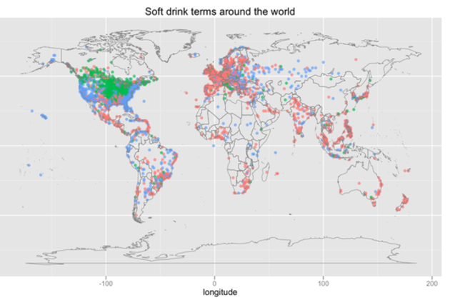 As more people move their conversations online and into the public eye via social networks, gathering information about regional dialects becomes easier than ever. Twitter data scientist Edwin Chen collected and analyzed tweets across the world to map one of the most well-known markers of linguistic difference: how people refer to soft drinks. First, he sampled messages tagged with a location, filtering them for "soda," "pop," or "coke." Then, he used other words in the sentence to make sure they referred to drinks ("drink a pop," for example) and to filter out specific references to Coke as a brand. Lastly, he aggregated the tweets by location and mapped them.
The results are much the same as in similar older work.. In the US, "pop" is...
Saturday, July 7, 2012
Find: Developer releases source of HTML5 mobile game, sheds light on challenges
Looks like a valuable resource!
Developer releases source of HTML5 mobile game, sheds light on challenges
Inspired by the buzz around HTML5, game development studio Wooga recently attempted to build a complete mobile game with standards-based Web technologies. To share the results of its year-long experiment, the company has published the game’s source code on GitHub under an open source software license.
Wooga also published a blog entry that describes some of the lessons that their developers learned from the experience. The company sees considerable potential in HTML5 gaming, but says that the technology isn’t quite ready yet. Wooga is releasing the source code with the hope that it will contribute to the Web development community’s body of knowledge.
"The reason we’re making Pocket Island open source is so that talented developers all around the world can learn from the team’s work here at Wooga, before breaking and improving on it," the company wrote in a blog post. "The promise of HTML5 is still an exciting one and while the time for mass market implementation may not be in 2012, we’re confident its time will come."
Tuesday, June 19, 2012
Viz: The changing hue of movie posters
Looks like a nice dataset.
The changing hue of movie posters
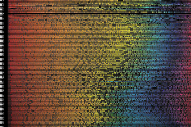
A couple of weeks ago, software engineer Vijay Pandurangan had a theory. He decided that movie posters have, over the years, become more dark and more blue. Rather than moving on with his life, he decided to analyze the color data from 35,000 posters produced from 1914 to present day. The result, which you see above, shows that his theory was correct.
At the top of the image you'll see data from 1914 and at the bottom that from present day. Pandurangan also produced an interactive version that gives detailed statistics for each year, as well as a clearer graphic that doesn't take image brightness into account. You can find both, along with an explanation of his process for creating the visualizations, on his blog.
Thursday, June 14, 2012

Spotted: Preserving the browsing experience with visualization -- supporting serendipitous book discoveries through information visualization
The bohemian bookshelf: supporting serendipitous book discoveries through information visualization
Alice Thudt, Uta Hinrichs, Sheelagh CarpendaleSerendipity, a trigger of exciting yet unexpected discoveries, is an important but comparatively neglected factor in information seeking, research, and ideation. We suggest that serendipity can be facilitated through visualization. To explore this, we introduce the Bohemian Bookshelf, which aims to support serendipitous discoveries in the context of digital book collections. The Bohemian Bookshelf consists of five interlinked visualizations each offering a unique overview of the collection. It aims at encouraging serendipity by (1) offering multiple visual access points to the collection, (2) highlighting adjacencies between books, (3) providing flexible visual pathways for exploring the collection, (4) enticing curiosity through abstract, metaphorical, and visually distinct representations of books, and (5) enabling a playful approach to information exploration.
Find: The Google APIs Explorer has a new look
The Google APIs Explorer has a new look
 |
| Jake |
 |
| Antonio |
Google Developer Team
Last March we introduced the Google APIs Explorer, an interactive tool that enables you to try out a Google API in minutes and explore its supported methods. When we launched it, the APIs Explorer supported over a half dozen APIs.
Starting today, the APIs Explorer has a brand new look to make it easier and more fun to navigate. We are also adding new features, including an indexed history of your API calls, a better editor for the body of a request, and a search box so you can search for APIs and methods easily.

Moreover, we have been busy adding support for more APIs to the Explorer. The Explorer now supports over two dozen Google APIs, and the list continues to grow! We have also added an indicator to show which methods require authenticated requests.
To get started, here are some sample requests you can try in the Explorer:
- Use the Google+ API to search for public profiles of people named "John Smith".
Wednesday, June 13, 2012
Tuesday, June 12, 2012
Competition: IBM/IEEE Smarter Planet Challenge; Student Project Competition -- deadline November
Some of you may want to develop your projects toward this competition.
Benjamin Watson
Director, Design Graphics Lab | Associate Professor, Computer Science, NC State Univ.
Benjamin Watson
Director, Design Graphics Lab | Associate Professor, Computer Science, NC State Univ.
919-513-0325 | designgraphics.ncsu.edu | @dgllab
IBM and IEEE are in search of creative team based student projects that can help students at any level learn about applying engineering, science and other disciplines to solve real world problems. It's a great opportunity to put your engineering skills to use…and earn cash prizes too!
The competition is open to college/university students from all geographic locations. Student teams should have three to five members in any year of university study. At least one team member must be an IEEE member. To find out more about this exciting opportunity, visit: http://www.ieee.org/go/smarter_planet_challenge or email smartplanetchallenge@ieee.org.
Monday, June 11, 2012
Job: [CS-Alumni] Rendering positions with Activision
More via David
Benjamin Watson
Director, Design Graphics Lab | Associate Professor, Computer Science, NC State Univ.
Director, Design Graphics Lab | Associate Professor, Computer Science, NC State Univ.
919-513-0325 | designgraphics.ncsu.edu | @dgllab
---------- Forwarded message ----------
From: David McAllister <davidm@cmonline.com>
Date: Sat, Jun 9, 2012 at 10:07 AM
Subject: Fwd: [CS-Alumni] Rendering positions with Activision
From: David McAllister <davidm@cmonline.com>
Date: Sat, Jun 9, 2012 at 10:07 AM
Subject: Fwd: [CS-Alumni] Rendering positions with Activision
Begin forwarded message:
From: Aaron Fulkerson <aaronf@mindtouch.com>Date: June 8, 2012 1:27:47 PM EDTTo: Andrew Zaferakis <andrew.zaferakis@gmail.com>
Subject: Re: [CS-Alumni] Rendering positions with Activision
Thanks Andrew for reminding me of this resource. :-)Hi, I'm Aaron. I graduated in 2004 from UNC with my degree in CS and went on to start www.MindTouch.com. I'm also the CEO. We're hiring too! Our customers are companies like SAP, Citrix, Mozilla, Intuit, etc. We develop a product that's a kind of next generation help system for technology companies. Moreover, we're located in San Diego, minutes from the beach.We're looking for engineers with web development skills.Andrew, let's get a beer sometime.On Thu, Jun 7, 2012 at 1:54 PM, Andrew Zaferakis <andrew.zaferakis@gmail.com> wrote:
Hello all!I'm the Lead Engineer on a new game development project for Activision that is about to begin next month. The studio is located in sunny San Diego, minutes from the beach. The target is for next-generation consoles (new Xbox, PS4) and PC. I'm looking to add more rendering positions given the new technology. If you are interested or know anybody else please send them my way.-ZAndrew ZaferakisLead EngineerHigh Moon Studios
Jobs: Graphics & infrastructure positions at Google in Chapel Hill
Seems they do the graphics in Android and Chrome. Via our former faculty member David McAllister.
Benjamin Watson
Director, Design Graphics Lab | Associate Professor, Computer Science, NC State Univ.
Benjamin Watson
Director, Design Graphics Lab | Associate Professor, Computer Science, NC State Univ.
919-513-0325 | designgraphics.ncsu.edu | @dgllab
---------- Forwarded message ----------
From: David McAllister <davidm@cmonline.com>
Date: Sat, Jun 9, 2012 at 9:56 AM
Subject: Fwd: [CS-Alumni] Jobs: Graphics & infrastructure positions at Google
From: David McAllister <davidm@cmonline.com>
Date: Sat, Jun 9, 2012 at 9:56 AM
Subject: Fwd: [CS-Alumni] Jobs: Graphics & infrastructure positions at Google
Begin forwarded message:
Date: June 8, 2012 9:55:34 AM EDTCc: Tom Hudson <tomhudson@google.com>Subject: [CS-Alumni] Jobs: Graphics & infrastructure positions at Google
Since we're all posting positions: Google would really, really like to hire several more people to do low-level graphics work in our Chapel Hill office, or to help with build/performance/tools infrastructure to support the team here. Windows, Linux, Mac, Android, OpenGL, DirectX all welcome. We're still looking for a good computational geometer and an assembly-language (SSE / Neon) hacker.We may not be the "minutes from the beach" that Z can advertise, but we're minutes from your alma mater and the Southern Part of Heaven. Most of the pixels drawn by Chrome and Android are drawn by our code, which means your RGBs show up in front of a plurality of web & smartphone users in the world.Tom
Wednesday, June 6, 2012
Viz: Amanda Cox and countrymen chart the Facebook I.P.O.
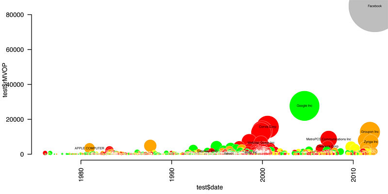
Nice peek into the nyt process.
The universe of initial public offerings is seemingly simple: about 2,400 tech companies since 1980, compiled by Jay Ritter, a professor of finance at the University of Florida.
As a first step, Amanda charted the companies by I.P.O. date (x-axis) and value at I.P.O. (y-axis), colored them by their 3-year return. (The key’s not included in her sketch, but for these purposes, know that red is bad and green is good.)
This chart’s not bad (even if, like me, you have low standards), but it doesn’t say much other than that there was a dot-com boom, that most of those companies didn’t do so well, and that Facebook is worth a ton of money.
Amanda Cox and countrymen chart the Facebook I.P.O.
On Thursday Facebook had the third-largest I.P.O. ever. In the week leading up it, my colleague Amanda Cox spent some time thinking how to best explain and contextualize this offering to readers. What follows is a series of sketches from Amanda, who shared her project folder with me for this post, and Matt Ericson, who edited the piece.The universe of initial public offerings is seemingly simple: about 2,400 tech companies since 1980, compiled by Jay Ritter, a professor of finance at the University of Florida.
As a first step, Amanda charted the companies by I.P.O. date (x-axis) and value at I.P.O. (y-axis), colored them by their 3-year return. (The key’s not included in her sketch, but for these purposes, know that red is bad and green is good.)
This chart’s not bad (even if, like me, you have low standards), but it doesn’t say much other than that there was a dot-com boom, that most of those companies didn’t do so well, and that Facebook is worth a ton of money.
Tuesday, June 5, 2012
Spotted: visualization for the analysis of gameplay data
A spatiotemporal visualization approach for the analysis of gameplay data
Günter Wallner, Simone KriglsteinContemporary video games are highly complex systems with many interacting variables. To make sure that a game provides a satisfying experience, a meaningful analysis of gameplay data is crucial, particularly because the quality of a game directly relates to the experience a user gains from playing it. Automatic instrumentation techniques are increasingly used to record data during playtests. However, the evaluation of the data requires strong analytical skills and experience. The visualization of such gameplay data is essentially an information visualization problem, where a large number of variables have to be displayed in a comprehensible way in order to be able to make global judgments.
Spotted: A new technique for comparing averages in visualizations
Comparing averages in time series data
Michael Correll, Danielle Albers, Steven Franconeri, Michael GleicherVisualizations often seek to aid viewers in assessing the big picture in the data, that is, to make judgments about aggregate properties of the data. In this paper, we present an empirical study of a representative aggregate judgment task: finding regions of maximum average in a series. We show how a theory of perceptual averaging suggests a visual design other than the typically-used line graph. We describe an experiment that assesses participants' ability to estimate averages and make judgments based on these averages. The experiment confirms that this color encoding significantly outperforms the standard practice.
Sunday, June 3, 2012
Competition: International Science & Engineering Visualization Challenge
Help people understand science with apps, games, or visuals.
Friday, June 1, 2012
Find: Qt 5 makes JavaScript a first-class citizen for app development
First look: Qt 5 makes JavaScript a first-class citizen for app development
The Qt development toolkit is undergoing a major overhaul. The developers behind the project announced the availability of the Qt 5 alpha release this week. It's a key milestone on the path to the official launch of Qt 5, expected to occur later this year.
Qt is an open source toolkit designed to support cross-platform desktop and mobile application development. It provides libraries, user interface controls, and other components. Qt was originally created by Trolltech, a Norwegian software company that Nokia acquired in 2008. Nokia subsequently relicensed Qt under more permissive terms and transitioned the toolkit to a community-driven open governance model.
The rise of Qt Quick
The update to Qt 5 will bring many significant technical and philosophical changes to the toolkit. The developers aim to transition the focus of Qt away from the traditional widget system (based on QWidget C++ classes) in favor of Qt Quick, a declarative scripting framework for building rich interfaces. This change will gradually shift Qt application developers away from the toolkit's C++ roots.
Wednesday, May 30, 2012
Find: US government to make data available through apis
Soon please.

Open government reboot focuses on APIs instead of data
Issued by the Office of Management and Budget, the Digital Government Strategy is the basis of a new White House directive to expose "high-value" Federal data through Web APIs
Have you ever wanted a mobile app that ties your location to crime statistics, government environmental and health data, and weather and solar flare data to calculate the hourly probability of a zombie apocalypse? While that may not be exactly what the White House has in mind, it’s the sort of mobile mash-up that a new Federal IT policy could make a lot less difficult to create. The Obama administration has added another twist on “open government”—open, as in open API.
On May 23, the White House issued a directive that requires all agencies to establish programming interfaces for internal and external developers to use, and make “applicable Government information open and machine-readable by default.” As part of an effort to push government toward a cloud-computing future, the White House is encouraging agencies to make their data more developer friendly, and to create a shared platform for providing mobile access to data for both citizens and government employees. And they have 12 months to start delivering.
The goal of the new policy, called the Digital Government Strategy, is to jump start the government’s three-year old open data initiative, draw more private developer interest, and encourage the development of mobile applications that connect citizens and government employees more effectively with data that has previously been public, but nearly inaccessible.
Tool: Making idiot-proof infographics with Infogr.am
Not for developers, but nice for end users.
Making idiot-proof infographics with Infogr.am
Enlarge / Infogr.am's splash page lets you choose between creating a new design, or accessing previously stored works.
Let's say you want to compare the airspeed velocity of various unladen swallows. You could put that data into a spreadsheet, or present it using a graph. Chances are you'll pick the latter.
The question is, how do you create a graph that not only looks nice, but presents said data in a coherent, easy to understand way? You could go the traditional route, and make something basic in Microsoft Office or your productivity suite of choice. Or, if you have a bit more skill, you could opt for the flexibility of Adobe Illustrator instead. But perhaps you have neither software nor skill, and just want to make a simple graph or chart.
Infogr.am takes the same approach that Tumblr took to blogging, by turning the otherwise daunting task of creating great infographics into a process that's dead-simple. You bring the raw data to Infogr.am, and the site's online tool can help you turn that data into a nice looking chart or full-blown infographic in minutes. It's really that simple—assuming you have a Facebook or Twitter account required to login—though, at times, to a fault.
Wednesday, May 23, 2012
Find: Google continues its investment in design
The Verge - All Posts

Amidst the news that Google's acquisition of Motorola was finally complete was another, smaller purchase — Google just bought design firm Mike and Maaike, a husband-and-wife creative team behind the design of the original T-Mobile G1. Of course, this device was Google's Nexus phone before there even was a Nexus program — it was the first handset to run Android. The G1 isn't the only iconic product Mike and Maaike has developed; they're also responsible for an earlier, portrait QWERTY Android prototype that never saw the light of day, Xbox 360 as well as a wide variety of other striking products. It's not yet clear what kind of work Mike and Maaike will be doing with Google, but we wouldn't mind seeing them take their skills to some...
Tuesday, May 22, 2012
Find: GitHub for Windows takes the pain out of using git
Also, for osx, and on microsoft's codeplex.
Ars Technica
GitHub uses the git distributed version control system originally created by Linus Torvalds to help manage Linux's development as its backbone. It provides project hosting, bug tracking, and more, all wrapped up in a powerful Web interface. GitHub's most important feature is perhaps its trivial ability to fork projects. It takes just a few clicks to create your own version of a project to hack on and develop. Thanks to these features, GitHub has become the go-to place for collaborative open source software development. It's the home of projects such as Ruby on Rails and Node.js.
However, one developer community has found GitHub harder to use than others. Though the situation has improved, git and Windows are not the best of friends. After all, git was developed for Linux; Windows isn't anything like Linux. But that's where GitHub's new application, GitHub for Windows, comes in. GitHub for Windows provides a simple way to install and start using git on Windows, along with neat integration with GitHub's hosting and forking infrastructure.
The application, released on Monday, is an attractive, Metro-styled application. In addition to the GitHub for Windows application itself, it includes a self-contained version of git, the bash command-line shell, and the posh-git extension for PowerShell. You don't even have to manage any of these individual pieces yourself. The application uses a ClickOnce installer so it keeps all the bits and pieces up-to-date automatically.
Monday, May 21, 2012
Viz: Android fragmentation -- one developer encounters 3,997 devices
That's a lotta versions on android!
Android fragmentation: one developer encounters 3,997 devices
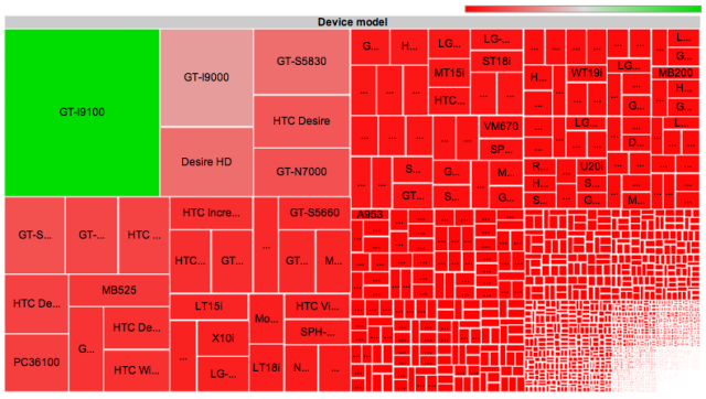
A map of all the thousands of separate device models that downloaded OpenSignalMaps in a six month period.
Viz: political polarization visualized -- it's real, and it's the right that's moved
These folks are doing great work, and their simple plots are very powerful.
Polarization is Real (and Asymmetric)
Revised 16 May 2012
Christopher Hare is a PhD student in Political Science at the University of Georgia.
Nolan McCarty is the Susan Dod Brown Professor of Politics and Public Affairs and Chair of the Department of Politics at Princeton University.
Keith T. Poole is Philip H. Alston Distinguished Chair, Professor of Political Science at the University of Georgia and Professor Emeritus at the University of California, San Diego.
Howard Rosenthal is Professor of Politics at New York University and the Roger Williams Straus Professor of Social Sciences, Emeritus, at Princeton University.
The recent outburst of scholarly and popular interest in political polarization has attracted attention to the methods we use to measure this phenomenon. One frequently voiced concern (see a recent column by Sean Trende) is that Congress may not have polarized as we have claimed in publications and blogs stretching as far back as 1984. The concern is that the meaning of ideological (NOMINATE) scores are tied to the legislative and historical context of the roll call votes that are used to estimate them. For example, the content of roll calls votes cast by members of 90th Senate that dealt with the Vietnam War, civil rights, and funding for LBJ’s “Great Society” programs are quite different than those votes cast in the current Senate. Thus, being the most conservative Senator (with a score of 1.0) in 1968 would mean something different than having an identical 1.0 score in 2012.
#moreIndeed, temporal comparisons should not be made for ideal points generated from static scaling methods. Static methods (like W-NOMINATE) treat each legislative session separately and there is no valid way to compare the scores of legislators from different years. However, we developed a dynamic methodology, DW-NOMINATE (McCarty, Poole and Rosenthal 1997), to allow for over-time comparisons of legislator ideological positions. The key innovation is the use of “bridge” legislators — members of Congress (MCs) who have served in multiple sessions — to compare the positions of legislators who have never served together.
A sports analogy to the overlapping cohorts method is the “common opponents” statistic. If we want to compare two teams who have not played each other, we compare their performances against a common opponent(s). Likewise, MCs who have not served together can be compared with the use of a “bridge” legislator who has served with both. For example, if we know that Sen. George McGovern (D-SD) is more liberal than Sen. Patrick Leahy (D-VT), and that Sen. Leahy is more liberal than Sen. Max Baucus (D-MT), then we can say that Sen. McGovern is more liberal than Sen. Baucus. Though intransitivities may arise cases involving 3 or more sports teams, Poole shows in his 2007 Pub...
Sunday, May 20, 2012
Find: It's "Pitch Day" for accelerator grads
n&o .biz
Think of it as final exams and graduation day rolled into one for the first crop of companies to complete the business accelration program at Triangle StartUp Factory.
The six companies in Triangle StartUp's inaugural 12-week class each will deliver 8-minute presentations to prospective investors and interested bystanders on Thursday, June 7, which has been dubbed "Pitch Day."
More than 300 attendees are expected for the free event, which also will include a panel session on investing, according to Chris Heivly, founder of Triangle Startup.
Earlier this year, Triangle StartUp raised $5.5 million in funding. It invests $50,000 into startups accepted into its program in exchange for a 7.5 percent ownership stake. After completing the program, the startup also will receive a loan convertible to equity ranging from $20,000 to $150,000.
You can register for Pitch Day here.
Friday, May 18, 2012
Viz interaction that isn't an afterthought -- Semantic interaction for visual text analytics
Finally a viz paper with interaction front and center.
Semantic interaction for visual text analytics
Alex Endert, Patrick Fiaux, Chris NorthVisual analytics emphasizes sensemaking of large, complex datasets through interactively exploring visualizations generated by statistical models. For example, dimensionality reduction methods use various similarity metrics to visualize textual document collections in a spatial metaphor, where similarities between documents are approximately represented through their relative spatial distances to each other in a 2D layout. This metaphor is designed to mimic analysts' mental models of the document collection and support their analytic processes, such as clustering similar documents together. However, in current methods, users must interact with such visualizations using controls external to the visual metaphor, such as sliders, menus, or text fields, to directly control underlying model parameters that they do not understand and that do not relate to their analytic process occurring within the visual metaphor.
Spotted: How accurate are models of text corpora? -- Interpretation and trust: designing model-driven visualizations for text analysis
Interpretation and trust: designing model-driven visualizations for text analysis
Jason Chuang, Daniel Ramage, Christopher Manning, Jeffrey HeerStatistical topic models can help analysts discover patterns in large text corpora by identifying recurring sets of words and enabling exploration by topical concepts. However, understanding and validating the output of these models can itself be a challenging analysis task. In this paper, we offer two design considerations - interpretation and trust - for designing visualizations based on data-driven models. Interpretation refers to the facility with which an analyst makes inferences about the data through the lens of a model abstraction. Trust refers to the actual and perceived accuracy of an analyst's inferences. These considerations derive from our experiences developing the Stanford Dissertation Browser, a tool for exploring over 9,000 Ph.D.
Thursday, May 17, 2012
Find: Google data shows smartphone growth is global
Google
Last October, we launched Our Mobile Planet, a resource enabling anyone to visualize the ways smartphones are transforming how people connect with information, each other and the places around them. Today, we're releasing new 2012 research data, and the findings are clear—smartphone adoption has gone global. Today, Australia, U.K., Sweden, Norway, Saudi Arabia and UAE each have more than 50 percent of their population on smartphones. An additional seven countries—U.S., New Zealand, Denmark, Ireland, Netherlands, Spain and Switzerland—now have greater than 40 percent smartphone penetration. In the U.S., 80 percent of smartphone owners say they don’t leave home without their device—and one in three would even give up their TV before their mobile devices!

We conducted this research to help people to better understand how mobile is changing our world. You can learn about mobile-specific usage trends, use this tool to create custom visualizations of data and more. There's plenty to discover in the latest research—to dig into new survey data about smartphone consumers in 26 countries from around the world, read our post on the Google Mobile Ads blog or visit http://thinkwithgoogle.com/mobileplanet.
Posted by Dai Pham, Group Product Marketing Manager, Google Mobile Ads
Thursday, May 10, 2012
Find: Google Plugin for Eclipse now provides richer tooling for Cloud SQL and Google APIs
Google Code Blog
 By Sriram Saroop, Product Manager
 We are pleased to announce the latest release of Google Plugin for Eclipse (GPE 2.6) with improved tooling for Cloud SQL and Google APIs. GPE 2.6 introduces the following features:
- Tooling for using Java Persistence API (JPA) to access Cloud SQL
- Importing the latest Google APIs into your GPE project
Object-Relational Mapping (ORM) frameworks are very popular in the Java community for accessing relational databases. The Eclipse Web Tools Platform offers a robust set of tools to configure and use JPA with an implementation of your choice. With the new Google Plugin for Eclipse (GPE) 2.6, you can now take advantage of these tools with Cloud SQL and Google App Engine. In any GPE project, JPA can now be enabled and configured as a project facet. The screenshot below shows the JPA facet configuration for a GPE project.

Spotted: Strategies for crowdsourcing social data analysis -- taming the Turk
ACM CHI
Wesley Willett, Jeffrey Heer, Maneesh AgrawalaWeb-based social data analysis tools that rely on public discussion to produce hypotheses or explanations of the patterns and trends in data, rarely yield high-quality results in practice. Crowdsourcing offers an alternative approach in which an analyst pays workers to generate such explanations. Yet, asking workers with varying skills, backgrounds and motivations to simply "Explain why a chart is interesting" can result in irrelevant, unclear or speculative explanations of variable quality. To address these problems, we contribute seven strategies for improving the quality and diversity of worker-generated explanations. Our experiments show that using (S1) feature-oriented prompts, providing (S2) good examples, and including (S3) reference gathering, (S4) chart reading, and (S5) annotation subtasks increases the quality of responses by 28% for US workers and 196% for non-US workers.
Tuesday, May 1, 2012
Find: nice primer on participatory design
UX Magazine

The practice of co-design allows users to become an active part of the creative development of a product by interacting directly with design and research teams. It is grounded in the belief that all people are creative and that users, as experts of their own experiences, bring different points of view that inform design and innovation direction.
Co-design is a method that can be used in all stages of the design process, but especially in the ideation or concepting phases. Partnering with users ensures their inclusion in knowledge development, idea generation, and concept development on products whose ultimate goal is to best serve these same users.
In this article I will examine the different stages of a co-design research process, as well as the methods and practices that are...read more
By Catalina Naranjo-Bock
Subscribe to:
Posts (Atom)