Nice peek into the nyt process.
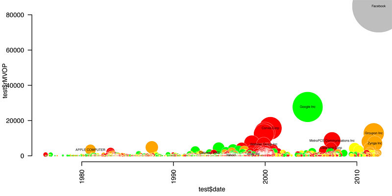
The universe of initial public offerings is seemingly simple: about 2,400 tech companies since 1980, compiled by Jay Ritter, a professor of finance at the University of Florida.
As a first step, Amanda charted the companies by I.P.O. date (x-axis) and value at I.P.O. (y-axis), colored them by their 3-year return. (The key’s not included in her sketch, but for these purposes, know that red is bad and green is good.)
This chart’s not bad (even if, like me, you have low standards), but it doesn’t say much other than that there was a dot-com boom, that most of those companies didn’t do so well, and that Facebook is worth a ton of money.
Next, a plot of 3-year return by I.P.O. date:
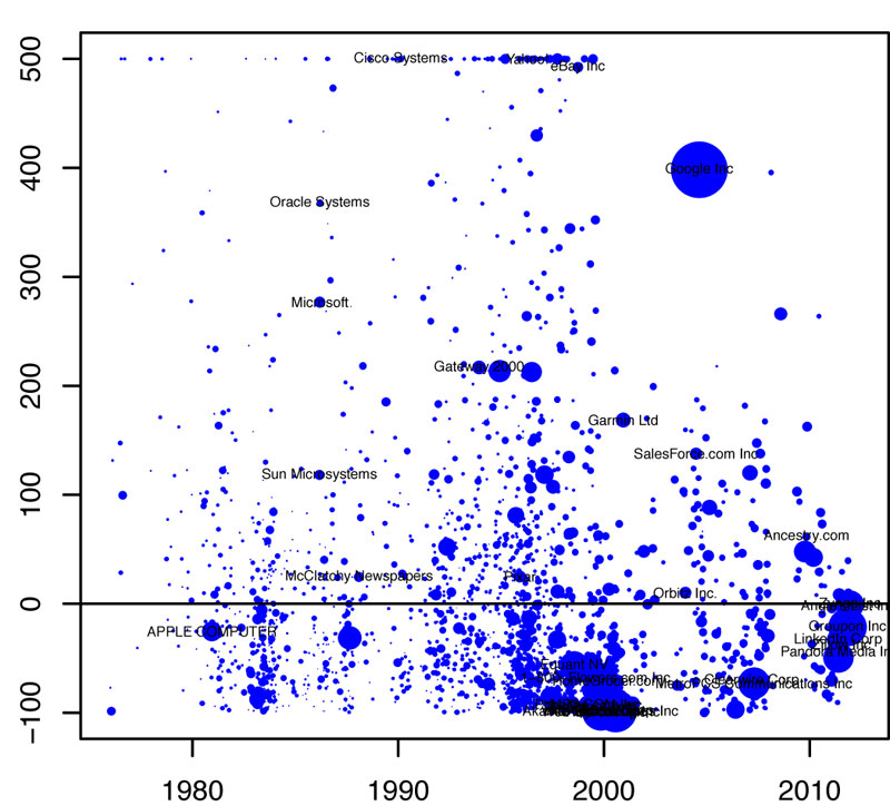
#more
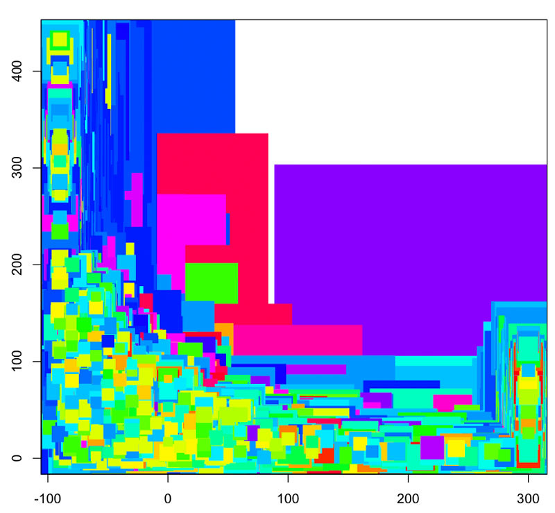
Trying to add in more nuance to this picture, shading the companies by the companies’ price-to-sales ratio at I.P.O. and including Facebook in a random position just for size:
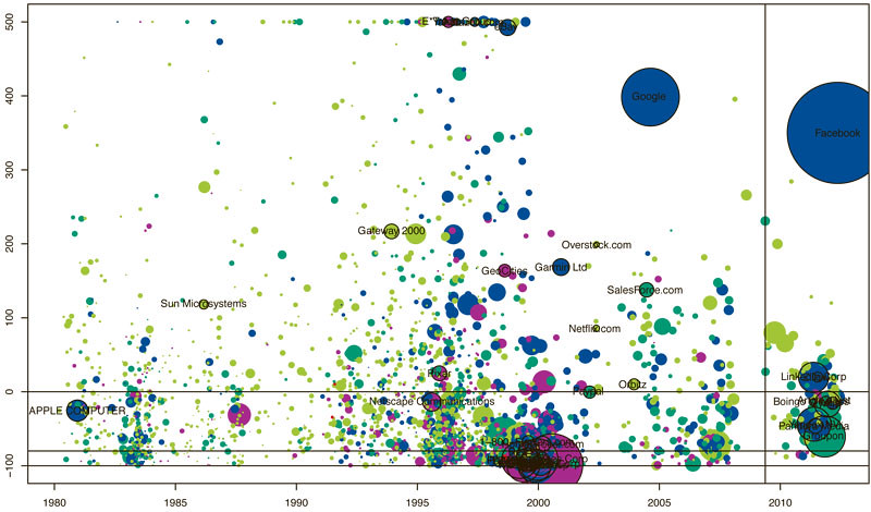
But rather than bringing clarity, it just sort of looked chaotic, even to the seasoned chart freaks of 620 8th Avenue. So she tried another form: a histogram of 3-year returns, colored by I.P.O. date:
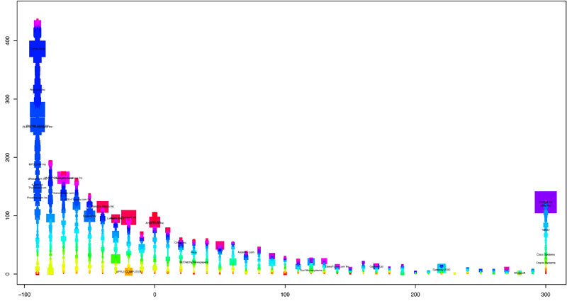
Or the same chart but piled into three time periods (not that anyone asked me, but I really like this one):

By the way, even the queen bee of statistical charting screws up that chart the first time (be conservative with your “cex” values, folks):
Another idea, vaguely reminiscent of the balloons from “Up,” is sales vs. market cap at I.P.O. colored by year. I won’t lie, I don’t get this one:
Amanda Cox and countrymen chart the Facebook I.P.O.
On Thursday Facebook had the third-largest I.P.O. ever. In the week leading up it, my colleague Amanda Cox spent some time thinking how to best explain and contextualize this offering to readers. What follows is a series of sketches from Amanda, who shared her project folder with me for this post, and Matt Ericson, who edited the piece.The universe of initial public offerings is seemingly simple: about 2,400 tech companies since 1980, compiled by Jay Ritter, a professor of finance at the University of Florida.
As a first step, Amanda charted the companies by I.P.O. date (x-axis) and value at I.P.O. (y-axis), colored them by their 3-year return. (The key’s not included in her sketch, but for these purposes, know that red is bad and green is good.)
This chart’s not bad (even if, like me, you have low standards), but it doesn’t say much other than that there was a dot-com boom, that most of those companies didn’t do so well, and that Facebook is worth a ton of money.
Next, a plot of 3-year return by I.P.O. date:
#more
Trying to add in more nuance to this picture, shading the companies by the companies’ price-to-sales ratio at I.P.O. and including Facebook in a random position just for size:
But rather than bringing clarity, it just sort of looked chaotic, even to the seasoned chart freaks of 620 8th Avenue. So she tried another form: a histogram of 3-year returns, colored by I.P.O. date:
Or the same chart but piled into three time periods (not that anyone asked me, but I really like this one):
By the way, even the queen bee of statistical charting screws up that chart the first time (be conservative with your “cex” values, folks):
Another idea, vaguely reminiscent of the balloons from “Up,” is sales vs. market cap at I.P.O. colored by year. I won’t lie, I don’t get this one:
0 comments:
Post a Comment