This paper tries to bring out the importance of cognition in Information Visualization. It talks about DCog framework developed by Hutchins which "proposes that human knowledge and cognition are not confined to the individual. Instead, it is distributed by placing memories, facts, or knowledge on the objects, individuals, and tools in our environment." It goes around the history and talks about how long it took for new fields to establish their theories and how long it took for us to grasp the important things to focus on. It stresses that Cognition should not be treated as separate field and it argues that DCog framework is very useful for InfoViz development. The author's point that InfoViz is all about perception and cognition makes great sense, I believe Info Viz should be built around Cognitive Science.
Saturday, September 10, 2011
Reaction :Attention and Visual Memory in Visualization and Computer Graphics
This paper focuses on Human Perception. This is the most important factor that has to be studied because by knowing how people see things we can make our visualization easy to be captured and make it much easier for the human brain can to process the information. This paper states that the state of our state of mind what we see.It goes around many theories of visual attention. It concludes that understanding the visual system will help us to develop effective Visualization techniques.
Reaction:External Cognition: how do Graphical Representations work?
This paper questions the contemporary visualization techniques and investigates the past to find out why we believe these techniques are the better ones. It also states that most of the choices made are based on intuition. The old fashioned static diagrams let users to leave cognitive traces whereas the 3D modelling and animations improves interactivity and enables instant feedback. There is no clear standard that can be followed to improve the visualization methods. The paper concludes that research should focus on the interactivity to improve the existing visualization methods.
Reaction: Distributed Cognition as a Theoretical Framework for Information Visualization
The authors of this article make some interesting points about distributed cognition in relation to information visualization. Although I see the reasons why DCog should be an important part of InfoViz research, I believe that their statements about implementing the DCog theoretical framework into HCI research is more important.
I agree that systems should have measurable metrics that allow us to determine a system's usefulness. The authors make it seem that it is nearly impossible to come up with standard guidelines that can be used among different systems. If these standards were to be achieved, would results be consistent after repeating test trials using different people?
Overall, I think that the DCog framework for developing InfoViz systems is a good step toward standardizing the field. It provides a different perspective on the evaluation of tools created in the InfoViz field.
Friday, September 9, 2011
Data: CIA World Factbook
App Smart Extra: CIA World Factbook Apps
The Central Intelligence Agency's World Factbook, a free global reference book, is available on smartphones through a variety of apps.Sent from my iPhone
Data: Excavating Your iPhone's Past
Interesting data source and app idea.
Excavating Your iPhone's Past
After a glitch erased my iPhone, I found a way to extract all my old text messages.Sent from my iPhone
Thursday, September 8, 2011
Tutorial: Geographic data on a map with Python
Plotting geographic data on a world map with Python
via Seeing Data by Chris McDowall on 8/11/11
Last week I promised to write a blog post detailing how I created this public transport animation. On reflection, it’s a topic best dealt with over a few sessions. Let’s start simple. How might you plot lots of geographic data on a map? In this post I will show you how to programmatically create a map of the World’s top ten most populated cities. It will end up looking something like this.
Competition: visualizing marathon
Late in the year in nyc. 
via (title unknown) by Charlene Manuel on 9/8/11
Abstract:
Announcing two big updates to the 2011 Visualizing Marathon Program: the New York's Marathon dates are now November 5-6 and the Germany Marathon will now take place in Berlin (December 3-4).
We’ve had a great response from both students and schools in all of the Marathon locations and we have two big updates to the 2011 Visualizing Marathon Program.
Due to Yom Kippur and the Columbus Day holiday, we’ve changed the dates for the Visualizing Marathon competition in New York to November 5-6 so that everyone can participate. We are still planning the same great event, just for a different weekend.
Thu, 2011-09-08
Data: bit.ly API
via bitly blog on 9/30/10
We are pleased to announce some new user-level metrics features in our API, making it even easier for developers to provide bit.ly users with realtime feedback about their trending bit.ly links.
We are currently using the new /v3/user/realtime_links API endpoint in our Chrome Extension to notify bit.ly users about their “Trending Bits.” This feature provides a popup notification whenever one of a bit.ly user’s links receives a certain number of hourly clicks. (This threshold can be modified within the extension’s settings.)

Other user-level metrics endpoints provide an overview of click traffic, referrers and originating countries across all of a bit.ly user’s links. All of these user-level metrics endpoints are accessible via OAuth 2, making it easy for users to access their bit.ly data via third-party applications without having to enter their bit.ly API key, username or password.
These new API endpoints and our OAuth implementation are fully documented at api.bit.ly. If you have any questions, do not hesitate to contact api@bit.ly, or sign up for the bit.ly API Google Group.
Viz: Access to Wikileaks
via bitly blog on 9/13/10
This Wednesday September 15th at 6pm, we will open the doors to our New York office for our third monthly hackabit hackathon! Our first two hackathons spawned lines upon lines of JavaScript, Python, C, Haskell, R, and many other delightful languages. A Wikileaks data visualization project from last month’s hackabit ii even got a shout-out in the New York Times bits blog.
This month’s hackathon promises to be particularly action-packed, as we will be rolling out some awesome new metrics-related bit.ly API endpoints. We will be holding another API contest in the near future, so be sure to come by if you want a head start!
If your project isn’t bit.ly-related, have no fear - all code is good code at our hackathon. Come hack, snack and throw back (some energy drinks) with us! Click here for more information and to register - we hope to see you there.
Data: Links Followed to Govt Sites
Very kewl.
via bitly blog on 7/26/11
Do you know exactly what you were reading 10 years ago this very moment? 10 years from now, you may. The data we create is a living archive of our interests and intentions, and we’re creating more of it every day — a staggering 1.2 zettabytes last year alone. At bitly, we are always looking to learn from our data, and we are thrilled that a particularly interesting set of bitly data is being made publicly available for hacking and analysis.
This Friday evening, bitly will host the New York branch of a nationwide, 4-city 1.USA.gov open data hackathon. The USA.gov team has made the realtime clickstream data for all 1.USA.gov URLs open to the public, providing an unprecedented window into the way that we engage with government content. We are extremely excited to see what talented hackers and coders can do with such a rich and fascinating data set.
In advance of the hackathon, the Measured Voice team has put together a microsite at govclicks.measuredvoice.com that ranks the most popular 1.USA.gov URLs per day by click count (an average of about 56,000 total daily clicks over the last few months). The diversity of content at the top of the list is fascinating; a NASA Tweetup announcement alongside information about the recent FAA furloughs and a strongly worded FDA warning to Diamond Foods about walnut packaging.

This basic ordered list provides a compelling look at the popularity of specific government URLs – and it is only scratching the surface of the underlying data. Where in the country are most people looking up information about FAA furloughs? (And, using a complementary API like SimpleGeo’s Context, what do we know about the demographics of those regions?) Which social networks drive the most traffic to NASA’s website? What US government content is most frequently accessed outside the US? There’s a wealth of insight encoded in the 1.USA.gov data just waiting to be discovered.
Indeed, working with data isn’t just a matter of crunching numbers and writing code; it also means knowing what you’re looking for and knowing what you’re looking at. Through the right lens, the data from the 1.USA.gov project could answer questions that we hadn’t even thought to ask – and some of the data that answers those questions may very well be yours.
If you’d like to explore this data with us, then come to our NYC office this Friday (or visit the other 1.USA.gov hackathons in San Francisco, San Diego and Washington D.C.) and build something new!
Viz: USA.gov Hackathon results
via bitly blog on 8/8/11

Many thanks to everyone who came out to our 1.USA.gov hackathon! It was great to see so many friendly hackers and open data enthusiasts collaborating and sharing ideas (and devouring 11 pizzas in about as many minutes).
Our friends at USA.gov posted a summary of the hacks created at all four nationwide hackathons, including an awesome visualization of NASA’s popularity worldwide created by Adam Laiacano at our New York office. Here are a couple more hacks that came out of the New York hackathon:
* A fascinating set of data visualizations by Harlan Harris.
* Sonification of 1.USA.gov data by Niki Yoshiuchi.
Want to hack on the 1.USA.gov data? It’s still publicly available on the USA.gov website. We’ll be hosting another hackathon soon — keep an eye on the hackabit Meetup group for more information!
Viz: Half-life of shared links
Overlapping line graphs are confusing, but this is cool data! Wish we could get at it....
via bitly blog on 9/6/11
How long is a link “alive” before people stop caring? Does it matter what kind of content it is, or where you shared it? At bitly we see a lot of links, and while every link is special, we’re learning a few general principles that we can share.
Let’s take a look at one particular story - Baby otter befriended by orphaned kittens - which was first shared by StylistMagazine on Facebook on Tuesday at 7:12am. If we plot clicks over time for this link, we see:
Rate of clicks per 10 minutes on “Baby otter befriended by orphaned kittens”
We can evaluate the persistence of the link by calculating what we’re calling the half life: the amount of time at which this link will receive half of the clicks it will ever receive after it’s reached its peak. For this link the half life was 70 minutes, which captures all the clicks between the grey lines on the graph above.
Let’s look at a second link - East Coast earthquake: 5.8 magnitude epicenter hits Virginia - , this one first shared by the Washington Post on Twitter.

Rate of clicks per minute on “East Coast earthquake: 5.8 magnitude epicenter hits Virginia”
While the exact details of the traffic are a little different, and the scale of the traffic to this link is much larger, we see essentially the same pattern: a fast rise, and a more relaxed drop-off. Noticeably though this link a half life of only 5 minutes: after 5 minutes this link had seen half of the clicks it would ever see.
This link is associated with a very timely event (an earthquake on the US East Coast) as opposed to the previous link (pictures of otters and kittens are clearly interesting all the time). We think that this difference in content drives the difference in dynamics of these two links. However, one alternative theory that comes up again and again is that the dynamics of the link traffic depend on where the link is posted: do links posted on facebook last longer than they do on twitter?
So we looked at the half life of 1,000 popular bitly links and the results were surprisingly similar. The mean half life of a link on twitter is 2.8 hours, on facebook it’s 3.2 hours and via ‘direct’ sources (like email or IM clients) it’s 3.4 hours. So you can expect, on average, an extra 24 minutes of attention if you post on facebook than if you post on twitter.
Distribution of half-lifes over four different referrer types. Facebook, twitter and direct link (links shared via email, instant messengers etc.) half lifes follow a strikingly similar distribution.
Not all social sites follow this pattern. The surprise in the graph above is links that originate from youtube: these links have a half life of 7.4 hours! As clickers, we remain interested in links on youtube for a much longer period of time. You can see this dramatic difference between youtube and the other platforms for sharing links in the image above.
The graph shows the distribution of half lifes for each referrer. So we’d expect to see link half lifes of less than 20K seconds (5.5 hours) for facebook, twitter and links shared directly, and we’d be very surprised to see any link maintain significant traffic for a lot longer than 60K seconds (16 hours). But for youtube, we’d be a little surprised to see half lifes of less than 5 hours!
In general, the half life of a bitly link is about 3 hours, unless you publish your links on youtube, where you can expect about 7 hours worth of attention. Many links last a lot less than 2 hours; other more sticky links last longer than 11 hours over all the referrers. This leads us to believe that the lifespan of your link is connected more to what content it points to than on where you post it: on the social web it’s all about what you share, not where you share it!


This post brought to you by the bitly science team! Questions or comments? Email us.
Data: Fusion Tables, a New Google Docs App
Turn gdocs into fusion tables. 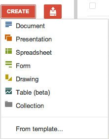
Fusion Tables, a New Google Docs App
Aaron, a reader of this blog, spotted a new option in Google Docs: creating tables. It seems that Google Docs started to integrate with Fusion Tables, a little-known Google service that lets you manage large data sets.Tool: New features and a new home for Swiffy
Flash to html5 convertor By Pieter Senster, Software Engineer
New features and a new home for Swiffy
By Pieter Senster, Software Engineer Tool: Google APIs Client Library for PHP (Beta)
If u php... Probably other bindings to this same data. 
Google APIs Client Library for PHP (Beta)
Viz: An Interactive Timeline of London Riots

The interactive visualization from the guardian shows the occurrence of various events from the start of the riots till the cleanup process. The map is divided into columns based on various areas and important aspects like police and social media. The timeline below can be dragged to view the series of events. The markers and their color indicate different types of events.
The visualization can be seen here:
http://www.guardian.co.uk/uk/interactive/2011/sep/05/england-riots-timeline-interactive?CMP=twt_gu
Reaction: Graphical Perception: Theory, Experimentation, and Application to the Development of Graphical Methods
This article provides a strong overview of theories and experiments that attempt to provide an answer as to how we perceive information, and how we interpret the same information when presented in different ways. Additionally, since there is strong scientific evidence to back up the claims of this author, it provides much more credence to the specific points the author addressed than the previous paper.
The extensive use of examples to illustrate the intended use of different graphical representations made it much easier to understand , and the layout for graphical theories and then experimentation supporting the theories made a strong case for the author. As the author suggests, some forms of graphs are more useful than others and that many modifications need to be made to currently used charts to improve their effectiveness at communicating information.
What I would find interesting, is how these ideas of graphical representation have changed since the paper was written in 1984, and how many of these ideas have been included in the general lexicon. I will most likely go back and compare these paper and the paper by Healey on my own to help bridge this gap in knowledge.
Wednesday, September 7, 2011
Reaction: Attention and Visual Memory in Visualization and Computer Graphics
The paper focuses on visual perception. The paper describes different theories supporting 'preattentive processing'. All the theories keep interest of the reader and we can easily emerge to a conclusion that, preattentive processing power of human should be used to draw focus of the visualizations to the most important data.
As the discussion moves to the visual memory aspect, some of the very interesting points are put forward. Firstly, human vision is far different from video cameras. Rather than creating a high resolution image, it creates an abstract view. The view changes only when significant changes occur and they get attended by the vision. The topics Change blindness and Inattentional blindness make an interesting read. Another point to be noted is that, some of the details are stored in the memory but can't easily retrieved unless explicitly asked for.
Finally the author spends some time in describing how the previously mentioned theories can actually be implemented in practice for visualizations and graphics. The author also mentions challenges in designing effective visualizations. This paper is surely an interesting and informative read for everyone who wish to build effective visualizations.
Reaction: Graphical Perception: Theory, Experimentation, and Application to the Development of Graphical Methods
The paper discusses about the importance of graphs in visualizations and how very simple properties of a graph can prove to be efficient when presenting graphical data. I feel that the authors have done a very good job by describing the various types of charts which we can use. This paper is a good read for beginners who wish to learn about the different types of charts and graphs which can be used to visualize their data.
Every graph is presented with the reasons behind using it for a particular data set. I find that this is an important point which was mentioned in the paper so that the reader can understand the usage of different graphs. The paper was also very simple to read and understand and I learned new concepts like the bar and framed rectangles and also found the position angle experiment very interesting.
The experiment that was conducted with a group of people co-relates to real life experiences and this helps the reader in remembering the ideas which are presented in the paper. I also found the framed rectangle chart very useful because it helps us present statistics using a black and white coloring without the black color dominating the white one. I thoroughly enjoyed reading the paper and would certainly extend my knowledge by reading some of the references mentioned in the paper.
Tool: Google Correlate

Google Correlate is a tool from the google labs that gives similar search patterns based on the uploaded dataset or a drawing. We can get the results based on a defined time line or US states.
We can see the tool here:
http://www.google.com/trends/correlate/
Reaction: Attention and Visual Memory in Visualization and Computer Graphics
The paper discusses the role of human perception in information visualization.It tells how human mind perceives to certain visualization and graphics and is a good attempt to study those.
I think apart from human perception, authors have used some basic elements of Human computer interaction that were quite relevant to the study. I'd in fact consider Information Visualization as an integral part of HCI. For example, the eye-fixation (saccade) concept is an important part of HCI and I think it's a good idea to merge that with the designs of information visualizations.
I particularly found this paper interesting when the authors tries to corelate the attention span of human mind with respect to the colors, text and other factors and how change blindness can completely change the perception for human visualization. I think probably these are some of the facts that most of the web companies use to target their advertisements. For example, putting a red font for ads may attract more attention than putting a yellow colored text.
Also, I think visual memory is quite an important factor in designing visualizations as mentioned by the authors. Humans certainly have quite short span of concentration and if we are creating a new visualization design, we should take care that users shouldn't be require to remember anything for long.
Overall, I found this paper to be quite useful for anyone who wants to understand the role of such factors in designing much better information visualizations
Reaction: Distributed Cognition as a Theoretical Framework for Information Visualization
Distributed cognition, a theoretical framework, a branch of cognitive science that proposes that human knowledge and cognition are not confined to the individual. Instead, it is distributed by placing memories, facts, or knowledge on the objects, individuals, and tools in our environment.
In many ways, I think the authors' argument that DCog provides a more useful frameworkto address the central issues of representation and interaction than does the traditional cognitive science frameworks, is valid. Attributing the cognition aspect totally on the human individuals, in many ways seem to me as an improper model of the actual process of visualization of the information.
We should realize that distribute cognition, can be found in our daily activities. For example, when a couple of people are trying to understand a complex algorithm. The persons share their thoughts and approach towards the problem, and may further use the paper and pencil to write down their understandings and successfully reach to the solution of the problem.
Reaction: Attention and Visual Memory in Visualization and Computer Graphics
The main objective of the paper is to shed light on visual perception .i.e., how people look at an image and what they learn from it. The paper performs deep analysis of what is known as "preattentive processing" - data learned from a small portion before an eye movement occurs. The paper states that what we see depends on what is on our minds. But human mood is known to change, does changing mood affect the way we see things? The paper presents several models on preattentive processing which are all hypothesis. It would have been helpful if experiments were stated on these models to give them credibility.
In one of the models by Treisman, the properties that were preattentive were determined. But the paper does not state the method in which they were determined. I was left wondering if this was done scientifically or through a survey. One feature described in the paper, ensemble coding, was particularly interesting. It showed that it was easier to compute averages than remembering specific details. The amount of information present in the paper is staggering. A lot of concepts had correlation to each other which was not evident in the first reading.Reaction: Attention and Visual Memory in visualization and computer graphics.
This paper deals with the science of visual memory, and its relevance to scientific and information visualization.
The paper starts with explaining the phenomenon of Preattentive processing. It is interesting to know that fixation-saccade cycle repeats 3-4 times each second of our waking lives, and all this is totally involuntary, without any awareness.
Then the authors go on to present number of theories which attempt to explain how preattentive processing occurs within the visual system. All these theories have focused on how low level-visual processes can be used to guide attention in a larger scene and how viewer's goals interact with these processes.
I think in order to understand and delve into the concepts of information visualization, it is very essential that we understand the science behind the visual memory and human perception. The research in this direction will help how physical resolution and visual acuity affect a viewer’s ability to see different luminance, hue, size and orientation values.
Reaction: Distributed Cognition as a Theoretical Framework for Information Visualization
The paper is an attempt to provide substance to the foundation of InfoVis using Distributed Cognition. The traditional belief is that cognition is information processing inside the brain. The paper states that the above belief is misplaced. It states that the environment plays an important role in shaping human cognition. A scenario is depicted in the paper in which an analyst interacted with an interface through a technical person. The scenario showed that processing of internal data is tightly bound to the processing of external data. Would the binding be more lenient if the analyst had used the interface himself?
The paper states that the transformations of external representations are visible but the transformations of internal representations are depicted through individuals in a cognitive system. This statement sounded skeptical and not entirely credible. DCog focuses on the inter dependency and coordination between between people and environment.But what if we have a system where individual properties are also important?DCog is still a framework which cannot be applied to issues in InfoVis as of yet. So, there are no concrete assurances that the theories presented in the paper can be materialized.
Reaction: Graphical Perception: Theory, Experimentation, and Application to the Development of Graphical Methods
This paper attempts to establish a standard for data analysis and presentation using graphical methods. The paper is legible because it uses examples to test and prove its theory. The paper states that alternative graph forms (dot charts) were used instead of popular graphs (bar graphs). The reason for this seemed unclear while reading the paper. I couldn’t understand what radical surgery was. The paper produces guidelines to be followed when constructing graphs to achieve maximum cognition. These guidelines’ are inferred from the perceptual tasks performed by people as they understand the graph.
10 perceptual tasks are initially identified. The paper narrates how these tasks aid in extracting quantitative information from several kinds of graphs with visual examples. The tasks are then ordered for maximum efficiency in graph perception. The authors initially hypothesize that judging length is more accurate than judging area which in turn is more accurate than judging volume. This hypothesis is believable to a reader when he looks at the examples and tries to judge for himself.
Reaction: Graphical Perception-Theory, Experimentation, and Application to the Development of Graphical Methods
As the name itself suggests this paper presents set of theories and experiments related to presenting the large amount of data in manner which provides more information. It suggests how we can improve the information presenting qualities of the traditional graphs. This paper has been fairly comfortable to read and understand because of the ample amount of examples and explanation provided for each theory and experiment. I like the experiments where it tells the situations wherein different types of graphs could be best fit. Length judgment in bar graph, angle judgment in pie chart and things like that were new to me. I thing i liked best about the paper was that the experiments correlate much more to real life situations. In sum, the paper did a really good job at explaining its theories, method of experimentation, expectation and results.
Reaction: Attention and Visual Memory in Visualization and Computer Graphics
I liked reading this paper. One of the main reasons for this is that it's much easier to recognize, understand, and learn from something you could correlate with. The ideas presented in this paper where more close to real life situations. The main focus of this paper was how we perceive visualization. It was good to learn about how the human eye processes visual images or other information. It was rightly said that the user only concentrates on the piece of information he wants to notice and thereby ignoring other relevant information which might be present around. Overall, it was a good paper to read but I would like to read more stuff about the utilization of visual attributes in the infoviz world.
Reaction: Distributed Cognition as a Theoretical Framework for Information Visualization
This paper was bit different than the others we have read so far. It presents a different perspective while showing the inefficiencies of traditional cognitive science when it comes to information visualization (info). But unlike other papers this one presents a theoretical framework for Distributed cognition. Personally this paper was bit difficult to digest and required reading some part over and over again. I was also thinking about the practical usability of the framework because as of now it is not fully developed.
I liked the use of basic examples throughout the paper but at the same time it made it difficult to generalize the concept for a broader use. Since there hasn't been much research in the field of cognitive side of visualization, at the moment this paper looks more abstract without supporting implementation. Also it does not provide much support to why DCog is more effective framework than the traditional one for information visualization. But as a whole it is a good paper to read in order to start thinking in a new direction something which is not in practice yet.
Reaction:Graphical Perception:Theory, Experimentation and Application to the Development of Graphical Models.
The paper explains the differences between traditional perception of
graphs and graphical perspective. The ordering of elementary tasks and
placing them as high as possible in the hierarchy allows the
visualizations to be perceived properly by the user. The author
compares the existing representations of data and provides a better
results if the graphs are constructed keeping in mind the graphical
perception.
The various differences in elementary task identification
pointed out in the graph show how a general user performs preattentive
processing and distinguishes the date. The transformation of various
graphs depending on the type of data to increase their understanding
is very impressive and changes the opinion on how we think about the
data. the paper suggests not to use particular types of models but on
what types of models can be used for different data in a general view.
Reaction: Distributed Cognition as a Theoritical Framework for Information Visualization.
The paper tries to provide ways to improve the research in Information visualization by taking into account that distributive cognition is one of the factors that is of prime significance in Information visualization. The author tries to make their point by providing theoretical models supporting their argument. The author tries to build their discussion from the Shneiderman's mantra " overview first, zoom and filter, then details on-demand". The authors believe that the research in cognitive science can definitely help build better Information Visualization systems. The author points out that representation and interaction are the two important things in Information Visualization and stresses to be taken into consideration while building InfoVis systems.
The author drives his point with constructive arguments highlighting the importance of improving cognition. This paper actually helps us understand that the environmental cannot be separated from human while studying cognition. This is a totally new perspective that I have tried to observe from the study. The author mentions five different steps to build theoretical frameworks. The author failed to specify different philosophical assumptions that are to be considered in building such models.
The author tries to explain a scenario they have used in one of the competitions they have participated and talks about the visual analytics tool they have developed. A detailed analysis of the internal, external, and distributed representation explains the Distributed Cognition (DCog) model that they have built and made studies on it. The DCog model built can be a great tool for researchers in the field of Computer Graphics and Information Visualization. The author although specifies that interaction is one of the two things after representation that is important for improving cognition, they failed to stress on explaining it in detail. The author concludes the discussion with specifying that Information Visualization is one of the research areas that is closely related to perception and cognition. The authors have raised their voice in specifying that their model DCog provides a more useful framework to issues of representation and interaction than does traditional cognitive science frameworks.
Reaction: Distributed Cognition as a Theoretical Framework for Information Visualization
The paper tires to focus on mainly three points. One is cognition is more an emergent property of interaction than a property of human mind. Second reductionist approach to study the abstract properties of isolated human minds may not be useful InfoVis Design and Third make cognition a research agenda and perform evaluation and theory which involves representation and interaction.
But I personally believe the authors have not been able to achieve whatever was stated in their proposal. Some of the point where in they sight examples of Hutchins that writing reading and interpreting a task with tools does not involve much of cognitive amplification is understandable and it proves that its is composed of individuals and the artifacts they use to accomplish a task (which is Cognitive system).
Even though the authors are trying to prove DCog(Distributed Cognition) they were not claiming that its more correct than traditional cognitive science. The author here has done a safe play by avoiding to completely rule out the traditional aspects and have tried to prove that its should be refined and may be DCog is the suitable theory.
The experiments on Osakas butterfly smuggler which says that factors like notepad, software and infrastructure affect the cognition was interesting read. Examples on distributed representation of oranges, donuts and coffee similar to the tower of hanoi was very intuitive. From these examples the authors were able to convince that cognition does depend on other factors. Since the theory itself is abstract and emerging a detailed study is required to understand the topic and may be as the author says DCog could be a theory which will formalize InfoVis.
Reaction: Distributed Cognition as a Theoretical Framework
The paper makes the case that distributed cognition should be used as a theoretical framework for InfoVis. The paper stays at a very high level and uses language that made it particularly hard to understand where the author is going. In addition this paper presents findings in abstract fashions without delving into specific examples. As a result, it's hard to draw any practical use from the described theory. In comparison to the other two, I had a hard time extracting valuable information from this paper.
Reaction : An experiment in graphical perception
The introduction is very simple and sets the objective of the paper. In a simple manner it uses the analogy of encoding the data to be represented and how we perceive it as decoding. So is is an experiment to analyze the decoding process in detail.
It mainly focuses on these
(1) Position along a common scale.
(2) Position along identical but non-aligned scales.
(3) Length.
(4) Angle.
(5) Slope.
(6) Area.
There is an experiment conducted focusing on these aspects and how it matters.
The experiments in graphical perception help in improving the display of data.
It shows that by our choice of the graphical methods we use to show data, we can control,to some extent, the basic judgments that are required to decode quantitative information.
Reaction : Attention and Visual Memory in Visualization and Computer Graphics
This paper mainly focuses on how we perceive the visualization that are offered to us. Human mind reacts and pay attention to a visualization and this is what the paper mainly tries to analyses mainly the visual attention and visual perception.
There are a few theories related to "preattentive" processing which show us various ways in which our visual memory behaves by illustrating though various examples.
Visual attention is particularly important as it can be used to track the observers attention. Particularly we are often wondering what should be highlighted or underlined in a page, this is the key in drawing the visual attention.
There are a lot of details about various kinds of pre-post attentive aspects , the current challenges part offers a very interesting question : " What is the information-processing capacity of the visual system" ? , I think although we can clearly identify few of the ways in which the visual attention and perception of few known things, it is still a difficult subject to determine the capacity or the processing of a visual system.
Reaction : Distributed Cognition as a Theoretical Framework for Information Visualization
This paper mainly focuses distributed cognition framework can be used to
substantiate the theoretical foundation of InfoVis. The author tries not be arcane by providing a lot of analogies and examples, he quotes brief history of time, butterfly example,tower of hanoi and even touches greek phisolophy and its philosophers like aristotle. At times where is attempting to simplify and articulate his views by using analogies and examples, at times they are digressing.
The conclusion although again starts with history and lessons to be learnt from it , is the best section. It gives a good summary of how the field is new and would require time to establish the theories. InfoVis is closely related to Human perception and cognition. The also argues that DCog provides a more useful framework in representation and interaction which the tradi-
tional cognitive science framework do not in comparison.
Reaction: Graphical Perception: Theory, Experimentation, and Application to the Development of Graphical Methods
The paper introduces a set of elementary perceptual tasks which the terminology is confusing. When talking about tasks, it is mostly about the action what the user would do such as find the paths, draw the lines, or pick the shape. Later on, the authors admit that they could have used another terminology such as elementary graphical encodings, but I wonder why they have left it as it is and not change it.
Figure 16 is not understandable as one cannot differentiate type 1,2, and 3 which only has position on the right parentheses. Same to type 4 and 5. A good visualization needs to include the details so that one can understand it without reading text.
I agree that the frame of a framed rectangle increases accuracy(Weber's Law). The contrast helps to recognize and detect the difference easier.
With the experiment, they have set for all cases, subjects would judge the position-angle graphs first. During the experimental design, counterbalancing would be necessary to avoid the effect or impact on learning processes.
The paper provides that they have correctly predicted by the theory that the accuracy orders by position>length>angle.
Reaction: Attention and Visual Memory in Visualization and computer Graphics
This paper discusses the importance of human perception in visualization. The paper talks about preattentive processing where humans automatically tend to categorize an image into different regions or different properties.
Dr. Healey presents visual examples to understand how they are perceived by humans, based on colors, shapes, boundary margins and the mix of these or other properties. He uses this to form the basis of his discussion in the paper where some features like a unique target or a different boundary are declared to be preattentive. The author describes the various scientific theories that explain why and how such preattentive features are categorized or identified quickly by the human visual system.
I specially liked the theory of feature hierarchy where the author talks about how certain elements help in presenting info without any confusion as some features are more prominent or so very distinct from another that the visual system can easily perceive it. Also, it is very interesting to know about how the human eye searches for color, text and how sometimes it is blind in identification of some changes, how memory plays an important role and how the mood of the person just before seeing the visual or repeated viewing of the visual can change his perception and understanding of the information.
This paper describes the theories and the many factors that affect visualization and perception. I wish it had included details of how a visual/ graph design can incorporate these sensitive issues to present maximum information to the user in a glance.
Reaction: Graphical Perception - Theory, Experimentation, and Application to the Development of Graphical Methods
In this paper author approaches the science of graphs through human graphical perception. Their approach includes both theory and experimentation to test it.
To test the above, two experiments were run in which subjects were supposed to judge bar and pie charts. For each type of judgment, subjects made visual evaluations and the result of the two experiments substantiated the theory i.e. position judgments were more accurate than length judgments and angle judgments.
Using the Bootstrap tool, author examined the sampling distribution of the error means and proved his experiment by giving mathematical justifications also. One good thing about the paper is that even after the authors have justified their theories/experiments, they stress on revising the theory as new experimental data is collected. The paper not only presents the graphical forms, which are used in data presentation but also in data analysis. Triple Scatterplots is one such tool for comprehending the structure of 3-D data.
Another impressive thing about the paper is that all the graphs and charts are so coherent and unambiguous instead of displaying pretty much data.
According to author, inspite of this theory having some limitations, it has produced very good results. Its application to some of the popular charts in graphical communication has led to replacements. The paper says that we should keep proceeding in the field of graphics and to do so, must be prepared to discard the old methods with the new and better ones.
Reaction: Attention and Visual Memory in visualization and Computer Graphics
This paper tries to answer following questions :- " Which visual properties draws our attention to a particular object in scene?" and "How much do we retain/remember about the object when focus is drawn away from it?" Certain visual features grab attention very quickly while others require focused attention. Author defines preattentive vision in terms of fixation and saccade cycles which follow bottom-up and top-down approach to communication perceived vision and thus channelize detailed analysis of vision in specific direction. Visual Features used in conjunction are no longer preattentive. On basis of accuracy and response time,feature integration theory explains preattentive behavior in terms of feature maps and a master map that contains target. Texton Theory further adds that preattentive processing occur in parallel and focused attention is serial. Guided Search theory when used in conjunction with Feature integration proves similarity theory by stating that low non-target similairty and high target-nontarget similarity weakens preattentive vision .It was very interesting to learn that boolean theory has its application in visualization as well.Theories conclude that all potentially significant data should be represented with most salient features to grab viewer's attention.
Author says that eye tracking or familiarity with target objects does not contribute much in human cognitive process. However attention can be guided by carefully studying viewer's state of mind.I agree that change blindness may disrupt the visualization process but inattentional blindness depends on individual's perception and presence of mind and may vary from person to person. Author concludes the article by discussing factors that should be taken into consideration for designing visual models. The article is very informative and leave scope for research on other factors that needs attention like Aesthetics and Engagement.
Tool: inMaps
Each color represents a different group in your contacts, such as: previous employer, college classmates, or a conference you attended. The user will have to name each group after exploring the results.

One limitation that I found is that there is no guidance that indicate why some circles (that represent a person) is bigger than other circles. Looking on the documentation of the tool, it indicates that a bigger circle represent people who are the most connected within that specific cluster or group.
Reaction: Distributed Cognition as a Theoretical Framework for Information Viz
According to author, traditional cognitive science has been inefficient in proving representation and interaction as key dimensions of Infoviz. Dcog disagrees with the belief that tools amplify cognition. According to this theoretical framework, cognitive skills should be amplified using individual's mind instead of tools.And this should essentially involve interaction between individual and environmental factors (social, cultural and material).Dcog is a collabarative approach where emphasis is more on interdependence and interaction with external factors than on individual cognitive skills. Author tries to convince that DCog does not completely ignore internal representation as we can track it through external representation, but fails to provide a strong argument on this. Papers discuss how externalization of information enable an interplay between external and internal factors in distributed environment. And thus escape the complex conclusions of traditional approach.It also states that a cognitive system should comprise of set of individuals and artifacts.
The paper follows a theorotical and hypothesis-based approach rather than experimental. Examples used throughtout are also very basic and can't be used for generalizing a therotical framework. However it lays a very strong foundation for key concepts in research like external represenation, cognitive coupling and coordination. Paper concludes with discussion on usage and application of DCog in current practices of Infoviz and cognitive systems .I liked the way author compares Dcog with traditional system at every step, but he should have stressed more on proving DCog as an effective framework for Infoviz.
Reaction:Attention and Visual Memory in visualization and computer graphics
All the papers till now have explained the benefits of visually displaying information and the different ways in which it can be represented. This paper deals with the actual science of visual memory and attention explaining how our visual memory reacts to different images.
I have seen this paper a couple of times. In fact Dr, Healey himself showed this paper in class when I took computer graphics under him last semester. The paper begins with the concept of preattentive processing. Various examples are given to prove how it becomes difficult for our visual system to spot the red spots when surrounded by red squares and blue circles. Then the paper deals with some theories of preattentive vision. The part that deals with changed blindness and inattentional blindness was eye catching. It was so very difficult to spot the difference between the two images when they were flickering. Unless your eyes are at the exact spot of difference, you wouldn’t be able to see any difference between the two images.
I think to be in the field of visualization it is very important to know the science and various theories behind the visual system, how are visual system reacts to different surroundings, how long is the attention span and why the system fails to distinguish between objects when surrounded by similar hue and shaped objects.
Reaction: Distributed Cognition as a Theoretical Framework for Information Visualization"
This paper seems like relatively dense reading, but obviously very informative. I like their definition of InfoVis right off the bat: “the use of computer-supported, interactive, visual representations of abstract data to amplify cognition”.
The article seems to make it clear at first that distributed cognition is just a framework, taken from cognitive science, that can help explain "representation" and "interaction," and help advance other areas of research in InfoVis. Noting the "famous" working memory limitation of 7 +/- 2 symbols of things recalls some information that I've heard in the past, so that helps me personal identify the origin of this information. If InfoVis can help extend that, then we're doing something good here. It's interesting to see visual "artifacts" that we create referred to as scaffolding to help us solve a problem. The paper finally identifies DCog as part of a wider movement to help assess the role of the environment on an individual's cognition (I believe), though this is not a definition. It seems useful, if not a little self-serving to define "cognition" as an "emergent" quality from an individuals interaction with the environment, rather than a wholly internal process (in the mind) for the individual, but it makes intuitive sense.
The definition of DCog finally comes as something that is examined as a distribution of cognition across internal and external structures; it describes roughly the, "propagation of information as representation states across a series of representational media that are brought into coordination with one another."
In regards to representations, the authors note that external and internal representations reciprocally interact together, and thus are tightly coupled.
In regards to interaction, the Tetris example that was given seems moderately enlightening. It matches my own experience, as well.
I like how this paper mentions the WWW as a means of sharing visualizations. That seems particularly relevant to this course. =)
All told, it does seem like DCog is a good framework for underpinning further research in visualizations. This paper was a bit dry, a little dense, with not many example visualizations, but it definitely got the point across, and was very informative. I think this may actually be one of the more important papers we can learn for this topic.
Reaction: Attention and Visual Memory in Visualization and Computer Graphics
The detailed discussion of preattentive processing is appreciated. It sounds like there is still a little bit of work to do in understanding the inner-workings of the mind that allow preattentive processing, but the outward effects are pretty well understood. I think the theory that search ability varies continuously and depends on the type of task and display conditions makes the most intuitive sense. As for the other effects, post-attentive amnesia and change blindness are two that I'd read about before and the discussion is very interesting in contrast to preattentive processing. The final focus on predicting attention and directing attention looks like something I would like to dive into a little more. Predicting attention may not be as important now if you're using it to lower rendering costs, since rendering speeds are increasing rapidly, but it could help to maximize the effect of a visualization. All in all this is a very interesting paper.
Reaction: Graphical Perception: Theory, Experimentation and the Application to the Development of Graphical Models
I appreciate that the authors set out by saying that there had been no prior scientific discussion of graphs, just a smattering of effectiveness comparisons, and some subjective comparisons. Their mathematical calculations really drive home their point (e.g. log2( 1 judged percent - true percent I + 1/).
I do not, however, agree with their seeming conclusion that dot charts can be used basically everywhere. Their example for replacing a pie chart with a bar chart, and then a dot chart, seems absurd on its face. They ask you to order the pie slices visually which is hard, but I think if you put the slices in order in the first place it's trivial. Plus, you can label each pie slice easily. From the dot chart it's not all clear that the percentages add up to 100%, and it also doesn't fit with any paradigm that I've ever seen. I think we're conditioned to expect pie charts when measuring percentages. I'm fine with their conclusions about angular, length and position differences, but it seems mis-applied here.
Completely off-topic, but the paper loses points for putting the figures/images that are discussed two whole pages after the discussion about them, rather than before or immediately afterwards.
Reaction:Graphical Perception - Theory, Experimentation, and Application to the Development of Graphical Methods
The goal of this paper is to show how traditional graph structures should be enhanced to improve perceptive and information qualities of the graphs. The focus of the graphs should be communicating the message rather than just depicting the statistics. This is clear from the way author designs the graph of murder rates so that the grouping gets distinctly visible. In one of the sections, the author makes an interesting statement that if the differences are to be conveyed, they should be plotted on their own Cartesian graphs for perceptually accurate results.
The experiments in the paper focus on ordering of elementary perceptual tasks based on the accuracy of extraction. The experiments clearly show that length judgement in bar graphs gives better accuracy compared to angle judgement in the pie charts. The accuracy of judgement also depends on the positioning of the elements.
The author extends this conclusion further to state that, certain non-traditional graph types like dot charts, framed rectangle charts etc are better for design of graphs. However, no experimental proof is given for this. It should be noted that, in the experiment described in the paper compares two well established, traditional graph types. It should be interesting to see result of similar experiment performed with bar charts and the dot charts. Results of such experiments will give us an idea whether human brains respond more accurately to a traditional representation or to a representation which is easier for perception.
Reaction : Graphical Perception
Objective of this paper is to establish a scientific foundation for graphical analysis and representation of data. The paper follows a systematic approach of explaining the concept of graphical perception,which author precisely describe as "visual decoding of information encoded on graphs". The two step approach involves collecting basic visual tasks and ordering them according to human perception. Paper illustrate efficient ways of extracting info from different graphs like bar,pie, Cartesian,volume graphs etc and then derive a hypothesis that impose an ordering on elementary perceptual tasks on the basis of accuracy that brings perception closer to actual encoded values. Ordering is supported with proper reasoning, experimentation and psycho-physics. I liked the way author explains the supposition that length judgment is more accurate than area, which is further accurate than volume, with a psycho-physics theory based on judgement of position and frame of framed rectangle. Mathematical formulas and experiment data does prove the viability of position-length experiment, however i feel that author should have provided more information on subjects as human perception and understanding plays a major role.The idea of proving the validity of approach by offering replacements( dot,grouped charts, framed rectangle) for commonly-used graphs, is very intuitive and novel. Author accepts shortcomings of the theory but also leaves room for improvements. Overall its a very informative article and makes a good attempt to establish a theory which was never in focus of researchers.
Reaction: Distributed Cognition as a Theoretical Framework for Information Visualization
Cognition is the act of understanding the data at hand. The author of this paper feels that this part of InfoViz field has been understudied and paying more attention towards this aspect of visualization could enhance this art. This is the central idea of the entire paper. The author makes a distinction between theory and a framework. In his opinion InfoViz field lacks a clear framework to study cognition.
The author draws differences and explains perception and cognition. Perception is the way humans see things; cognition, the way information is processed. Thus perception is followed by cognition. InfoViz has developed with respect to quick perception of data but there is no benchmark that can measure cognition. All in all the author tells us how InfoViz could be enhanced if we have a framework for cognition. However the paper fails to present a framework itself. Thus unlike previous papers reviewed today this study does not seem to give concrete results that can be used to bring tangible benefits to the field of Visualization.
The author draws differences and explains perception and cognition. Perception is the way humans see things; cognition, the way information is processed. Thus perception is followed by cognition. InfoViz has developed with respect to quick perception of data but there is no benchmark that can measure cognition. All in all the author tells us how InfoViz could be enhanced if we have a framework for cognition. However the paper fails to present a framework itself. Thus unlike previous papers reviewed today this study does not seem to give concrete results that can be used to bring tangible benefits to the field of Visualization.
Reaction: Distributed Cognition as a Theoretical Framework for Information Visualization
Authors state that Distributed Cognition Framework is the theoretical basis for InfoViz. Compared to other two papers that I read this paper was not that convincing. Also the language used and terms and examples used to explain their points are difficult to digest. The authors have not presented a complete study of the Cognitive framework. My views for this paper are that this paper would be a good reading for those students who want to dive in this research area and not for beginners in visualization.
Reaction: Attention and Visual Memory in Visualization
I find this paper to be particularly interesting as it delves deeply to how we perceive visualization. The paper used various experiments conducted in the past to describe different visual attributes. While some are intuitive, others are simply fascinating in that they produce results that deviates from our initial expectation. Inattentional blindness and attentional blink are two examples that are interesting because it suggests that while our eyes may capture a scene like a camera, our brain cannot process and analyze the image perfectly. As a result, this phenomenon among other visual attributes is perhaps the reason why magic and optical illusions exists.
This paper does a particularly good job at describing how to utilize our visual attributes. From the experiments the paper describe, the author draws out important pieces and formulate them as tips on how to provide effective visualization that can capture our attention quickly. I would be interested in further readings that would go into possible theories that explain the development of the visual attributes described in this paper.
Reaction: Graphical Perception
The paper presents a set of theories and experimentation that attempts to explain how perception might influence our interpretation of data in a visual manner. Overall, the paper did a good job at explaining its theories, method of experimentation, expectation and results. The ample illustrations that accompany the paper provides great support for some of the arguments the authors are trying to make.
One particular note I find interesting was the way the experiment tries to guard against cognition. The experiments uses various methods to encourage subjects to rely much more heavily on their perceptive functions. As a result, the experiment resembles much more closely to our real life experiences of scanning or glancing at materials without thinking. As our world become much more graphical and our methodologies at presenting data matures, I wonder if we can continue to rely on the principles of this paper and take advantage of our perceptive functions.
Reaction: Attention and Visual Memory in Visualization and Computer Graphics
The word 'pre-attentative ' processing immediately caught my eye when I started reading the paper. The famous example of red circle in the blue ones has been discussed many a times. This paper was indeed interesting to read and digest. The concept and examples of pre attentative processing were worth reading and helped me understand how to better represent some visualization. There are many things which we ignore like the change blindness where in figures c and d it took me a minute to spot the difference between the color of trousers of the gentleman. This paper helped me definitely.
Reaction: Attention and Visual Memory in Visualization and Computer Graphics
This paper focuses on research which concentrates on the impact of viewer's attention and effectiveness i.e. his/her visual perception on the efficiency of how a visualization conveys information i.e visual analytics. The paper tells us about how a human eye processes visuals or images through preattentive processing. The paper puts forth different theories of how this processing actually works which is really interesting. These theories give us some insight on how the visual system might process a particular visualization with specific properties. One theory I particularly enjoyed reading was the similarity theory. We can actually relate to it practically as it focuses on how the visual system can take a lot of time or less time depending on how similar the targets and the non-targets are.
The paper also mentions how our visual system behaves when it is presented with an appropriate visualization and the material that we can hold in our memory after we see the visualization. The paper lists various characteristics which affect visual system's perceptive property and relates that to visualizations.
One excellent example is the video in which users concentrate on counting the passes that the team makes and unintentionally ignore the woman with the suit and umbrella.
The paper is an interesting read and connects the aspects of visual system's ability to perceive and remember images and the consequences it has on the design of efficient and effective visualizations.
Reaction: Graphical Perception- Theory, Experimentation and Application to the development of Graphical Methods
I agree to the authors who say that graphs have been used for perception of data for a long period of time. Initially after reading the paper I was indeed puzzled when they questioned some of the ongoing methods for graphs and suggested some improvements. The way say 'surgical' improvements itself suggests that they want some indeed radical changes for the perception of data via graphs. It was good to read about how we could ameliorate the accuracy of the existing graphs so as to increase their quality. I have observed this in many papers that I have read throughout my Master's curriculum that the authors challenge the existing tradition (here it is the graphs) and have proposed new reforms like dot charts, dot charts with groups and framed rectangle charts. However, as once discussed by Dr. Watson in one of the class people are indeed adamant towards changing age old methods and traditions. Here it is the graphs which are in presence from a very early period. So replacing a graph by some new charts and people accepting them easily is a question for debate...
Reaction: Attention and Visual Memory in Visualization and Computer Graphics
This is a very famous paper presented by Dr. Healey. I have come across this paper more than once in my graduate courses. This paper spans its study across multiple inter-disciplinary domains: HCI, Computer graphics, Psychophysics.
Dr. Healey presents the various stages in which a user interprets images. There is a pre-attentive visualization which gives us information reflexively. The user interprets this information sub-consciously without actually observing the representation. Many factors in a visualization play important role in this. Color, dimensions, position to name a few. This point is proved by the snapshots of the experiments that are included in the paper. One can find more intuitive examples on Dr. Healey's web page. The snapshots in the paper come from the applets that have been included on his page. Further the paper presents various aspects like postattentive amnesia, memory-guided search, change blindness, inattentional blindness, and attentional blink. We come across these things in our daily life but we seldom know what these are called or what is the reason behind these phenomenon. This paper does the job of conveying a reader a study of why these things happen. By using this knowledge we can better visualize data and thus convey it better to an end user.
Dr. Healey presents the various stages in which a user interprets images. There is a pre-attentive visualization which gives us information reflexively. The user interprets this information sub-consciously without actually observing the representation. Many factors in a visualization play important role in this. Color, dimensions, position to name a few. This point is proved by the snapshots of the experiments that are included in the paper. One can find more intuitive examples on Dr. Healey's web page. The snapshots in the paper come from the applets that have been included on his page. Further the paper presents various aspects like postattentive amnesia, memory-guided search, change blindness, inattentional blindness, and attentional blink. We come across these things in our daily life but we seldom know what these are called or what is the reason behind these phenomenon. This paper does the job of conveying a reader a study of why these things happen. By using this knowledge we can better visualize data and thus convey it better to an end user.
Reaction: Distributed Cognition as a Theoretical Framework for Information Visualization
The objective of this paper is to propose DCog(Distributed Cognition) as a theoretical framework for information visualization. Personally, I found this paper difficult to understand, as there are a lot of points put forward which are not clear. For example, the authors say that this framework is not yet fully developed and hence cannot provide full explanations of the general principles of cognitive coupling, etc. There are a couple of other points too, which makes the user think that the authors have not provided enough support for this framework.
As not much research has gone into the cognitive aspect of visualization, this paper seems to be written very abstractly. The authors fail to provide specific reasons for importance of cognition in visualization. Otherwise, the paper focuses on further development in the field of cognition. Some reasoning, like the one given by Hutchins, is definitely interesting, but it would have been more relevant to discuss it with respect to information visualization. This paper is a good starting point as a literature review while preparing to do further research in this field.
Reaction: Graphical Perception- Theory, Experimentation and Application to the development of Graphical Methods
This paper deals with the effectiveness of graphs in representing data. Authors of this paper conduct an experiment to test the ease by which users can accurately comprehend the underlying data. The paper revolves around this experiment. At the start of this paper the author presents a hypothesis, gives information about the subjects of this experiment. Further he carries out the experiment and as expected gives further improvements to improve graphical representation techniques.
In my opinion, this is a well written paper with a few good points and bad points. Good points being the care with which the author carries out his experiments. Details like experimental environment, choosing subjects, hypothesis, studying results are taken good care of. This is a sign of a good scientific study. However overall the paper seems outdated. The enhancements proposed to the most basic graphs have not been in practice since the paper has been written and still these graphical representations have come a long way. So reading the paper today gives me an impression that their effort was futile. To conclude I think graphs, pie charts, etc. are to give an overall representation of the data and to gain accuracy the user will have to refer spreadsheets and databases.
In my opinion, this is a well written paper with a few good points and bad points. Good points being the care with which the author carries out his experiments. Details like experimental environment, choosing subjects, hypothesis, studying results are taken good care of. This is a sign of a good scientific study. However overall the paper seems outdated. The enhancements proposed to the most basic graphs have not been in practice since the paper has been written and still these graphical representations have come a long way. So reading the paper today gives me an impression that their effort was futile. To conclude I think graphs, pie charts, etc. are to give an overall representation of the data and to gain accuracy the user will have to refer spreadsheets and databases.
Subscribe to:
Comments (Atom)