Facebook Freakonomics: a new tool to map the world's friendships
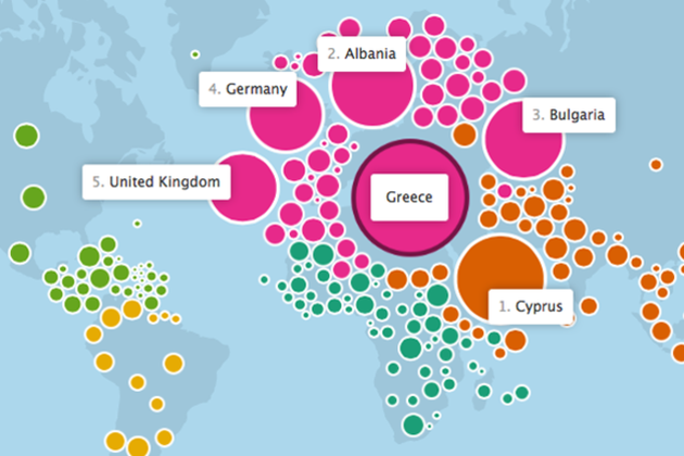
Last November, Facebook flipped Stanley Milgram's "six degrees of separation" theory on its head and showed that we're a lot closer than you might think. Today, Facebook launched a new interactive map of the world's friendships — a partnership with the data visualization wizards at the Stamen design studio — that illustrates some of the ways we're connected. The map uses an often-amorphous blob of bubbles representing the world's countries to show which ones share the most friendships, and many times, even explain why.