Saturday, September 17, 2011

Reaction:A Review of Overview+Detail, Zooming, and Focus+Context Interfaces

This paper primarily provides information and compares four schemes(interface approach) which allow user to get focus and contextual views of information space.In this firstly author has provided very clear description of all the four schemes,namely Overview+Detail ,Zooming, Focus+Context and Cue based.Each of them are described in detail with examples.Being novice in field I found description of multiple real examples of each scheme very informative.Author explanation about effect of these schemes on cognition and mental effort are beneficial while making selection among these.

Paper also provides detailed empirical evaluations of these scheme performed over period of time by different researchers.Authors has summarize those in two tables namely Low-Level-Evaluation and High-Level-Evaluation which provide pro and cons of these schemes.I find experimental fats in sections named spatial memory and cue based learning interesting.

Reaction:Toward a Deeper Understanding of the Role of Interaction in Information Visualization

In this paper author tried to stress on the fact that representation has overshadowed importance of interaction in Information Visualization Community.Author also conveyed that Interaction can overcome shortcomings of representation in InfoViz. I agree to this view of author as interaction can provide cues for cognition and overcome occlusion if used properly, there by enhancing overall experience and helping in reaching conclusions.

In paper author has further proposed seven categories of interaction techniques on basis on user intent.They are Select,Explore,Reconfigure,Encode,Abstract/Elaborate,Filter and Connect.I find section with details of each category important because it provided very clear description of categories and their examples.It is starting(initial) work toward interaction in InfoViz, however I liked author's work for being useful for naive users and also for drawing attention toward the interaction.

Ques:I got the perspective of interaction in static images.Still would like to know are there any papers for that and what could be done in interaction for static images ?

Reaction: A Review of Overview+Detail, Zooming, and Focus+Context Interfaces

The author's description of various categories of interface approaches and their pros and cons are very informative and provide a direction on the design and evaluation of user efficient interfaces. The overview+detail form of interfaces are very useful in representing a lot of detail in the visualization. The use of this type of interfaces help to create interfaces that cater to a large audience. But, the problems arising with this method can be overcome by using one or more other methods in combination with this. If we use context+detail along with this method, we can still represent all the data and change the representation dynamically if the user requests a different view.

The analysis of empirical results cannot be an exact measure of an interface approach as empirical results are not always correct and a more in detail analysis of the interface in various situations can help in proving more insight into the interface. The fish eye distortion can be good in some situations. The cue based approaches are also helpful in situations where the visualization needs to be used to represent data to a naive user and where the interaction can be limited or none. So, every approach has its own advantages and disadvantages and proper combination of these approaches based on the context can help in creating a better visualization.

Reaction: A Review of Overview+Detail, Zooming, and Focus+Context Interfaces


The paper mainly deals with the theme of usability of zoom, focus + context (distortion as well as blending), overview + detail and cue and how their presence instead of plain and simple scrolling and panning helps to provide larger details on a screen still maintaining the focus on things to be pointed out from these details. 

I thought that the paper tried to describe few interface schemes and then compare them stating their pluses and minuses and ultimately trying to propose a combined approach that would suit most if not all requirements of usability and ease of access for information.

I tried to capture the pros and cons of each technique that were mentioned in the paper as follows -


Technique
Pluses
Minuses
Zooming and Panning
1. Easy to implement
2. Widely used
1. Desert Fog Problem (user losing track during navigation)
2. Need of cognitive effort in refocusing after zooming in
Focus + context
1. Larger Possible focus
2. Task dependent benefits
1. Some find distortion techniques to be distraction (either because they are new to eye or lack the taste)
2. Some have difficulty in special comprehension direction scale etc.
Overview + Details
1. Preferred over zooming and panning
2. Outshines panning, zooming and fisheye
1. Requires mental effort and time to absorb the overview and detail representation
2. Requires more space since both are presented in separate windows
Cue
1. Suppress larger details into smaller ones by modifying the data
1. Dependent on context or search criteria

I agree with the author that none of the above mentioned techniques are ideal but are overall better than panning/scrolling. While overview + detail and zooming are standard and their benefit overrides usability problems, fish eye on the other hand are occasional and are used only of aesthetic purpose(like MAC OS doc etc).

I feel that, though an honest attempt is made in this paper in providing an acting guide for suggesting an approach which can get best of these mentioned schemes, current researches in interface schemes are not upto the mark that can act as a guideline for – “what combination of techniques for what tasks are most effective”

I being in cult of mobile platform, wonders - Can any of these techniques be used for specific analytic tasks on mobile gadgets? (I know Iphone uses some of these technique but given non-Iphone users like me might one day be benefited by researches in this area and their application to mobile platforms)

Reaction:The Eyes Have It:A task by Data Type Taxonomy for Information Visualization

In this paper Author have conveyed the visual information seeking mantra.Author has stressed in paper on technique of Overview first,zoom and filter ,then details on demand multiple times to convey its importance.These individual steps are dwelled in detail later on with advanced steps like relate,extract etc.
This paper also describes about seven data types,namely 1-dimensional, 2-dimensional, 3-dimensional, multidimensional, temporal, tree and network. Each of these data types are described in details with example's referred from cited papers, which can be beneficial for selection among data types.I find examples in papers informative and helpful for novice as well moderate practioner of field.Moreover filter-flow model for Boolean expression was very interesting way to deal with ambiguities of Boolean expressions.

Viz: Real-Time Visualization of Discussions about Breast Cancer on Twitter

Viz: Radioactive Orchestra: Creating Music from Radioactive Isotope Decay

Reaction: Toward a Deeper Understanding of the Role of Interaction in Information Visualization

The paper explains in depth understanding of what interaction is and how interaction is perceived in information visualization. The aggregation of interaction techniques based on the user intent helps in identifying similar existing techniques so that the user interaction can be analyzed well. The division of the interaction techniques as independent techniques is difficult because in most cases while extracting information from a visualization, each technique would be preceded by one or more other interaction methods before reaching the desired results.

The select technique helps in identifying points of user interest within any visualization, but exploration is where we get the actual results. So, I think select and explore as two separate techniques are misleading and only explore can do the work when select is made an implicit task within exploration. The use of abstract/elaborate,encode and connect is like creating a new visualization using interaction which helps in better understanding of the visualization and needs to be present along with representation to improve the user cognition. I think interaction should be an integral part of visualizations along with representation as with the technology we have today, interactive visualizations make more sense and add value to the representation.

Reaction: The Eyes Have It: A Task by Data Type Taxonomy for Information Visualizations

The article tries to interpret the visualization of complex data using a task by data type taxonomy that makes user exploration of the visualization fast and easy. The present day visualizations are predominantly in one or the other forms of data types stated in the paper. The author's view on creating visualizations that help in exploring only the points of interest with growing volume is what is expected from the visualization as a lot of data need to be represented in the visualization, but still only some part of it may be of interest to a particular group of users while another group of users may be interested in another part of the visualization.

The perception of a visualization is complete in most cases after the information seeking mantra as most of the user expected information is analyzed after those steps. But, a lot of other tasks like relation, history and on demand details are required when one or more data types are present in the visualization and data needs to be extracted from them. The author's view of taxonomy and tasks is very efficient in analyzing complex graphical visualizations rapidly and extracting required information.

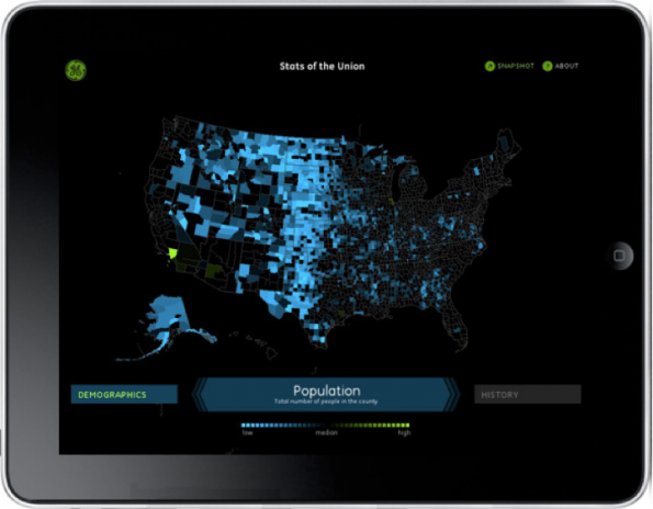
Find: 10 Infographics and Visualization Apps for iOS
Spotted: Why Should Engineers and Scientists Be Worried About Color?
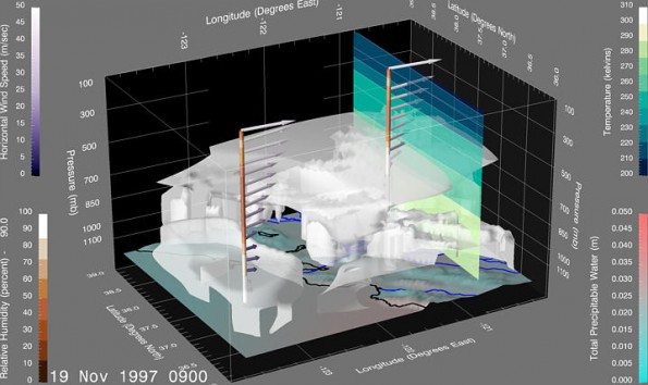
Bernice is a leader in viz and perception

Why Should Engineers and Scientists Be Worried About Color?


Event: BioVis 2011 Papers & Abstracts now Online

This is coupled with the premier event in viz, visweek. Worth going if u can. 

BioVis 2011 Papers & Abstracts now Online

 The first IEEE 


Reaction: The Eyes Have It: A Task by Data Type Taxonomy for Information Visualizations

This article discussed information visualization in the context of seven data types (or display mediums) and seven tasks that information visualizations can give. The article attempted to give a more in-depth disucssion of what it termed teh "Visual Information Seeking Mantra", which was "Overview first, zoom and filter, then details-on-demand."

I think this article did a good job of trying to deal with the difficulty of characterizing and accurately describing best practices for information visualization. In other papers, I've read how you can't look at infoviz just from one side - that it requires analysis from multiple angles. In this article the authors look at how the data is presented along with what it allows you to do. I found most interesting the ideas of history and extraction. Being able to undo what you have done makes the exploration of data much easier, but being able to extract the data in a useful form after you've explored makes the entire enterprise meaningful. I see these two tasks as lacking in a lot of visualizations that I've seen.

I also thought the advanced filtering idea was interesting - including the point about natural language and boolean language being opposed in some ways. The strategy they described for a more natural view of filtering seemed like a good idea.

Tool: A new Stable release of Chrome, expanding the frontiers of the web

Stable but only native store apps for now. 

A new Stable release of Chrome, expanding the frontiers of the web

Today, we’re happy to ship a new release to the Stable channel of Chrome, following up on last month’s Beta channel release. This release contains two significant technologies which allow developers to create even more powerful web apps and games:

Friday, September 16, 2011

Reaction: The Eyes Have It: A Task by Data Type Taxonomy for Information Visualizations

The author proposes a taxonomy of tasks for seven different types of data:1-D,2-D,3 - D,temporal, multidimensional, tree and network. Each of these data types are explained in detail. The author considers the 'Overview first, zoom and filter, then details-on-demand' principle to be the most important guideline in information visualization.

The basic tasks for each of the seven different data types along with examples are identified. Some of the tasks can be termed as follows: Overview, zoom, filter,details-on-demand, relate,history,extract. The author also discusses about dynamic filtering which will help the users answer specific questions about the dataset. Some of the approaches for specifying the queries using Boolean expressions are discussed.

Most of the concepts are explained in detail but there are some terms like the starfield displays, perspective wall etc which have little or no explanation. The readers have to refer additional papers to understand better.

Reaction: Toward a Deeper Understanding of the Role of Interaction in Information Visualization

Representation of a dataset and interaction with the represented data are two key aspects of information visualization. But interaction, according to the authors has always been sidelined and hence they choose to highlight its importance. Over the years there have been several definitions of interaction. But in the context of infoviz, interaction means direct or indirect manipulation and interpretation of visual representation. By this definition, a menu is an example of interaction.

The authors review taxonomies of interaction techniques based on existing literature and examine several infoviz systems. Seven categories of interaction are identified : Select,Explore,Reconfigure, Encode,Abstract/Elaborate,Filter and Reconnect. Each of these interactions are well explained with popular examples like the Name Voyager, Visual Thesaurus etc which were discussed in the class earlier this semester. This paper is definitely a good starting point to delve deeper into the specifics of different kinds of interactions.

Reaction: A review of Overview + Details, Zooming, and Focus + Context Interfaces

The paper starts with quite an interesting discussion on the span of view from the human and device perspective and tries to bridge the gaps between the two. It has correctly stated that traditional forms of displaying information use the concept of windowing and scrolling. This definitely creates a break in the cognitive abilities of the viewer. The viewer is either required to move / scroll through the data or even scale the sizes or visibility of data.

The paper however proposes to study the various levels and methods of detailing of information viewing by the users. In particular the paper discusses on following techniques: overview + detail, zoom, focus + contextual and cue. In each category, the authors have discussed in detail about the features, foundations and objectives. They have also compared the strengths and weaknesses of each category. The author has also provided illustrated examples while explaining each type of technique.

I found the discussion on the fish eye view quite interesting as it was being noted to be very impressive with its dynamic features. To support this discussion the authors have mentioned about the Mac OS and its document viewer software. I also liked the discussion on the cue techniques for highlighting Focal Objects. The chess board image which is used as an example illustrates the concept quite aptly.

As a conclusion note, I particularly liked that the authors did not favour any particular technique and have left an open – ended discussion there. They have also concluded well by describing each of the technique in depth.

Reaction: Toward a Deeper Understanding of the Role of Interaction in Information Visualization

This paper begins with a striking note on the importance given to representation and not interaction in the field of InfoVis. The authors have stressed upon the relevance of both the fields equally in the science of InfoVis. Thus the need to define and explore the context of interaction in Infovis is considered as the goal in this paper. The authors in this paper have defined clarity in terms of the scope of their work and have clearly put forth the structure and expectations from the paper.

Moving further in this paper, I like the fact that the authors have considered even the operations performed on the static images as interaction. They have a comprehensive attempt to define the concept of interaction. The taxonomies discussed here are also indicating all the aspects or extent of interactions involved between the users and data. The authors have indeed surveyed extensively covering 59 papers, 51 systems and 311 techniques to come up with the template of methods in interaction. Based on the user notion and research, the authors have come up with seven interaction techniques which include select, explore, reconfigure, encode, abstract, filter and connect. The authors have further discussed elaborately on each technique and have illustrated them quite well. They also discussed in depth about issues with each of the technique. Thus in this paper the authors have come up with a novel user-based interaction techniques which will definitely prove to be useful in the field of interaction in InfoVis.

Reaction: The Eyes Have It: A Task by Data Type Taxonomy for Information Visualizations.

In this paper, the authors have cited the large availability of information. This causes difficulty in exploring and understanding the data which leads to the need to generate a methodology or schema to represent the information. They talk about using color displays to depict the information in more effective manner.
The author identifies the seven basic tasks of abstraction which are overview, zoom, filter, details- on – demand, relate, history and extract. These discussions are further made on the basis of seven data types which are 1-D, 2-D, 3-D, multidimensional, temporal, multidimensional, tree and network. The author describes the basic operations or tasks as the mantra in visualizing the information. The author has also included a detailed description on advanced filtering. The paper very well supports the statement that the information can be well comprehended in visual form as compared to a text format. The paper does provide a promising hope to the field of information visualization and exploration.

Thursday, September 15, 2011

Reaction: Toward a Deeper Understanding of the Role of Interaction in Information Visualization


Information visualization =  representation + interaction , I had known this, since reading the first paper so I think that this paper extends the view presented in some of the earlier papers that to attract audience towards the visualization, we need, not only excellent representation of data but also a way to present an interactive system (at higher abstraction of-course!). This paper was informative in the sense that, everyone knows how to interpret data from interactive charts, that are there on scale of millions on the web, but actually there is compartmentalization of this interactions, This was something new that I found out from the paper. It is a known fact, that, with interactive visualizations we can play around with data change it form to other and do many other eye-candy things, but the credit goes to the authors for drawing fine-lines among such various techniques to interact with a viz-system.

I strongly agree that this separation of interactive techniques presented in the paper is not the only way in which we can categorize interactions in visualization. But still it lays a founding stone for others to build upon if they wish to make the line of separation even more wider or smaller according to their way of interpreting this interaction.

Again just like the previous reading of this week, I found this paper to be definitive, when it comes to naming and definition for the techniques of interaction which we all use but when asked to distinguish often leave us stumped and loss of words.

Reaction: The Eyes Have It: A Task by Data Type Taxonomy for Information Visualizations


The paper has a good take on how the data has been traditionally been displayed, using the data types mentioned in paper.  I support the authors view that with the amount of resources at our hand, it is very much possible to go one step ahead and try dynamic on-the-go manipulation on information visualization. When we apply those mantra’s of visualization, we can present information at a rapid rate. The author was aptly pointing out that, to take total advantages of these ideas of visualization, we need much more novel ways of representating our data, along with increase in resoucres at our disposal (like high end parallel computing, high resolution display etc.)

The idea that, modern day computer acting as a helping hand towards presenting information using unique tools like the fisheye views needs more attention is conceivable. I think if we can make progress in developing such tools further, which has a plenty of scope definitely; can help in exploration of data which is both magnanimous and complex.

What I learnt from the paper was the precise notion of various data types mentioned and how visualization is coming to terms with modern complex data types. The mantra given in the paper needs a serious attention in the sense that it can facilitate utilities in such complex information visualization.

What bewilders me is, that since we are floating in the clouds, given the indispensable resources and computing at our hands how can we use them to go further ahead on the track the authors have tried to lay down by showing their studies of introducing complex viz data types to make work of a user elementary? I am pretty much sure that we are far from over in terms of identifying more novel exploration tools of info viz.

Dev: Recapping TimesOpen: Innovating Developer Culture

I like foursquares teamlets and standing meetings. 

Recapping TimesOpen: Innovating Developer Culture

The second TimesOpen of 2011 on Innovating Developer Culture took place last Wednesday. The program was a departure from the usual code-heavy fare the meetings are known for. An expert on organization culture change, Jessica Lawrence, from the New York Tech Meetup, joined engineering manager, Ken Little from Etsy, and Foursquare co-founder, Naveen Selvadurai.

Viz: Spotfire


Don't know if anyone has already posted this, but I came across this awesome set of visualizations....


Viz: This Chart Explains the Confusing Hierarchy of Nvidia GeForce Graphics Cards

Data: Rich Snippets for Apps

App store data. 

Rich Snippets for Apps

Now that both the Apple App Store and the Android Market have Web interfaces, Google decided to show better snippets for the results from these sites. The next time you search for [Angry Birds], [Cut the Rope], [Shazam] or [ASTRO File Manager], you'll find results that include a small icon, the app's rating, the number of reviews and the price. For now, only the results from the Android Market include thumbnails.


Data: Getting started on the Google+ API

Just public data. 

Getting started on the Google+ API

By Chris Chabot, Google+ Developer Relations

Cross-posted with the Google+ Platform Blog

The Google+ project brings the nuance and richness of real-life sharing to software. The Google+ platform brings that nuance and richness to all of the web. We started with Google’s own products, added the +1 button for site owners and content publishers, and introduced games from a handful of partners. That’s just the beginning though — we want every one of you who builds applications to be able to include rich sharing, identity, and conversations in your app. Today, we’re taking the next step on that journey by launching the first of the Google+ APIs.

Find: Windows 8 Metro-style Internet Explorer 10 doesn’t support Flash

No flash on win8 mobile ui. Flash is in trouble. 

Windows 8 Metro-style Internet Explorer 10 doesn’t support Flash (hands-on video)

Well the presence of two versions of Internet Explorer in Windows 8 is certainly making a bit more sense today — Microsoft has said that the Metro version of IE10 [...]

Announcement: late to office hours today

Due to a proposal defense

Find: Critics call foul as Google takes aim at JavaScript with Dart

Wednesday, September 14, 2011

Viz: America's report card


This is an interesting visualization by a group called One Block Off the Grid who deals in solar energy. The organization had a survey of users from various states about the facilities they provide and prepared a report card of the states.
The states were ranked based on the grades gien for various fields like health, natural beauty etc..,
The full visualization can be browsed here:
http://1bog.org/blog/infographic-americas-report-card/

Example: Line graph going back

This is an example of a line graph that goes back. Distance traveled in a year is plotted in X and gas prices in the Y axis. The year (time) follows the line.


Lecture: interaction

Folks,

Our next lecture will discuss interaction for visualization, with discussion lead by Ju Hee Bae. Here are the papers you need to react to:

Tuesday, September 13, 2011

Monday, September 12, 2011

Reaction: Graphical Perception: Theory, Experimentation, and Application to the Development of Graphical Methods

This article was the most technical of the three for this week with good reason. The in-depth analysis and description of the different charts and graphs in this reading provided me with a lot of information pertaining to each type. My experience with graphing data is very minimal (i.e. limited to bar graphs, pie charts, and line graphs), so the descriptions helped me understand how many different charts are meant to be viewed and how they should be created.

I think that this article could prove itself as a good reference for future use. The only downside I can see is the density of information. Although each type of chart has its purpose, I don't think I would be confident in choosing the best chart type for a complex situation. Ultimately, I would most likely end up relying on the "basic" 3 types.

Reaction: Attention and Visual Memory in Visualization and Computer Graphics

This article was an enjoyable read. The authors brought to light several sample situations that clearly explain how attention to visualizations varies with different factors. In one of the sections, the authors mention that the data in some visualizations is not stored in long term memory since the visualization is meant to be novel. Incidentally, I found that this statement holds true with one of the change blindness examples. I have seen one of the comparison images in the past but still needed to take several glances until I spotted the difference between the two.

Change blindness was one of the factors that stood out to me the most in this article. It is a complex factor in itself such that some visualization elements, such as luminance, give viewers a more difficult time in change detection. This section helps readers note some issues with attention outside of the viewer's field of view and helps pin-point what to avoid when developing a visualization. Mainly, keep all critical information inside the viewer's scope.

The factors discussed near the end of the publication provide readers and designers with several small but practical pieces of advice. I thought it was interesting that they mention aesthetics and engagement in relation to the ability to persuade viewers into lingering on different areas of a visualization. These factors make me think of a user as a customer and a visualization as an advertisement.

Finally, the authors advise designers to avoid forcing users to remember details for a set of old and new data. Instead, present both sets of data in such a way that the user can quickly reference either one. This advice brought Florence Nightingale's diagram to mind since it is a good example of displaying two sets of data.

Visualization: Real time network traffic Visualization.

Akamai Technologies is one of the companies that handles billions of web interactions of daily transactions for most of the big companies in various sectors. It has its presence in almost every sector of the market. They have very interesting visualizations here, related to the network performance comparison. Of the lot real time web monitor is one of those data visualizations which gives information about the network traffic that is flowing over the internet across the globe. Areas with high traffic are highlighted allowing users to understand the difference between traffic at various places. Also information about places that had network attacks are specified. And all information is updated real time.

Viz: WeatherSpark - Beautiful Weather Graphs and Maps


I was explaining a friend how bad/good was the winter here in Raleigh. The low/high means don't tell much, and many resources allowed to view one past day at a time. I came across this visualization


It shows, the recorded low/high, mean, low/high percentiles 90, 75, 25, 10, low/high record, it labels interesting peaks, hours of sun, wind direction, etc.

Technology: Flash
Authors: Jacob Norda and James Diebel

Reaction: Distributed Cognition as a Theoretical Framework for Information Visualization

The paper brings in a new idea in distributed cognition. The distributed cognition framework is based on the idea that tools amplify cognition. Authors believe that a lot of attention is conventionally given to human perception but they would like to consider the representation of the info to be equally or of greater importance. Based on the distributed cognition framework the authors have to tried to explain some of the examples they have quoted. The paper even though aims to solve generic problems the explanations dont seem to solve generic set of examples. They seemed to be tailored to the examples discussed.

The paper was in general a little difficult to grasp as this might need some background in cognitive frameworks and some knowledge of traditional approaches to cognition would be required too. It is still an interesting read as it opens up a new perspective and a new approach to explain the observations. 

Reaction: Attention and Visual Memory in Visualization and Computer Graphics

The paper starts by describing preattentive processing and the different theories which attempt to explain the different observations. The different theories discussed include Feature Integration theory, Textron theory, Similarity theory, Guided search theory, Boolean Map theory. There is a constant to and fro between serial and parallel processing ideas. The theories evolve to explain the new observations and examples. Discussions on feature hierarchy and ensemble coding bring out very important basic concepts which help in making better visualizations.

The next part of the paper describes concepts about visual expectation and memory. Change blindness and postattentive amnesia are interesting concepts which can affect how we design a visualization. At the end of the paper the author has summarized how these concepts apply to visualizations. This paper seemed like a valuable resource to understand how human perception works and how it affects the field of visualization.


Charting Tool: Chartle.net

We have seen many charting tools in the class so far ranging from the google charting API to the flare to the ExtJS. Here is one more to the growing list of the charting tools.

Okay so you will ask whats new of this tool that sets it apart from the rest rite?

Here the reason -

Chartle.net is a complete-online solution to the creating interactive flashy charts. No need to download any API or import any libraries. Step 1. Select the type of chart you want Step 2. Load the data in the dialog box provided  and your are done! whats best, you can publish or embed the generated chart in your blogs, web pages anywhere


I created an PieChart and published it to get an embed code (basically an iframe) which now I can include in any blog, website etc. The embed code looks like this -

<iframe name='powered-by-chartle.net' src='http://genflux.chartle.net/embed?index=45997&amp;content' width='510' height='320' marginwidth='0' marginheight='0' frameborder='0' scrolling='auto' >Report problems to embedding@chartle.net</iframe>


A cool feature I think it has that, this is interactive chart so there is scope to present data in much better than one can ever think, like selecting row-data from table and highlighting on chart and vice-versa. There are scatter chart, line chart, maps, venn diagram etc. for whole list check here.
PS: all this on the go without me having to download any library or API. (future is great for such tools with advent of cloud!!!)

The website thanks the googleAPI team so I believe that in the backend it is the GoogleApp engine that powers this site so one might argue its uniqueness but for the features that it provides I think it a utility rather than ya yet another charting tool,


Source: chartle.net

Reaction: Graphical Perception: Theory, Experimentation, and Application to the Development of Graphical Methods

The paper written in 1984 is an attempt to make a basic theory of graphical perception. The theory they set out to specify and validate is not exhaustive but still sets the course for the future developments. Based on experiments and the theory of Psychophysics they formulate an ordering of perceptual tasks. The ordering lists the perceptual tasks in the increasing order of the accuracy of perception by humans. This divides the 10 visual perception tasks taken into consideration into 6 groups. Where each group has one or more than one perceptual task and has lower perception accuracy when compared to the group before it in the list. Though the groups seem to work for the experiments done by the authors. There is not enough explanation as to why some of these perceptual tasks were considered to have the same accuracy. There was no experimental evidence given to prove that perception of length, angle and direction can have the same level of accuracy. There is sufficient discussion and reference to experiments to prove the ordering. There could have been some discussion on how the order is affected when the amount of information being represented increases.

Based on the experiments and theory described in the first part of the paper the authors have shown a new kind of charts which are evidently better compared to the traditional representations. It is very convincing to see that the grouping dot chart can convey information more quickly and easily when compared to grouped bar chart. The framed rectangle chart when compared to the shaded area chart is better to compare any two states and their murder rates visually. However in my opinion the shaded area chart is better in representing parts of the country where there is high murder rate and where there is lesser murder rate. The shading dominates the state boundaries and hence provides a more unified view. 

This theory in general forms a basic idea based on which visualizations and choices made to represent data can be justified. However a lot of work needs to be done to make this a more exhaustive and universal theory for data visualization. 


Distributed Cognition as a Theoretical Framework for Information Visualization


This paper discusses the concept of "distributed cognition" framework and its importance as an underlying theory for information visualization. It presents a detailed study in the aspects of how information is represented and how the interactions are incorporated in a cognitive way to the user. The authors explore and try to explain the way the tools, symbols, environment amplify comprehension coupled with the cognitive powers of the human mind and how these things do not work in isolation but their collaboration helps to convey information successfully.

The authors use different examples to stress on the fact that representations and different interactions with any visualization help the   user to get a different viewpoints and perspectives which amplify his cognition and understanding. The paper thus highlights that external representation of data is much more important to visually engage and inspire the audience than just concentrating on the perceptive powers of humans.

The paper gives a detailed explanation and preaches the use of the distributed cognitive approach but fails to make a strong argument as to why it must be the basis of InfoViz and how it is better than using any other approach. Also, it states in section 6 of the paper that both internal and external representations form a tightly coupled system to help cognition, which in my opinion essentially means that no single framework can form a basis of any visualization. It must be a confluence of external symbols, the data itself and the studies of human perception.

Reaction: Graphical Perception: Theory, Experimentation, and Application to the Development of Graphical Methods

Paper was lengthy but explained the material in detail. The flow of the paper suited for a beginner. Separated the tasks and solutions clearly. I had an oppurtunity to read about different graphs and their merits. No confusions.

Thanks
Pradeep

Reaction:Graphical perception:theory,experimentation and application to the developement of graphical methods

In this paper the author uses number of examples and theories which helps in better understanding of how information is perceived .It tells us about graphical perception using strong evidences.

Using different examples the author tries to explain the different graph representations. This helped in understanding the advantages of one representation over the other.For example the length judgement in bar graphs,angle judgement in pie charts were few of the many examples presented by the author.It also says how the present charts should be modified so as to improve the understanding from them.

The paper was an interesting read due to its many examples and co relations.

Reaction:Attention and Visual Memory in Visualization and Computer Graphics

In this paper the role of human visual perception in visualization design is stated.The author explains preattentive processing here.Various theories have been presented for the preattentive processing and it can be understood how preattentive processing power of humans should be used for visualization.

The author then moves to visual memory and visual attention aspect. The author describes how the human eyes perceive images and what information is stored in the brain. The human brain gives an abstract view of these images.The author also explains about predicting attention and directing attention.

This paper discusses past and current theories of visual attention and visual memory. It tells us how and what is the importance of visual system understanding so as to draw good visual displays.

Reaction: Distributed Cognition as a Theoretical Framework for Information Visualization

This paper provides a high level view of DCog and revolves around cognition and co-ordination. The author tried to keep the text short, so it was vague and does not dicuss enough examples. The paper does not give any knowledge about choosing the framework. So I am still confused which framework will be appropriate for different visualization.

Deciding on a framework at the beginning is very important for any visualization. What are the possiblities for changing the framework at a later stage of the visualization ?

Thanks
Pradeep

Sunday, September 11, 2011

Viz: German Party Donors

Viz: Saudi Terrorist Network

Reaction:Graphical Perception: Theory, Experimentation, and Application to the Development of Graphical Methods

       This paper talks about how we try to get information from different types of graph showed to us. It lists the elementary tasks performed for understanding a graphical representation. The designers should not be focused on displaying the accurate information (" A table can do this work") but rather they should design graphs that can be perceived using finite number of elementary task,  meaning with out straining.
       The authors have well put the theories and has supported them with cool Experiments. Different types of charts have been taken as competitors and the elementary tasks performed to gather information from each one has been very clearly explained.I found it interesting that the angle and position also play role in visualizing the information and also I liked the idea of framed-rectangle charts. I believe the paper does not contain the entire list of tasks but it is really a good start.

Viz: Have Our Email Viewing Habits Changed?

To answer the q, yes: more mobile mail, less webmail. Desktop mail still largest and steady. Gmail stealing from hot ymail. 
Not sure pie series are best for change over time. And bubble pairs? Really. 
Cool data tho: too bad it's proprietary.

Have Our Email Viewing Habits Changed?


Competition: The Information Is Beautiful Awards

Annual competition deadline march. Monthly starts sept 19. 

The Information Is Beautiful Awards

Find: Revealing the Periodic Listening Habits of last.fm Users

Nice data! Really needs labels tho. 

Revealing the Periodic Listening Habits of last.fm Users

lastfm_listening.jpg

Data: Exploring the Original Transcripts of Early Space Exploration

Project: Five Best Screencasting or Screen Recording Tools

We will be making videos explaining our projects, and screencasting may be the simplest method. Cam studio here is free. 

Five Best Screencasting or Screen Recording Tools [Hive Five]

Five Best Screencasting or Screen Recording Tools 

Reaction:Distributed Cognition as a Theoretical Framework for Information Visualization

This paper shows how distributed cognition framework can be used to substantiate the theoretical foundation of InfoVis. The traditional experimental approach studies how human perceive and store abstract information.DCog questions such approach of studying human cognition.

We understand that the environment cannot be separated from human while studying cognition. Keeping this in mind DCog is a framework under development.

InfoVis is a research area that is related to study of human perception and cognition.To successfully incorporate the human component into InfoVis theories,we need a framework that can identify important theoretical concepts.

Need: Data Explosion Lifts the Storage Market

50% more mb stored this year than last. 

Data Explosion Lifts the Storage Market

The data explosion is creating a surge in demand in the storage business--up 47 percent--and EMC is gaining most from the trend.

Tool: How Netflix uses WebKit and HTML5 for connected devices