Saturday, November 12, 2011

Report: VisWeek updates by Jérôme Cukier: Day 5

On the capstone talk by nyt graphic designer Cox, among others. Take home: with annotations, familiarity matters less. 

VisWeek updates by Jérôme Cukier: Day 5


Day Five – Thursday 26th October


Remarkable Presentations


Georgia Albuquerque and colleagues from TU Braunschweig presented an incredible tool in a paper called “Synthetic Generation of High-Dimensional Datasets”. The tool and the accompanying paper are available here. Simply put, what this does is let a user “paint” a dataset with a few mouse strokes. Let’s suppose you want a dataset with data following a certain pattern, or with certain correlations: with this interface you can easily generate data that approach the form you want. This is plotting data…. but in reverse.


Report: Kosara on Vizweek: Visualization is Growing Up

Maturity means effectiveness. 

Visualization is Growing Up

Several topics at this year's VisWeek conference have come up because visualization is playing a bigger role in important decisions. When the consequences can be severe, it is important to know whether a visualization actually works, whether we can trust it, and what biases it might present.


Tool: An introduction to WebGL from Dev.Opera


An introduction to WebGL from Dev.Opera

If you’ve been holding off on learning much about the new WebGL standards, Opera has a nice piece covering just what WebGL can and can’t do, along with some nice examples and technical details.

Report: Decoded Conference 2011

Viz: Google+ Ripples: yup, Wattenberg and viegas

See the tweet from viegas behind the big pic link.

Google+ Ripples: Revealing How Posts are Shared over Time

google_ripples.jpg

Viz: Opinion Visualization: What People Think about the Occupy Wall Street Protest

Saw this myself. Worked well, though underused by data. 

Opinion Visualization: What People Think about the Occupy Wall Street Protest

opinion_occupy_wall_street.jpg


Viz: Politilines shows what candidates talk about during debates

Interesting. Always challenging to summarize with keywords though. 

I wonder if links scale well to lots of speakers? Too many crossings?

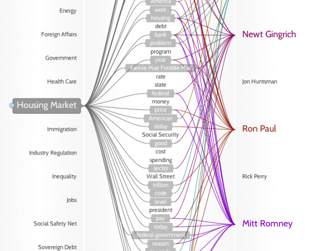
Politilines shows what candidates talk about during debates

Politilines by Periscopic


Find: Revolutionary User Interfaces

Nice review of recent mobile history. Interesting stacked graph, and
nice line graphs of rankings.

The stacked graph is a bit busy, with a few colors too similar.

http://www.asymco.com/2011/11/03/revolutionary-user-interfaces/

Friday, November 11, 2011

Tool: Introducing Closure Stylesheets

Variables for CSS. 

Introducing Closure Stylesheets

(CSS is for programming, not for pasting)

When the Closure Tools were first released a little over two years ago, they gave web developers the ability to organize and optimize their JavaScript and HTML in a new way. But there was something missing, namely, a tool to help manage CSS.

Wednesday, November 9, 2011

Find: a preview of the 3d maps coming to ios, by C3 Technologies

Apple recently bought them. Seems they use image based rendering, not polygons. Looks better than google, they claim accuracy of one foot. 

C3 Technologies' 3D Mapping Looks Freaking Amazing

0c33dmp01.jpg

#more 

0c33dmp02.jpg

What could be better than Google Maps? C3 Technologies' stunning 3D city displays, which let you rotate, zoom and pan through the city as if you'd modeled it all on your computer. The technology, which uses footage captured from airplanes and processed through a formerly proprietary military missile-guidance system, absolutely must be seen to be believed. Check out San Francisco, starting around 2:00:

(more...)

Find: Information Visualization Framework

An orphaned chapter from Lima's book. 

Information Visualization Framework


**This text was part of an extinct chapter of Visual Complexity: Mapping Patterns of Information, which never saw the light of day. Instead of being forgotten in a dusty folder, I decided to make it available to the general public and invite any constructive criticism by our growing community. Hope you will find it useful.**

#more 

-


Data and information visualization are fundamentally about showing quantitative and qualitative information so that a viewer can see patterns, trends, or anomalies, constancy or variation, in ways that other forms – text and tables – do not allow.


Michael Friendly


-


The concept of visualization is certainly not new. Humans have been involved in the visual representation of information for more than 30,000 years. During this time, there has been a variety of portrayed subjects, many of them pertaining to natural phenomena, but the common underlying purpose of communicating a message has always been present. Whether we talk about cave paintings, cuneiforms, maps, or charts, we are always alluding to information in a quality of a message from a sender to one or more receivers. “The progress of civilization can be read in the invention of visual artifacts, from writing to mathematics, to maps, to printing, to diagrams, to visual computing.”[1], say Card, Mackinlay and Shneiderman. Historian Alfred W. Crosby attests to the importance of visual aids throughout the ages, by claiming that visualization and measurement were the two factors most responsible for the rapid development of all of modern science[2].


Even though visual artifacts have always been a central element in the history of humankind, over the last 25 years the term “visualization” has become immensely popular, being fragmented in a profusion of subfields, carrying a diversity of specialized labels such as Information Visualization, Data Visualization, Scientific Visualization, Software Visualization, Geographic Visualization, Knowledge Visualization, Flow Visualization, and even Music Visualization. Many of these areas emerged in the midst of existing parallel areas like Information Design, Information Graphics, and Visual Communication. The distinction between them is occasionally thin, and in some cases almost inexistent. This rich plethora of labels is certainly indicative of the outburst of a new practice, but one that is still struggling to define itself. While some consider this to be the birth of a new medium, or even a new science, the consensus on a definite descriptive label is not so obvious.


According to Michael Friendly, the renowned professor of Psychology at Yor...

Find: Adobe officially kills Flash Player for mobile, says HTML5 is 'the best solution'

Adobe admits defeat on mobile. That's defeat period. 

Adobe officially kills Flash Player for mobile, says HTML5 is 'the best solution'

adobe android 2

#more 


Adobe just officially announced that it's killing Flash Player for Android and the BlackBerry Playbook, following a ZDNet report of the decision late last night. The company will still develop and support Flash for the PC, but says that HTML5 is the "best solution for creating and deploying content in the browser across mobile platforms." Adobe will also continue to support AIR on mobile so developers can package Flash content as mobile apps, and Flash Player 11.1 for Android and Playbook is still on track to be released — and Adobe will continue to ship bug fixes and security updates, as well.


Continue reading…

Viz: Visualizing twitter languages

Via my colleague Carol Strohecker at the Center for Design Innovation.

Vive le tweet! A Map of Twitter's Languages | Strange Maps | Big Think
http://bigthink.com/ideas/41004


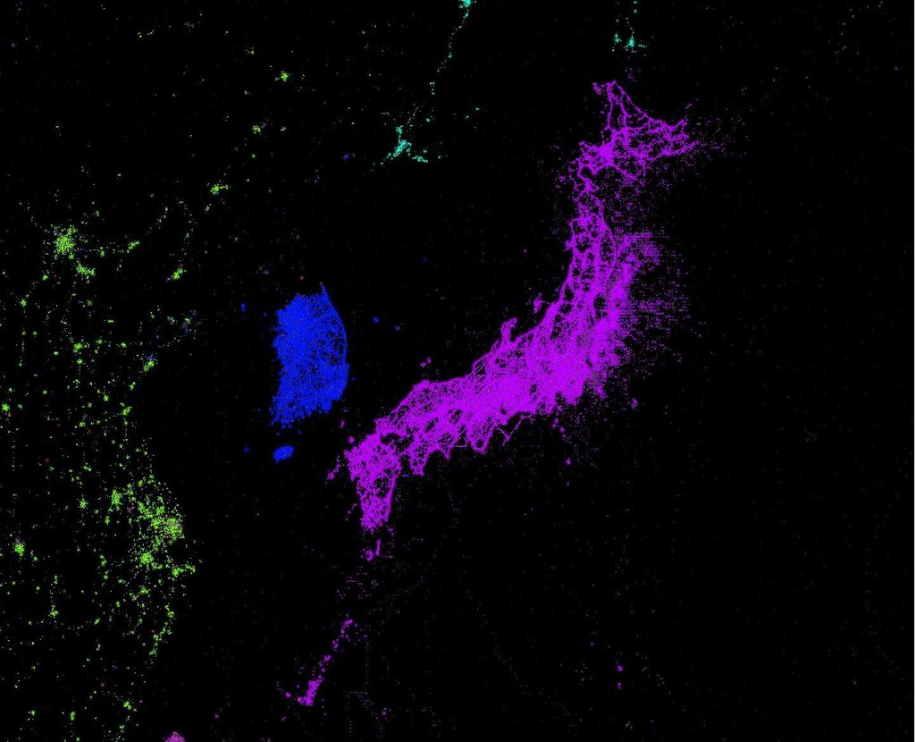
6323179865_f25102abec_b.jpg

Tuesday, November 8, 2011

Tool: OAuth 2.0 Playground: open to developers


OAuth 2.0 Playground: open to developers

Author Photo
By Nicolas Garnier, Developer Relations Team

Cross-posted on the Google Apps Developer Blog

In March, we announced that all of the Google Web APIs adopted support for OAuth 2.0. It is the recommended authorization mechanism when using Google Web APIs.

Today, we are announcing the OAuth 2.0 Playground, which simplifies experimentation with the OAuth 2.0 protocol and APIs that use the protocol. Trying out some requests in the OAuth 2.0 playground can help you understand how the protocol functions and make life easier when the time comes to use OAuth in your own code.


Selecting the APIs to authorize


#more 

With the OAuth 2.0 Playground, you can walk through each step of the OAuth 2.0 flow for server-side web applications: authorizing API scopes (screen shot above), exchanging authorization tokens (screen shot below), refreshing access tokens, and sending authorized requests to API endpoints. At each step, the Playground displays the full HTTP requests and responses.


exchanging tokens
Exchanging the authorization code for a refresh token and an access token

The OAuth Playground can also use custom OAuth endpoints in order to test non-Google APIs that support OAuth 2.0 draft 10.


configuration

OAuth configuration screen


You can click the link button to generate a link to a specific Playground state. This allows quick access to replay specific requests at a later time.

Monday, November 7, 2011

Report: VisWeek – What Constitutes the Best Research?

Stephen Few, a leader in the field, has doubts about the paper selected as best at the recent infovis event. More to the point, about the process by which it was selected. 

VisWeek – What Constitutes the Best Research?

I’ve often complained that much information visualization research is poorly designed, produces visualizations that don’t work in the real world, or is squandered on things that don’t matter. To some degree this sad state of affairs is encouraged by the wayward values of many in the community. A glaring example of this is the “InfoVis Best Paper” award that was given at this year’s conference (and many in past years as well). Despite the obvious technical talent that went into developing the “Context-Preserving Visual Links” that won this year’s award, these visual links are almost entirely useless for practical purposes.


Context-preserving visual links are lines that connect items in a visualization or set of related visualizations to highlight those items and thus make them easier to find, and do so in a way that minimally occludes other information. There are many ways that items can be highlighted. The best methods apply visual attributes to those items that we perceive preattentively, causing them to pop out in the display. This approach highlights items without adding meaningless visual content to the display. As you can see in the following example of context-preserving visual links, items are highlighted by the addition of lines to connect them.


#more 

The lines are the most salient objects in the display, yet they mean nothing. Drawing someone’s attention to visual content that is meaningless undermines the effectiveness of a visualization. They direct attention where it isn’t needed. Even worse in this case, they suggest meanings that don’t actually exist by forming paths, which usually suggest meaningful routes through data. Also, lines that connect items suggest that those items are somehow related, but this is not always the case.


My intention here is not to devalue the talents of these researchers, and certainly not to discourage them, but to bemoan the fact their obvious talents were misdirected. What a shame. Why did no one recognize the dysfunctionality of the end result and warn them before all of this effort was…I won’t say wasted, because they certainly learned a great deal in the process, but rather “misapplied,” leading to a result that can’t be meaningfully applied to information visualization.


The fact that this work was given the “Best Paper” award indicates a fundamental problem in the information visualization research community: because so many in the community are focused on the creation of technology—a computer engineering task—they lose sight of the purpose of information visualization, which is to help people think more effectively about data, resulting in better understanding, ...

Report: The Most Interesting Papers at the Infovis Conference (VisWeek 2011)

I also liked gestalt lines, though I'm not sure I understand the name itself yet. 

Our own quilts work is mentioned. Thanks Kim and info aesthetics! Definitely agree that they have a steeper learning curve than node link diagrams; we designed them for expert use. That said, with instruction, novices understood quilts well. 

The Most Interesting Papers at the Infovis Conference (VisWeek 2011)

GestaltLines

This post was written by Kim Rees, a partner at Periscopic (@periscopic), an interactive design firm specializing in data visualization and information presentation.

#more 

VisWeek has come and gone, but you can still get your fill by finding most of the papers online. I was able to attend most of the InfoVis and some of the TVCG tracks, and was really excited by much of the work.

While many of the research was focused on trying to "do something better," there was one paper that presented a novel, new type of data visualization. GestaltLines (PDF) by Ulrik Brandes and Nick Bobo of the University of Konstanz used balance to visualize dyadic relationships. Even in its most basic form, a 'Gestaltline' shows type, extent, and time of the relationship. Color is left as a degree of freedom to encode other variables. Using a sparkline or multivariate glyph approach, a gestaltline can easily be placed within text as a dataword. The technique seems like a very intuitive way of viewing relationships.

Another talk I found intriguing was called Discursis (or "Conceptual Recurrence Plots" according to the paper title) by Daniel Angus, Andrew Smith and Janet Wile. By using colored squares plotted on the diagonal, this method visualizes the strength of engagement in a dialogue. Using doctor/patient conversations as their case study, Discursis easily showed which meetings were beneficial to the patient. I can see this method being applied to a number of scenarios.

ScreenShot037 copy.jpgThere were a number of papers dealing with optimizing edge bundling and improving visual routing. Of the latter, a good method (PDF) was provided by
Markus Steinberger, Manuela Waldner, Marc Streit, Alexander Lex, and Dieter Schmalstie of Graz University of Technology which preserves as much of the context, whether it's text, image, map, etc., while still providing visually clear links between highlighted items. Their paper is a g...

Reaction: A Survey of Algorithms for Volume Visualization

Elvins gives an insight into the most active field volume visualization. This paper is closely related to the 3d algorithms paper algorithm (Marching algorithm) published by Lorensen. This paper discusses some set of algorithms which are currently used in the volume visualization field.

This paper helped me to understand the various visualizations methods like direct volume rendering, surface fitting, progressive refinement.

Elvins present a detailed view of the various volume visualization algorithms like coutour-connecting, opaque cube, splatting which were not discussed by Lorenson. Another commendable approach used in this paper is the discussion of the approaches used in every method for visualization instead of enlisting the algorithm itself.The splatting algorithm is very new and interesting.

Overall this paper is a good start to understand the volume visualizations.

Marching Cubes: A High Resolution 3D Surface Construction Algorithm

This a technical paper where the algorithms and implementations are discussed. Authors discuss about various other unheard methods for 3d visualizations like contour surfacing, ray casting. The paper was little complex when the actual implementation part is discussed.

This paper introduce various areas where 3d visualizations can be used and particularly about the medical representations. It is also great that this algorithm considers a variety of medical data, from CT scans, MRI scans and SPECT scans. The article as adds a note about the prospects of using this algorithm more extensively as a result of faster hardware and improvement in display systems.

Marching algorithm is explained in depth with the implantation, programming language used and also the results.

Sunday, November 6, 2011

Viz: Nobel laureates by country and prize

Well done. Need to know who won though. 

Nobel laureates by country and prize

Nobel Laureates


#more 

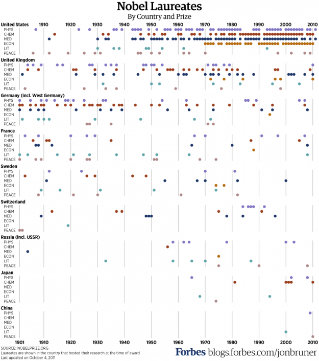
Nobel Prizes have been awarded every year since 1901. Where are all the winners from? Jon Bruner from Forbes puts it in a graphic. It's a simple yet effective approach where dots represent a won award, and countries are sorted by number of prizes won. The United States has clearly dominated the field since 1950, although many winners were foreign-born:


The United States is also unique in the scale on which it attracts human capital: of the 314 laureates who won their Nobel prize while working in the U.S., 102 (or 32%) were foreign born, including 15 Germans, 12 Canadians, 10 British, six Russians and six Chinese (twice as many as have received the award while working in China). Compare that to Germany, where just 11 out of 65 Nobel laureates (or 17%) were born outside of Germany (or, while it still existed, Prussia). Or to Japan, which counts no foreigners at all among its nine Nobel laureates.


Before World War II, it was a different story. Germany led the way.


[Forbes | Thanks, Jon]


Viz: Geographic data doesn’t always have to be mapped

Indeed an excellent post, and an excellent blog by an nyt designer. 

Geographic data doesn’t always have to be mapped

Matthew Ericson, deputy graphics director at The New York Times, talks maps and when you should try something else:

#more 

Maps also a terrific way to let readers look up information about specific places. On election night, they answer questions like like "Which seats did the Republicans gain?" or "Who won all the seats in Oregon?" or "Who won my Congressional district?" You don’t have to remember the number of the House district you live in — you can just look at the map, zero in on the area that you’re interested in, and see if it’s shaded red or blue.


And obviously, when the story is completely based on the geography — "How far has the oil spill in the Gulf spread?" — there’s nothing more effective than a map showing just that.


But sometimes the reflexive impulse to map the data can make you forget that showing the data in another form might answer other — and sometimes more important — questions.


The full post is worth a read, chock-full of examples.


Book: Visualize This: Price Fluctuations

By the flowing data author, Nathan Yao. 

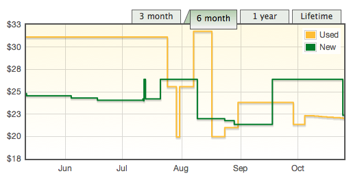
Visualize This: Price Fluctuations

It's been about three months since Visualize This came out, and in case you haven't gotten your hands on a copy yet, now might be a good time to get it. Amazon just lowered the price.


I didn't know price changed so much — although I'm not surprised — I'm guessing based on a number of factors such as third-party prices, competitors' prices, and sales. The Kindle version (not shown) changed a lot in the beginning, costing more than the paperback, but I don't think it's changed since it came down to the current price. You can see the changes, as reported by price tracking site Tracktor (just try to ignore the weird vertical scale).


#more 

The used price is not completely accurate since there weren't any used copies available before the book was released in July.


Also, I'm not entirely sure about the listings for used books on Amazon, as all of them are from resellers with thousands of ratings. Four copies are listed for above retail, and one of those is more than four times as much. That expensive copy must be a special edition that I haven't heard about.


Viz: Google+ Ripples show influence and how posts are shared

Looks cool. A real feature of google plus. Have to give it a try. Is this Wattenberg and viegas?

Google+ Ripples show influence and how posts are shared

Google+ Ripples


#more 

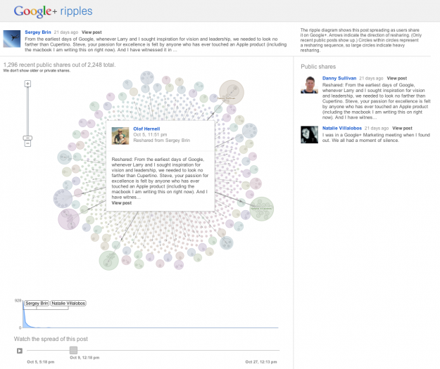
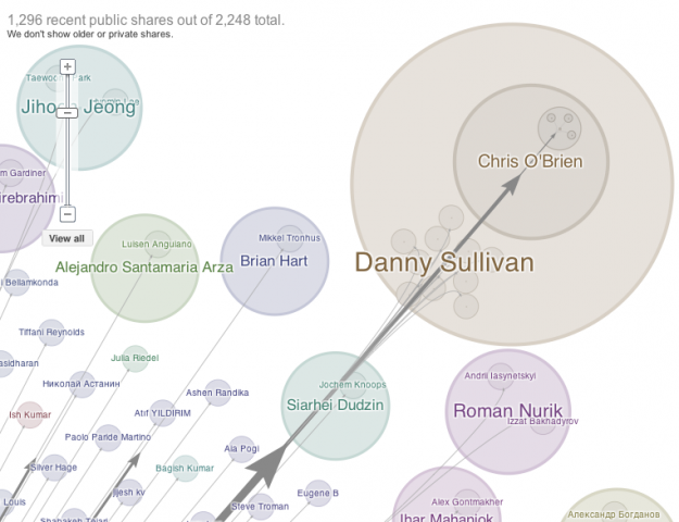
Posts and links get shared over and over again, but we usually don't know how. We get counts, but who shares what and how far do does a link reach? Google+ Ripples gives you a peak into the process. A link or status is posted, and like when a pebble is dropped in a pond, a pattern forms outwards.


The above, for example, is the view for Sergey Brin's update when Steve Jobs passed away. Each circle represents a share, and arrows indicate the direction of a share. Larger circles indicate heavier resharing.


Zoom in to see more details of sharing sequences:


That's not all though. There are lot of details that make this feature impressive. First and most importantly, this feature is available for all users and all publicly shared posts. Select the dropdown options for a post, and 'View Ripples', which brings you to a fast-loading visualization. It usually takes a few seconds for these sort of things to load and process, but Ripples loads instantly.


Then there's the draggable timeline in the bottom that lets you see when shares happen. Press play to see bubbles pop up instantly.


Finally, the visualization is tightly coupled with Google+ itself and not just some lab experiment in the boonies of Google land. A scrollable list of shares on the right update as you zoom in and out of the Ripples, which makes it easy to find influential people and see what people are talking about.


See it in action in the video below, or just try it out for yourself.


[Google+ Ripples via @blprnt]


Fun: Venn diagram: Platypus playing a keytar

Hah! 

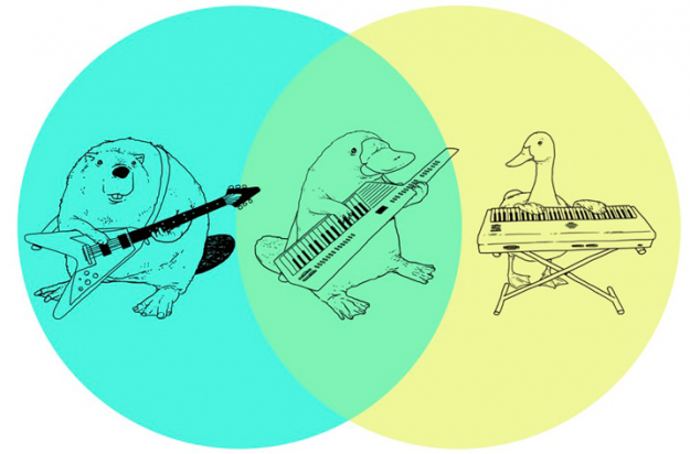
Venn diagram: Platypus playing a keytar

Keytar platypus

The word you're looking for is epic. From Tenso graphics, maker of amusing t-shirt sketches. [via]


Viz: 7 billion people in the world: past, present and future


7 billion people in the world: past, present and future

World population

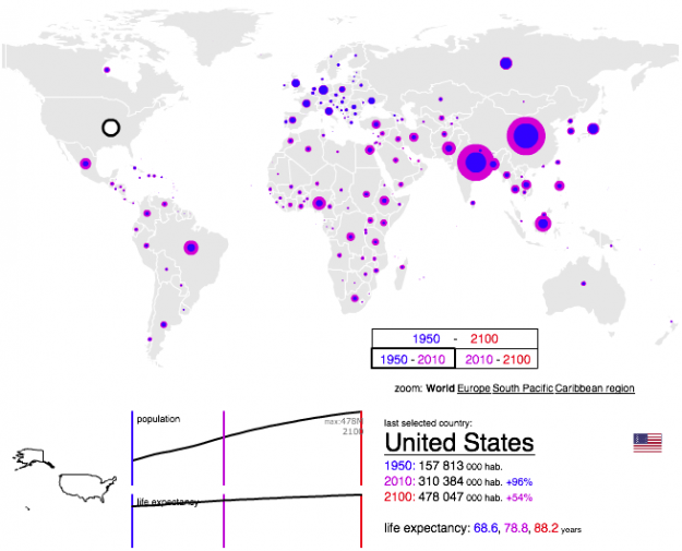
According to estimates from the United Nations Population Division, there are now over seven billion people in the world. That's enough people to fill, like, an entire room. Yeah. Visualization firm Bestiario, for The Guardian, shows this growth by country, using their home-brewed visual programming language, Impure.


There are a few options to play with. You can click on the bubble for a country to see the time series on the bottom for population from 1950 to 2010, through a projected 2100 population. Life expectancy for the same range is also shown. To compare geographically, you can also choose the year filters in the bottom right to compare, say, population in 1950 to that of 2010.


India and China of course pop out in that range, whereas many African populations are expected to increase a lot, percentage-wise, during the next century.


[The Guardian]


Report: Telling Stories With Data website

narrative viz workshop website.

http://data-stories.com/

Report: Telling Stories with Data – VisWeek 2011

A report from the narrative viz workshop at the recent viz conference. 

Telling Stories with Data – VisWeek 2011

Note from Nathan: Last week, visualization researchers from all over gathered in Providence, Rhode Island for VisWeek 2011. One of the workshops, Telling Stories with Data, focused on data as narrative and what that means for visualization. This is a guest post by the organizers: Nick Diakopoulos, Joan DiMicco, Jessica Hullman, Karrie Karahalios, and Adam Perer.

Spotted: Nick Diakopoulos » Unpacking Visualization Rhetoric

A sample of a nice looking paper at the recent viz conference on
visualization as persuasion.

http://www.nickdiakopoulos.com/2011/08/13/unpacking-visualization-rhetoric/