Google+ Ripples show influence and how posts are shared
#more
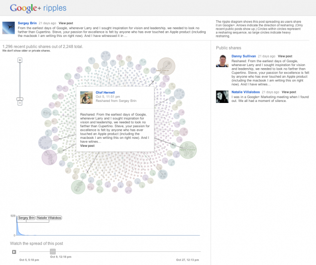
Posts and links get shared over and over again, but we usually don't know how. We get counts, but who shares what and how far do does a link reach? Google+ Ripples gives you a peak into the process. A link or status is posted, and like when a pebble is dropped in a pond, a pattern forms outwards.
The above, for example, is the view for Sergey Brin's update when Steve Jobs passed away. Each circle represents a share, and arrows indicate the direction of a share. Larger circles indicate heavier resharing.
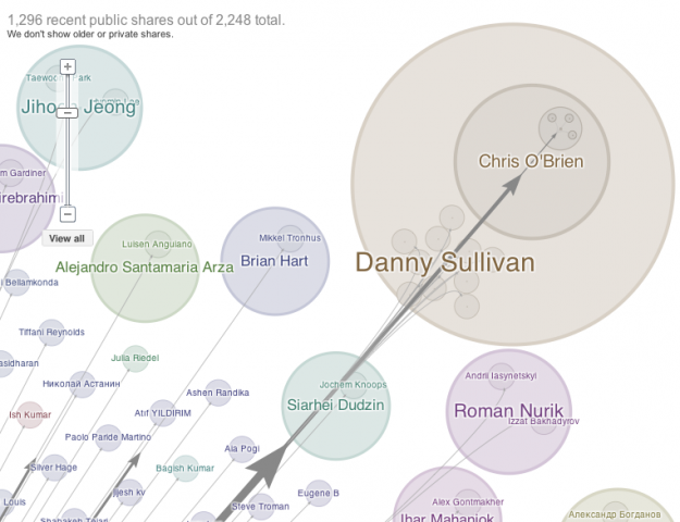
Zoom in to see more details of sharing sequences:

That's not all though. There are lot of details that make this feature impressive. First and most importantly, this feature is available for all users and all publicly shared posts. Select the dropdown options for a post, and 'View Ripples', which brings you to a fast-loading visualization. It usually takes a few seconds for these sort of things to load and process, but Ripples loads instantly.
Then there's the draggable timeline in the bottom that lets you see when shares happen. Press play to see bubbles pop up instantly.
Finally, the visualization is tightly coupled with Google+ itself and not just some lab experiment in the boonies of Google land. A scrollable list of shares on the right update as you zoom in and out of the Ripples, which makes it easy to find influential people and see what people are talking about.
See it in action in the video below, or just try it out for yourself.
[Google+ Ripples via @blprnt]

0 comments:
Post a Comment