Showing posts with label css. Show all posts

Wednesday, August 15, 2012

Find: visualizing the evolution of the web

Behind the scenes: visualizing the evolution of the web

Dero

Sergio

This guest post is by Sergio Alvarez, Vizzuality, and Deroy Peraza, Hyperakt, in collaboration with Min Li Chan, Chrome Team

At Google I/O this year, we launched a new version of The Evolution of the Web, a project visualizing the history and pace of innovation in web technologies and browsers. The Evolution of the Web traces how web technologies have evolved in the last two decades and highlights the web community’s continuous efforts to improve the web platform and enable developers to create new generations of immersive web experiences. In collaboration with the Google Chrome team, the team at Hyperakt designed the interactive visualization while Vizzuality built it using HTML5, SVG, and CSS3.

The visualization included 43 web technology "strands" across 7 browser timelines to represent major developments on the web platform. On hover or tap, each strand is highlighted to reveal intersections that tell the story of when browser support was implemented for each new web technology. To provide additional context, we developed a secondary visualization to illustrate the growth of Internet users and traffic.

Tuesday, November 15, 2011

Reaction: Balancing Systematic and Flexible exploration of social networks


The paper introduces "Social Action" that allows users to understand and analyze Social Network analysis measures. The paper talks about the difficulties in generating multiple views and patterns in case of social networks, mainly due to the umpteen currently used methods and provides a tool that allows users to explore the social network graph and allows for "customized" ranking of nodes.

The paper introduces attribute rankings and coordinated views which provide flexible mechanisms to the user like color coding, filtering, dynamic queries to analyze the structure of the social graph. A simple and obvious problem that will be faced in case of such enormous graphs are its breadth. In order to handle this, the users can aggregate nodes based on a criterion. The authors also introduce measures to rank nodes based on linkage between nodes or the graph properties. The users can then apply filter to these nodes based on their ranks and also compare them based using scatter plots. These strategies work even in case of multiplex social networks.

Thus, it provides the users an easy and flexible way to view visualizations and understand and find patterns, find similar groups of people and detect anomalies easily.

Friday, November 11, 2011

Tool: Introducing Closure Stylesheets

Variables for CSS. 

Introducing Closure Stylesheets

(CSS is for programming, not for pasting)

When the Closure Tools were first released a little over two years ago, they gave web developers the ability to organize and optimize their JavaScript and HTML in a new way. But there was something missing, namely, a tool to help manage CSS.

Thursday, September 15, 2011

Data: Rich Snippets for Apps

App store data. 

Rich Snippets for Apps

Now that both the Apple App Store and the Android Market have Web interfaces, Google decided to show better snippets for the results from these sites. The next time you search for [Angry Birds], [Cut the Rope], [Shazam] or [ASTRO File Manager], you'll find results that include a small icon, the app's rating, the number of reviews and the price. For now, only the results from the Android Market include thumbnails.


Thursday, September 8, 2011

Viz: Access to Wikileaks

via bitly blog on 9/13/10

This Wednesday September 15th at 6pm, we will open the doors to our New York office for our third monthly hackabit hackathon! Our first two hackathons spawned lines upon lines of JavaScript, Python, C, Haskell, R, and many other delightful languages.  A Wikileaks data visualization project from last month’s hackabit ii even got a shout-out in the New York Times bits blog.

This month’s hackathon promises to be particularly action-packed, as we will be rolling out some awesome new metrics-related bit.ly API endpoints. We will be holding another API contest in the near future, so be sure to come by if you want a head start!

If your project isn’t bit.ly-related, have no fear - all code is good code at our hackathon. Come hack, snack and throw back (some energy drinks) with us! Click here for more information and to register - we hope to see you there.

Monday, September 5, 2011

Data: Top500 SuperComputer Sites

The TOP500 Project was started in the year 1993. It keeps track of the trends in the field of high performance computing. The best performance on the Linpack benchmark is used as performance measure for ranking the computer systems. The main objective of the project is to provide a ranked list of general purpose systems that are commonly used by high end systems.

The project reports data of the top supercomputer sites across the globe and to make the information available over internet more compact it shows brief description of the installation site , the manufacturer, computer, field of application, position w.r.t other top computers and other relevant information about a particular supercomputer without going into its minute detail.

From the available database of all the top 500 super computers from 1993 there are interfaces that allow users to create sublists of the available lists. It also allows creation of single list statistics and charts of a particular super computer available in its databases. Of the available list of supercomputers dating 1993 there are interfaces that allow users to create historical charts to track changes over time. The project also provides information about related papers and books that can be referred in the field of high performance computing. Apart from having an effective user interface for deriving statistical information about vendors both w.r.t systems produced and their performance they also allow users to access the data in a table format. The lists maintained by the project are available for download both in an excel format and as XML data . This website is observed as a very good reference to know things about the fastest computers of the day and are updated twice every year.

Sunday, September 4, 2011

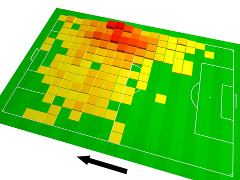
Viz: On the role of bacon in visualization

A nice critique of a media viz. Note the few ref on color

On the role of bacon in visualization

I recently ran across a chart on Spiegel Online, the most popular German site for online news. The chart was a tilted 3D heatmap in fully saturated primary colors, with a thick black arrow aside.


Monday, August 29, 2011

Data : IBM Many Bills , A visual Bill Explorer


Transparency is the key in Governance. There are a lot Bills which are enacted into laws by the Government of the Day. This portal pulls all the data from the thomas website. The whole idea is to allow users to search the bills, explore them and also know how each of their representative has contributed .

There are a lot of search options and it is customizable to some extent. The idea is to present the legislation in a manner that is easily understood by the end users. There are various predefined tags which are mapped to a particular color code. By entering the key word , all the bills which have the key words are returned , along with the color codes which help in drilling down the exact section that we might be interested in.

This is still in Beta and its performance is a big question , as it is very slow and hence can impact the user experience.

The portal is open and can be used for searching the bills. here.

Sunday, August 28, 2011

Data: FAWN

The Florida Automated Weather Network (FAWN) provides up-to-date weather information by collecting information from system of automated weather stations distributed throughout the State of Florida. Though it is used for many purposes its critical for agriculture. FAWN database servers is maintained by IFAS Information Technologies.They receive weather data from remote stations every 15 minutes. The information is processed and made available almost instantaneously through several different search methods accessible through FAWN web server, as well as an interactive voice-response system. Graphical representation of the data can be seen here

FAWN weather data are stored in searchable databases. Temperature, Dew point,  Relative Humidity, Rainfall, Solar Radiation, Wind Speed etc are some of the parameters which are returned by the database collected from the stations in the map here

Different method to access the data
1) Report Generator
2) Latest Observations
3) Graphic Weather Data
4) Data Feeds
5) FTP : Yearly CSV Data

Thursday, August 25, 2011

Data: SpotCrime


SpotCrime.com is a popular and comprehensive source of crime information on the web. The reported crimes include arrest, arson, assault, burglary, robbery, shooting, theft and vandalism. This data enables us to compare the crime rates in different cities. SpotCrime is owned by ReportSee, Inc.The crimes reported in any city/state can be looked up by entering the relevant address. The information is mainly collected from news reports and police departments. Also,new crimes can be reported.One of the main advantages of SpotCrime is that the crime locations are displayed on Google maps.

The link is http://www.spotcrime.com/. The data from spotcrime.com can be obtained by aggregating the RSS feeds. These feeds which are XML files can be used as source for visualizations. For example, http://s3.spotcrime.com/cache/rss/san-antonio-denver-heights.xml  http://s3.spotcrime.com/cache/rss/pittsburgh-mount-washington.xml
(These are obtained from the RSS feeds section in Spotcrime.com)

If required, the feeds can first be converted to JSON/CSV formats and then used in the visualizations. For example, in the link http://geocommons.com/overlays/156043 , the RSS feeds are used as the source and made available to the users in JSON, Excel and other formats.Some of the static datasets can also be found. For example, here is one dataset: http://www-958.ibm.com/software/data/cognos/manyeyes/datasets/crime-data/versions/1   (Please click 'View as Text' in the above link)

In addition, an interesting visualization built in HTML5 and Protovis shows when these crimes happen in 25 different cities across the Unites States and can be found here.

References:
http://en.wikipedia.org/wiki/SpotCrime.com


Tuesday, August 23, 2011

Sunday, August 21, 2011

Viz: Thinking Machine 4 ( Chess Visualization )


Thinking Machine 4 is visualization of chess game engine. The chess engine is simple and uses only basic algorithms from the 50s (alpha-beta pruning and quiescence search). This visualization tries to portray how computer thinks (in this algorithm) and shows the moves it is computing.


In this after every human move thinking machine shows how computer is trying to calculate potential future moves.It is shown with the arcs of different color.The brighter arcs are thought by the program to be better.

It also shows the wave of influence for each piece on board.This shows the effective attack range of that piece.(Which could be useful for very naive new player)


Its simple and interesting visualization and shows very interesting moves while playing it.This can bee really useful in judging and developing game play for chess. However as there are so many arcs one easily loose the track and it looks a bit cluttered.


Technologies Behind:
  1. HTML
  2. JAVA-APPLET
  3. PROCESSING(for graphics)
Its bit different from other visualization on terms of technology as it uses applet and lot of server side computation.

References:

Viz: TouchGraph Amazon Browser

This classic graph visualization lets the user search for books, movies,electronics with a slight twist. The "TouchGraph Amazon Browser" enhances the browsing experience by allowing the user to explore connections between related items to the searched term. The search can be made in different categories like books, music or movies. Once the searcg graph is displayed, every individual item can be clicked on to to get detailed product information along with a link to the standard Amazon page for the product.

Going into the tecnicalities of the visuzlization, the TouchGraph search relies on the cluster methodology to fully represent the searched item, related item, recommended items by taking into account the sales rank of each item as calculated by Amazon.

Concept of Clusters: As mentioned in the "Help" section of the TouchGraph Amazon Browser, the clusters are formed for similar items to the searched item which are a part of Amazon's recommended list. The size of the bubble for the image is based on the sales rank as calculated by Amazon. The exact algorithm for calculating sales rank is given in the "Help" section.The cluster toolbar is provided to allow the user to change the number of clusters,colors given to the clusters.

I found this visualization very intuitive and rather interesting to use than the normal website method. The visualization of the clusters according to common subjects, recommendations, sales rank gives all related information about a product at a glance which makes it a very effective method.

Try a demo of this at http://www.touchgraph.com/amazon

Apart from Amazon, TouchGraph also has similar interactive visualizations for FaceBook and SEO.

Wednesday, July 13, 2011