On the role of bacon in visualization
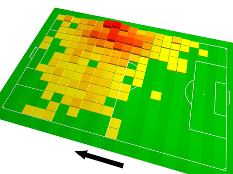
I recently ran across a chart on Spiegel Online, the most popular German site for online news. The chart was a tilted 3D heatmap in fully saturated primary colors, with a thick black arrow aside.
I quickly uttered my surprise at the presence of such a poorly designed chart — esp. in such a high profile online publication — in a snarky Twitter comment, and soon after, Robert Kosara posted a whole blog post defending the graphic, and calling for “a bit more subtlety in our criticism”.
Well, I am not sure if Twitter was optimized for subtlety, yet, I guess I should clarify a bit the background of my judgement (especially since Robert’s speculative assumptions about my train of thought is not accurate in all points).
The chart in question shows the amount of a certain soccer player’s presence in different areas of the field. The field is divided in cells, and in each cell, a little “tower” indicates by height and color the amount of the player’s presence in that cell. Essentially, this makes it a hybrid of a heatmap and a 3D bar chart overlaid over a soccer field.
The redundant encoding (i.e., in this case, using height and color to encode the same value) is nothing bad per se, and in this case quite justified, as both the color encoding as well as the 3D bars height alone would be too weak visual variables for the data.
The 3D-y-ness of the chart? I am not fond of it. I find it a very clear case of “Hmm, this looks a bit bland. Maybe we should tilt it a little? Ooh look, how awesome.” Frankly, to me this is just childish. Let me put it this way: Bacon is a legitimate ingredient to many dishes, and can be quite tasty, when used right. But if your cooking style is to start with cooking something bland, and then add bacon to make it less bland, then, trust me, you are not a great cook. A great cook makes a feast out of a simple egg, they say, and I think this is what we should aspire to.
The arrow? Well, it serves its purpose, but it is quite loud, isn’t it. The missing legend, title, and description of the data and its transformations? Why bother? We have a 3D chart!
Anyways, all of that is not that grave, maybe even nit-picking, but the one thing that is unforgiveable about the chart is the color palette. If you do a heatmap, there is...

0 comments:
Post a Comment