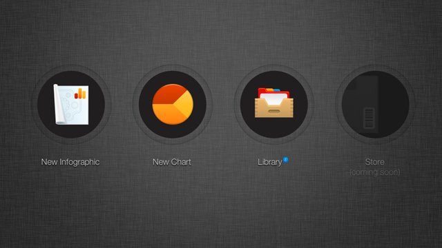
Making idiot-proof infographics with Infogr.am
Let's say you want to compare the airspeed velocity of various unladen swallows. You could put that data into a spreadsheet, or present it using a graph. Chances are you'll pick the latter.
The question is, how do you create a graph that not only looks nice, but presents said data in a coherent, easy to understand way? You could go the traditional route, and make something basic in Microsoft Office or your productivity suite of choice. Or, if you have a bit more skill, you could opt for the flexibility of Adobe Illustrator instead. But perhaps you have neither software nor skill, and just want to make a simple graph or chart.
Infogr.am takes the same approach that Tumblr took to blogging, by turning the otherwise daunting task of creating great infographics into a process that's dead-simple. You bring the raw data to Infogr.am, and the site's online tool can help you turn that data into a nice looking chart or full-blown infographic in minutes. It's really that simple—assuming you have a Facebook or Twitter account required to login—though, at times, to a fault.
0 comments:
Post a Comment