People moving
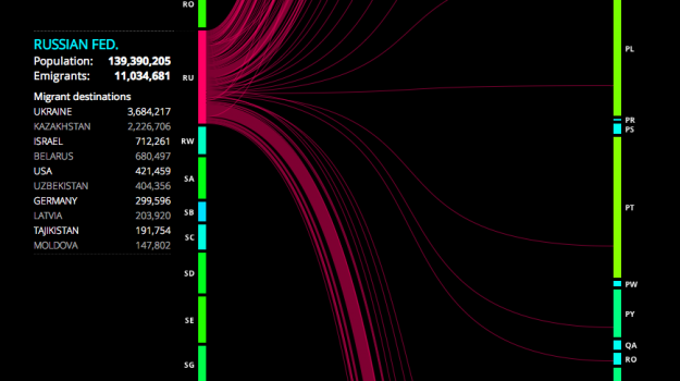
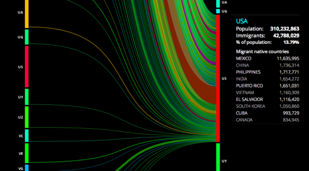
Hundreds of thousands of people immigrate every year, with some countries seeing higher rates than others. To compare and to gain a better sense of the number of people moving around, Carlo Zapponi created peoplemovin.
Each side is a super long stacked bar that represents international migration in 2010, and countries are in alphabetical order. Click on the left to see emigration from the selected country or click on the right to see where people have immigrated from.

I'm kind of struggling with the line lengths because the bars are so long. You're looking at migration — people moving from point A to point B — but a long line doesn't mean anything. The color scheme, which I think represents migration rates, is also not clear. So take it for what it is. It's still interesting to click around.

0 comments:
Post a Comment