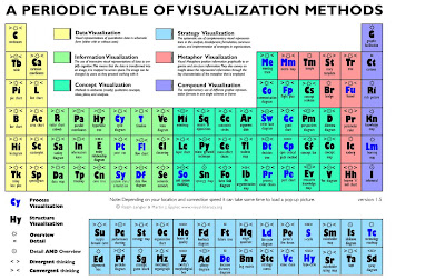
The branch of visualization studies is an emergent one and very few attempts have been made to make it a structured domain of research which includes many different sub-domains like the human-computer interaction, graphic design, management or achitecture. The creators the the periodic table of visualization tried to gather potential candidates for inclusion in the visualization and those methods which best meet the requirements of visualization.
To gather potential candidates the researchers(Ralph Lengler and Martin Eppler) consulted many websites whose focus is compilation of visual methods for problem solving, learning etc, books on visual methods and last but not the least the articles from scientific journals which generally apply visual methods.
The resulting periodic table is roughly based on periodic table of elements which developed in late 19th century by Dmitri Mendeleev. The figure is as shown below -
The actual interactive visualization of the Periodic Table of visualization can be found here
This periodic table is constructed along two dimensions: Periods and groups. Of the several dimensions that are deemed most relevant, the authors found complexity of visualization most fitting for 'periods' and application area most fitting for groups. Similarly as one moves down a column one can find similar methods as the ones on the top level but getting more and more complex. (eg. spectogram more complex than line chart)
What I find particualarly interesting is the chart is in accordance with Ben Shneiderman’s visualization mantra of Overview first, zoom and filter, then details on demand since it presents in the overview the structure and the details on demand when clicking on a symbol in web-based versions or in a printed version when one look closer.
This periodic table represents the rough schematics of periodic table of elements in the sense that it tried to map different visualization methods with the position of elements. If one wants to access data from the map then just clicking over a particular visualization slice(as they refer to it) can generate a overlay which contains more data for that dataset.
The dataset in this example I found was the overlay window which provides more information of the visualization method that has been focused by hovering over it. The API feeds the overlay window with the data which is related to the corresponding hovered slice.
The overlib javascript library is used for generating the data inside in the tooltip.
My PPT - Work in Progress

0 comments:
Post a Comment