Is red bigger than blue, or smaller? Heat maps have problems. 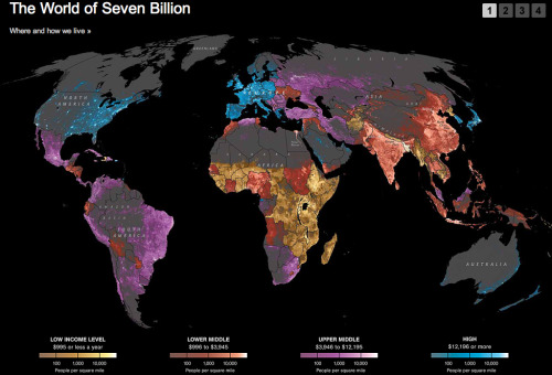
covestor:Here’s an amazing new graphic from National...
Here’s an amazing new graphic from National Geographic that maps income levels on top of world population densities. In a glance you can see where humans live on earth and at what wealth level. Click through for the full thing, plus more demographic information (on pages 2-4) broken down by income level: (via Where and on how much money the world lives ‐ Covestor)
Sent from my iPhone
0 comments:
Post a Comment