Thursday, March 14, 2013

Data: Public Data Website to Launch This Week

Public Data Website to Launch This Week

Data geeks can rejoice as the City of Raleigh makes more public information available through its new website.


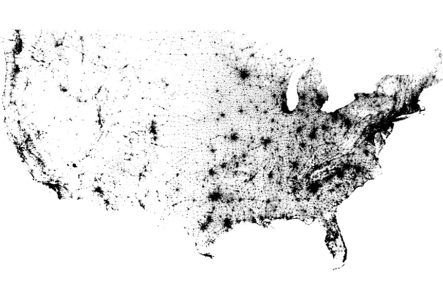
This week the City will launch Open Raleigh, a new platform for storing, accessing and visualizing public data. It’s appropriate timing, considering March 10-16 is Sunshine Week, a celebration of open government.


City officials hired Socrata, a company that specializes in open data, to host the site, which will include various forms of public information. The city will spend $10,000 on a four-month pilot and then $50,000 for a full year after the pilot is over.


When Open Raleigh launches in a beta version Friday, residents will have access to fire, police, census and building permit data as well as some financial data. More data will continue to be added as the public requests it.


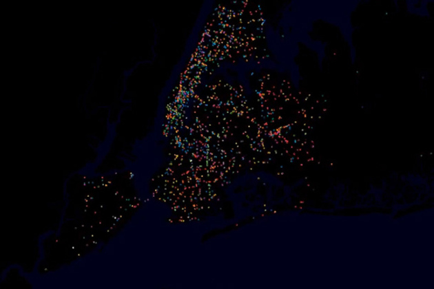
The data will be in a readable and downloadable format so it can be manipulated or visualized in a number of means. For example, neighborhood leaders can create crime maps for their communities, or mobile application developers can create an app that tells users where to find the nearest greenway.


A full launch will be done in late September and will include a full financial ledger.


Eventually, Open Raleigh will be compatible with other regional municipalities and include data from county, state and the federal government.


City IT staff and members of the Technology and Communications Committee this week discussed ways the City could measure the return on investment and track how the data is being used, but more work will need to be done before that is possible.

Tuesday, January 1, 2013

Viz: The Census Dotmap contains one black dot for every person in the US, and nothing else

The Census Dotmap contains one black dot for every person in the US, and nothing else

Census Dotmap

There are 308,450,225 dots on the map you see above. One for every person living in the United States, based on data from the 2010 Census. It doesn't seem plausible when you're looking at the entire country; metropolitan areas seem to be represented by indistinct swaths of black rather than tiny dots. But zoom in and even the most populated cities are finely broken down. There are no state borders, city lines, or individual roads represented on the Census Dotmap, as creator Brandon Martin-Anderson calls it. Nor is there any topographic data integrated here, yet the exhaustive reference still manages to offer a good sense of areas where nature prevents settlement. In fact, it lines up wonderfully with stunning imagery of Earth at night...

Wednesday, November 28, 2012

Spotted: how differences in cognition and personality affect visualization - Understanding Visualization by Understanding Individual Users,

Understanding Visualization by Understanding Individual Users

Visualization is often seen as a tool to support complex thinking. Although different people can have very different ways of approaching the kind of complex task that visualizations support, as researchers and designers we still rarely consider individual differences in creating and evaluating visualizations. This article reviews recent research on individual differences in visualization and human-computer interaction, showing that both cognitive abilities and personality profiles might significantly affect performance with these tools. The study of individual differences has led to the conclusion that advances in this important area in visualization will require more focused research. Specifically, we must isolate the cognitive factors that are relevant to visualization and the design factors that make one visualization more suited to a user than another. In doing so, we could increase our understanding of the visualization user and reshape how we approach design and evaluation.

Tuesday, November 27, 2012

Find: Beautiful and meaningful - Watch the beauty of public transit unfold in New York, Boston, and other cities around the world

Watch the beauty of public transit unfold in New York, Boston, and other cities around the world

nyc traffic video

YouTube user STLTransit has a wonderful collection of videos that visualize the movements of the public transit systems of various locations — turning public transit data into a flowing display of a city's daily life. Each video shows the ebb and flow of traffic during a single day, with various transit systems like bus and rail shown in different colors. The result is a brief but exciting glimpse at our world — a satellite's view of a city's living protoplasm on the streets below.

Monday, November 26, 2012

Find: Robert Kosara's visualization history

Robert Kosara (@eagereyes)

11/26/12, 11:24 AM

New on eagereyes: The Changing Goals of Data Visualization eagereyes.org/criticism/chan…

Monday, November 12, 2012

Spotted: how people choose summarizing phrases - Descriptive keyphrases for text visualization

“Without the clutter of unimportant words”: Descriptive keyphrases for text visualization

Jason Chuang, Christopher D. Manning, Jeffrey Heer

Keyphrases aid the exploration of text collections by communicating salient aspects of documents and are often used to create effective visualizations of text. While prior work in HCI and visualization has proposed a variety of ways of presenting keyphrases, less attention has been paid to selecting the best descriptive terms. In this article, we investigate the statistical and linguistic properties of keyphrases chosen by human judges and determine which features are most predictive of high-quality descriptive phrases. Based on 5,611 responses from 69 graduate students describing a corpus of dissertation abstracts, we analyze characteristics of human-generated keyphrases, including phrase length, commonness, position, and part of speech.

Thursday, October 18, 2012

Find: NYT Viz - How States Votes Have Shifted

Interesting visualization of bipolar values over time. Careful design here. 

Over the Decades, How States Have Shifted

An interactive graphic shows the political evolution of each state from 1952 through 2008 and the states' current standing in the FiveThirtyEight forecast.