Wednesday, December 11, 2013

Find: data and visualization politics begin #finds #visualization #data #politics

An early example of what will soon be a flood of data rhetoric. 
 
 
// published on Latest Posts | The Atlantic Cities // visit site
Why New Yorkers Are Hating on the NYPD's New Interactive Crime Map

The New York Police Department unveiled a user-friendly interactive crime map last weekend. You can look at crime by precinct, by address, or on a heat map. One can also toggle between murder, rape, or a view that shows all seven major felony crimes.

The NYPD designed the interactive map at the behest of the New York City Council, and it's pretty good from a visual perspective. Yet New Yorkers aren't happy with it. 

Bronx Councilman Fernando Cabrera told DNAInfo that the map isn't at all what the council was talking about in May, when it mandated the NYPD to create a crime map. As you can see in the screenshot above, the NYPD's map doesn't contain important information like time and date, nor does it break out each incident with specific details. Cabrera added that the NYPD worked on the map "in obscurity," didn't keep the council updated on its progress, and ultimately has created a map that is "sub-standard to what you find in other states and in other cities, likes Chicago." 

The other major criticism of the map comes from advocates for bicycle and pedestrian safety. The Village Voice argues that the absence from the map of vehicular injuries and homicides is "a giant, gaping blind spot in the data visualization." It's also in keeping with NYPD Commissioner Ray Kelly's views on traffic deaths. 

As Sarah Goodyear reported in October, Kelly believes prosecuting reckless driving is too complex. "Some people say that the police are not arresting enough people for reckless driving and that sort of thing. Well, you have to — and there are many court decisions that say this — you have to observe the violation," Kelly said at The Atlantic's CityLab summit. "It takes in-depth investigation and examination, it takes witnesses, it's much more complex than you might think."

If the NYPD omitted vehicular homicides from its crime map because it doesn't have the resources to investigate all vehicular homicides as crimes, why not do the next obvious thing, and create a separate map? The city council held a hearing in October to discuss this very idea. The NYPD's position? We don't wanna. As Streetsblog noted at the time, Susan Petito, assistant commissioner of intergovernmental affairs for the NYPD, testified before the council that because vehicular accidents are cataloged by the nearest intersection, not the nearest address, the maps won't be useful or even all that intelligible.

When asked if the NYPD would like to join the council in finding a way to map vehicle incidents more accurately, Petito replied, "The utility of a street address, I can't sit here and tell you that would add anything."

Bicyclists and pedestrians just can't win with the current NYPD. 

Saturday, November 30, 2013

Data: Vaccinations have prevented at least 103 million cases of contagious disease since 1924 #data


 // published on The Verge - All Posts // visit site
Vaccinations have prevented at least 103 million cases of contagious disease since 1924

Vaccinations have been credited with some of humanity's greatest health technological triumphs over disease, including drastically reducing polio around the globe and almost eliminating smallpox entirely. But how many people have been spared life-threatening infections thanks to the introduction of vaccines? At least 103.1 million children in the US alone since 1924, according to a new analysis of historical infection rate data going back to 1888.

Continue reading…

Tuesday, November 19, 2013

Find: A Bewitching Look at Migration Patterns Among American States #finds #census #visualizations

The color, curvature and symmetry here is especially appealing. However, the form doesn't scale well: it's hard to see the flows of all states at once, and the bidirectional nature of the flows aren't represented. A centered matrix would communicate more clearly, though some pleasing curvature would be gone. 

Good inspiration for the nc innovation data. County to county flows? 

*** 
 
// published on Latest Posts | The Atlantic Cities // visit site
A Bewitching Look at Migration Patterns Among American States

New York residents must really get sick of the winter snow and gloom. How else to explain that more of them moved to Florida in 2012 than any other state?

That's just one of the fascinating nuggets of demographic trivia waiting to be uncovered in this wild-looking visualization of state-to-state migrations. The prismatic, arc-veined portal – like peering into the scope of an alien hyper-rifle – shows the movements of the roughly 7.1 million Americans who relocated across state lines in 2012. It's based on the U.S. Census Bureau's American Community Survey, an annual tabulation of moves that just so happens to include the involuntary uprootings of prisoners and members of the military.

"Restless America" is the work of Chris Walker, a data-analytics virtuoso in Mumbai who also made that clever visualization of property values in New York City. As to why he embarked on this project, Walker explains via email:

I'm really interested in migration, as I think migration patterns show that people still see opportunity and hope for better lives, and they're willing to take risks. I see migration as a form of 'creative destruction'; it renews and enriches some communities while eroding others. This process strains individual cities, but I think it's healthy for the country overall. People need to dream and be allowed to act on their dreams. I wanted to show this on a national scale.

The graphic may look like spaghetti pie at first glance, but it really is beautifully simple once you learn how to navigate it. Here's Walker explaining about that:

The visualization is a circle cut up into arcs, the light-colored pieces along the edge of the circle, each one representing a state. The arcs are connected to each other by links, and each link represents the flow of people between two states. States with longer arcs exchange people with more states (California and New York, for example, have larger arcs). Links are thicker when there are relatively more people moving between two states. The color of each link is determined by the state that contributes the most migrants, so for example, the link between California and Texas is blue rather than orange, because California sent over 62,000 people to Texas, while Texas only sent about 43,000 people to California. Note that, to keep the graphic clean, I only drew a link between two states if they exchanged at least 10,000 people.

For an example, let's go back to New York. If you put the mouse pointer over the state name, the graphic quickly informs you that more people recently exited than entered – 405,864 to 270,053, respectively. It also resolves into this minimalist view:

Gray strings represent all the states that New York sent more than 10,000 people to in 2012. The thickest band runs to Florida; click on it and you'll see that 53,009 New Yorkers headed for the Sunshine State and are perhaps appearing in Florida Man's Twitter feed this very instant. Conversely, 27,392 Floridians moved to New York and might now be experiencing the joy of $14.50 packs of cigarettes.

Regarding the uneven transfer of bodies between these particular states, Walker writes that his "hunch is that these are retirees" decamping for the balmy Southeast. Other popular destinations for people escaping from New York include New Jersey and Pennsylvania, which Walker has a theory for, as well: "More likely these folks are leaving pricey New York City for more affordable suburbs in neighboring states."

Not all interstate transmissions are this lucid. Take a look at California, for instance, which last year had migration pathways to more than 30 states:

With such a geyser of colored lines, it might be hard to immediately fathom a most basic point that in 2012 more people left California (566,986) than entered (493,641). Walker believes the imbalance may be due to residents tired of exorbitant prices seeking a lower cost of living. Here are a few more of his insights:

  • Migrants are flocking to Florida. Interestingly the state contributing the most migrants to Florida is neighboring Georgia. Texas, New York, and North Carolina are the next largest contributors.
  • Texas is the second-largest destination for migrants. Over 500,000 people moved to Texas in 2012. People tend to come from the Southeast, Southwest, and the West, with the biggest contributor being California. 62,702 Californians packed up and moved to the Lone Star state in 2012.
  • Most people leaving DC tend to stay in the area, opting for Virginia or Maryland. The economy of DC, centered around the federal government, seems to discourage more distant migrations.
  • The migrants who leave two very cold states, Maine and Alaska, have very clear preferences. Their most popular destinations are Florida and California.

Images created by Chris Walker

Friday, August 23, 2013

Find: visualizing how foods "go" together #finds #graphs #visualization

Not sure nodes and links were the best choice here. 

---

// published on The Verge - All Posts // visit site

PB&J: One chart shows how 381 different foods will taste together

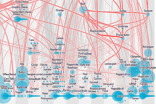
Some tastes just fit together perfectly — but why? This month, Scientific American tackles the question with an interactive chart, combining chemical analysis of 381 ingredients with data from over 50,000 recipes. The red lines indicate a shared chemical compound, like the common sugars between an apple and a glass of white wine. The analysis also unearths less expected links, like a surprising number of shared compounds between soybeans and black tea. It's a matter of taste whether those common compounds actually make the foods taste better together, but there's reason to think they do. The underlying research finds that, in European cuisine at least, chefs tend to pair flavors based on shared chemistry.

Continue reading…

Saturday, August 17, 2013

Find: New York City's Wealth Gap, Mapped In 3D

Mapping wealth to height feels intuitively right. Why? 

---
  
// published on Latest Posts | The Atlantic Cities // visit site

Visualization of the Day: New York City's Wealth Gap, Mapped In 3D

In a new set of visualizations, Nickolay Lamm, the artist and researcher who made these eerie GIFs of U.S. cities underwater, is drawing attention to the extensive of wealth inequality in Manhattan.

Lamm's inspiration came from standing atop Mt. Washington in his hometown of Pittsburgh and asking: what if you could see the inequality hidden behind the relatively even Pittsburgh skyline? Lamm explained via email why he ultimately decided to explore New York City's wealth gap instead:

I know that, for many people, moving New York City is the start of their journey to achieve the American Dream. The American Dream suggests that if you work hard enough, you can achieve it. However, it's clear that the landscape in order to achieve that dream is not as even and equal as it appears on the surface.


View of Manhattan 


View from Central Park to Harlem 


View from Harlem 


View from Yankee Stadium in the Bronx 


View of Lower Manhattan 

Using the above map of median net worth in New York City (based on 2010 Census data), Lamm created 3D bar shapes for each block. So a block where the median income is $500,000 translates to a 5 cenitmeter bar, $112,000 to 1.12 centimeter, and so forth. Lamm then used Google Earth to make sure the bars were placed accurately on the photos.

What about other cities? Lamm says he may do Los Angeles, Chicago, Washington D.C., Miami, and or Philadelphia next.


Wednesday, June 19, 2013

Find: Map the iPhone Users In Any City, And You Know Where the Rich Live

Echoes of the recent pew survey showing that android is used more heavily among lower income groups. And if incomes group by both space and os, then os also clusters in space. 

Ssup in Indonesia though? Maybe blackberry's security is important to them?? 

---

// published on Latest Posts | The Atlantic Cities // visit site

Map the iPhone Users In Any City, And You Know Where the Rich Live

Our stuff often says a lot about us, whether we own a hybrid car or a station wagon, a MacBook Pro or an ancient desktop. And this is no less true of our smart phones, sold on a sharply divided market between iPhones, Androids, and Blackberries.

Among other things, cell phone brands say something about socio-economics – it takes a lot of money to buy a new iPhone 5 (and even more money to keep up with the latest models that come out faster than plan upgrades do). Consider, then, this map of Washington, D.C., which uses geolocated tweets, and the cell phone metadata attached to them, to illustrate who in town is using iPhones (red dots) and who's using Androids (green dots):

That picture comes from a new series of navigable maps visualizing some three billion global, geotagged tweets sent since September of 2011, developed by Gnip, MapBox and dataviz guru Eric Fischer.* They've converted all of that data from the Twitter firehose (this is just a small fraction of all tweets, most of which have no geolocation data) into a series of maps illustrating worldwide patterns in language and device use, as well as between people who appear to be tourists and locals in any given city.

The locals and tourists map scales up a beautiful earlier project from Fischer. You could kill a few hours playing with all of these tools, built on the same dataset. But we particularly liked looking at the geography of smart phone devices. As in Washington, above, iPhones are often more prominent in upper-income parts of cities (and central business districts), while Androids appear to be the dominant device in lower-income areas.

These maps are also a blank canvas with nothing on them other than tweets. To the extent that you can easily make out the Washington Beltway above, or plenty of other roadway networks throughout the rest of these maps, that means people are tweeting while driving (or, preferably, sitting in the passenger seat).

Here is New York City, which has a smattering of Blackberries in Manhattan (yes, it's possible to tweet from a Blackberry). That green patch to the left is Newark:

Here is Chicago:

And Houston:

Atlanta:

Los Angeles:

And one place that really loves Blackberries? Jakarta.

Correction: This article initially misspelled Eric Fischer's name.

All images courtesy of MapBox, Gnip and Eric Fischer.

Thursday, March 14, 2013

Data: Public Data Website to Launch This Week

Public Data Website to Launch This Week

Data geeks can rejoice as the City of Raleigh makes more public information available through its new website.


This week the City will launch Open Raleigh, a new platform for storing, accessing and visualizing public data. It’s appropriate timing, considering March 10-16 is Sunshine Week, a celebration of open government.


City officials hired Socrata, a company that specializes in open data, to host the site, which will include various forms of public information. The city will spend $10,000 on a four-month pilot and then $50,000 for a full year after the pilot is over.


When Open Raleigh launches in a beta version Friday, residents will have access to fire, police, census and building permit data as well as some financial data. More data will continue to be added as the public requests it.


The data will be in a readable and downloadable format so it can be manipulated or visualized in a number of means. For example, neighborhood leaders can create crime maps for their communities, or mobile application developers can create an app that tells users where to find the nearest greenway.


A full launch will be done in late September and will include a full financial ledger.


Eventually, Open Raleigh will be compatible with other regional municipalities and include data from county, state and the federal government.


City IT staff and members of the Technology and Communications Committee this week discussed ways the City could measure the return on investment and track how the data is being used, but more work will need to be done before that is possible.

Tuesday, January 1, 2013

Viz: The Census Dotmap contains one black dot for every person in the US, and nothing else

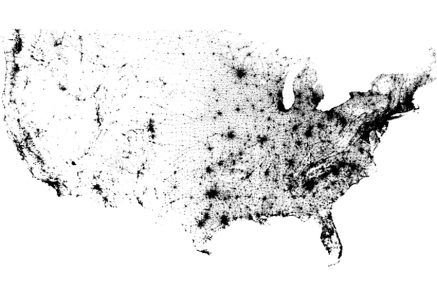
The Census Dotmap contains one black dot for every person in the US, and nothing else

Census Dotmap

There are 308,450,225 dots on the map you see above. One for every person living in the United States, based on data from the 2010 Census. It doesn't seem plausible when you're looking at the entire country; metropolitan areas seem to be represented by indistinct swaths of black rather than tiny dots. But zoom in and even the most populated cities are finely broken down. There are no state borders, city lines, or individual roads represented on the Census Dotmap, as creator Brandon Martin-Anderson calls it. Nor is there any topographic data integrated here, yet the exhaustive reference still manages to offer a good sense of areas where nature prevents settlement. In fact, it lines up wonderfully with stunning imagery of Earth at night...