Wednesday, February 15, 2012

Find: 'Binary Tetris' source code will fit in a tweet

Sweet!

The Verge - All Posts
Binary Tetris

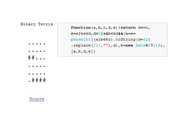
Like minimalist games? Then you won't do much better than Binary Tetris, a reworking of Tetris into dots and pound signs. GitHub user Aemkei, who has previously translated Conway's Game of Life and a 3D "library" into code of 140 characters, has recreated Tetris in enough JavaScript to fill a tweet. The game's blocks come only in one shape, and there's no way to rotate them, but it's an interesting proof of concept that can be played here. There's also no scoring system, so we amateur players can get a break from the competitive Tetris masters in our midst. For fully annotated code, click through to the source link below.

Find: HTML5 bullets: Sencha issues developer scorecard for Chrome on Android

Chrome is a big leap forward for android and html5 webapps. 

Ars Technica

Google issued a beta release of Chrome for Android last week. The port, which brings Chrome's feature set and excellent support for Web standards to Android, is a major improvement over the mobile platform's current default browser.

As we reported in our coverage of the beta, Android's default browser has historically had difficulty handling sophisticated application-like Web experiences. The new port of Chrome has the potential to remedy that weakness and bring highly competitive HTML5 support to Android.

Monday, February 13, 2012

Tool: Weave for visualization development

Not sure what's different or better about this... Need to take a closer look. 

FlowingData

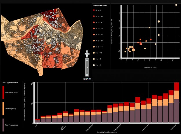
Visualization with weave

Web-based Analysis and Visualization Environment, or Weave for short, is open source software intended for flexible visualization.

Weave (BETA 1.0) is a new web-based visualization platform designed to enable visualization of any available data by anyone for any purpose. Weave is an application development platform supporting multiple levels of user proficiency — novice to advanced — as well as the ability to integrate, disseminate and visualize data at "nested" levels of geography.

It looks like everything is done through a click interface, and you can piece together modules and link them, etc. There is some setup involved, but there are a number of video tutorials and documents to get everything installed.

Source code also available on GitHub.

[Weave]

Sunday, February 12, 2012

Find: Super Bowl 2012: Nothing Curbs App Usage Except Madonna

Flurry

The Super Bowl is an American phenomenon, now largely considered a de facto American holiday.  As the premier media event, it regularly attracts record-breaking audiences.  This year, Super Bowl XLVI, played on February 5, 2012 between the New York Giants and New England Patriots, became the most watched television program in history, drawing an audience of 111 million viewers according to The Nielsen Company.  Prior to this, the record was held by last year’s Super Bowl, which itself had overtaken the number one spot held for twenty-eight years by the final episode of M*A*S*H.

The Second Screen

Also breaking new ground this year was the concept of the "second screen," which illustrates that while watching TV (the first screen), people often interact with second screens such as smartphones and tablets.  To avoid losing attention paid to the first screen, marketers increasingly are exploring ways to complement the first screen experience with the addition of hash tags, QR codes, voting and more.  Among the most ambitious was Shazam, a music and media discovery service, which worked with ad partners such as Toyota, Best Buy, Pepsi, Bud Light and Fed Ex to drive additional second screen interactions related to advertising via the Shazam mobile app.  During the halftime show, for example, viewers could get the setlist, buy music and download mobile apps from the artists.  Shazam reported millions of audio tags as a result.

Aside from a handful of innovators like Shazam, Flurry believes that the second screen is still largely more disruptive than complementary.  If a consumer is not paying attention to the television program in front of her, she is likely using an application to post social updates or play games.  For example, if a Super Bowl ad isn’t holding a viewer’s interest, playing another round of Words with Friends is a likely activity.  Monitoring app usage provides Flurry the ability to understand this tightly-coupled, inverse relationship between the first and second screen.

Massive Second Screen App Audience

For this report, Flurry tracked U.S. app usage, per second, over the course of Super Bowl XLVI, mapping application session starts to each television spot aired, game time segment, the halftime show, and more.  We further studied behavior differences between males versus females.  With Flurry Analytics in over 160,000 applications, the company detects app usage on more than 90% of all iOS and Android devices per day.  Let’s start by comparing the size of the U.S. application using audience to Nielsen’s report of the number of people who watched the Super Bowl last Sunday.

Flurry SuperBowl App vs TV AudienceSize resized 600

The left-hand column shows the number of users Flurry estimates launched applications in the United States between the hours of 3:15 PM PST to 7:15 PM PST on Sunday, February 5.  During this four-hour window, in which the Super Bowl was played, Flurry estimates that nearly one-third of the U.S. population used an application.  Compared to Nielsen’s estimate that 111 million people watched the Super Bowl this year, the two audiences are similar in size.

Flurry SuperBowl AppStarts perSecond V4 resized 600 


Wednesday, February 8, 2012

Spotted: TreeMatrix: A Hybrid Visualization of Compound Graphs

Looks related to our lab's work and Fekete and inria's. 

CG Forum

Abstract

We present a hybrid visualization technique for compound graphs (i.e. networks with a hierarchical clustering defined on the nodes) that combines the use of adjacency matrices, node-link and arc diagrams to show the graph, and also combines the use of nested inclusion and icicle diagrams to show the hierarchical clustering. The graph visualized with our technique may have edges that are weighted and/or directed. We first explore the design space of visualizations of compound graphs and present a taxonomy of hybrid visualization techniques. We then present our prototype, which allows clusters (i.e. subtrees) of nodes to be grouped into matrices or split apart using a radial menu. We also demonstrate how our prototype can be used in the software engineering domain, and compare it to the commercial matrix-based visualization tool Lattix using a qualitative user study.

Saturday, February 4, 2012

Find: Device Usage on the Social Web

Great information. Tells us something about how people use their devices, not just when. 

Eg desktops are work machines, tablets are pleasure. Tabs and consoles have surprisingly similar usage patterns. Phones, tabs and consoles reach much more deeply into our personal lives than pcs. 

Don't like having to divide by 7 in the chart though. Think, please!

Oh and, what's up with gamers on Thursday at 5?

bitly blog
We use our phones differently than our laptops, and our tablets differently than our gaming devices. We decided to take a deep look into the bitly data to figure out exactly how differently, and we found some surprises!

We analyzed the bitly data for the entire year of 2011 to understand how people use different hardware devices, and how this changes the way that people consume information. We looked at two types of data, the raw numbers and the use percentages (to make different platforms with wildly varying usage levels easy to compare). Web browsers were still the primary tool for accessing online content, followed by smart phones, tablets and gaming machines.

How are bitly links used across different platforms?

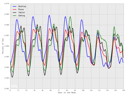
Desktop computers are most heavily used on weekdays before noon. Phone traffic peaks at roughly the same time. Tablets are most used at Tuesday at 5pm. Gaming devices (Nintendo DS, Nintendo Wii, Playstation), Thursday at 5pm.

One of the most interesting patterns is the peak, small valley and then another peak that both phones and tablets exhibit. The second peak is roughly at the same level Monday through Thursday, but drops off on Friday and doesn’t appear on the weekends.  This pattern is shifted over for tablets, with the second peak occurring later in the evening. This reflects the aggregate behavior patterns with these devices, showing us when the world is sleeping, eating, and taking a mid-afternoon coffee break.

Which platforms have similar usage patterns?

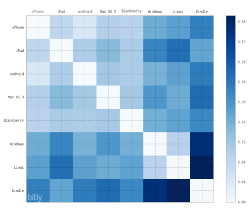
In the above plot, similar behavior is colored white; very different behavior is colored dark blue. From this plot we can see three surprising insights:

  • Windows and Linux users behave similarly on the social web! Geeks aren’t that different from the rest of the world. :)
  • Mac OS X is used more like a mobile device than either Windows or Linux on the desktop.
  • The Kindle is used in a very different manner to engage with the social web. We find that the majority of Kindle usage is much later in the evening than other devices.

From this data, we can say that device should definitely be a consideration when you create and share content on the social web. Think carefully about the physical context of how people will read your content! If you’re making a tablet application, make sure you test it with someone late at night lying in bed, and if you’re making an early-morning newsletter, you know exactly what time and device to target it at.

This post lovingly crafted by the bitly science team.

Find: Unicode over 60 percent of the web

Good bye ASCII. 

Google
Computers store every piece of text using a “character encoding,” which gives a number to each character. For example, the byte 61 stands for ‘a’ and 62 stands for ‘b’ in the ASCII encoding, which was launched in 1963. Before the web, computer systems were siloed, and there were hundreds of different encodings. Depending on the encoding, C1 could mean any of ¡, Ё, Ą, Ħ, ‘, ”, or parts of thousands of characters, from æ to 品. If you brought a file from one computer to another, it could come out as gobbledygook.

Unicode was invented to solve that problem: to encode all human languages, from Chinese (中文) to Russian (русский) to Arabic (العربية), and even emoji symbols like or
; it encodes nearly 75,000 Chinese ideographs alone. In the ASCII encoding, there wasn’t even enough room for all the English punctuation (like curly quotes), while Unicode has room for over a million characters. Unicode was first published in 1991, coincidentally the year the World Wide Web debuted—little did anyone realize at the time they would be so important for each other. Today, people can easily share documents on the web, no matter what their language.

Every January, we look at the percentage of the webpages in our index that are in different encodings. Here’s what our data looks like with the latest figures*:

*Your mileage may vary: these figures may vary somewhat from what other search engines find. The graph lumps together encodings by script. We detect the encoding for each webpage; the ASCII pages just contain ASCII characters, for example. Thanks again to Erik van der Poel for collecting the data.