Showing posts with label geo. Show all posts

Tuesday, January 1, 2013

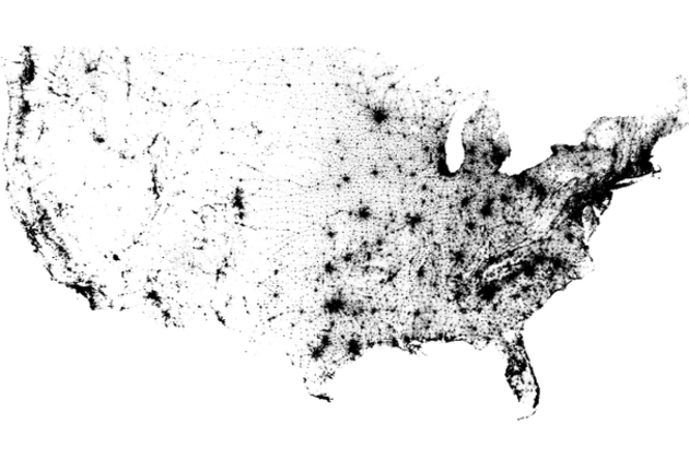
Viz: The Census Dotmap contains one black dot for every person in the US, and nothing else

The Census Dotmap contains one black dot for every person in the US, and nothing else

Census Dotmap

There are 308,450,225 dots on the map you see above. One for every person living in the United States, based on data from the 2010 Census. It doesn't seem plausible when you're looking at the entire country; metropolitan areas seem to be represented by indistinct swaths of black rather than tiny dots. But zoom in and even the most populated cities are finely broken down. There are no state borders, city lines, or individual roads represented on the Census Dotmap, as creator Brandon Martin-Anderson calls it. Nor is there any topographic data integrated here, yet the exhaustive reference still manages to offer a good sense of areas where nature prevents settlement. In fact, it lines up wonderfully with stunning imagery of Earth at night...

Monday, September 10, 2012

Viz: Facebook Freakonomics - a new tool to map the world's friendships

Facebook Freakonomics: a new tool to map the world's friendships

facebook freakonomics mapping world's friendships

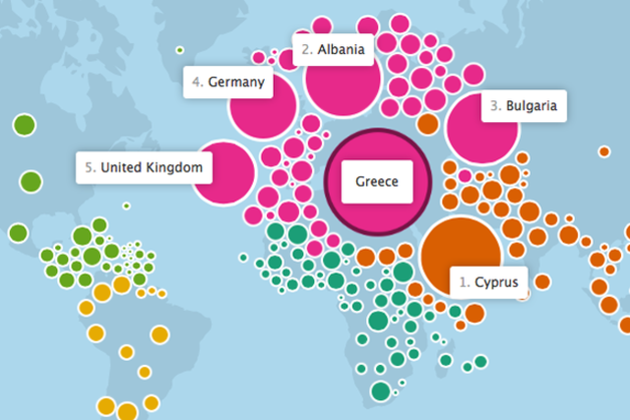
Last November, Facebook flipped Stanley Milgram's "six degrees of separation" theory on its head and showed that we're a lot closer than you might think. Today, Facebook launched a new interactive map of the world's friendships — a partnership with the data visualization wizards at the Stamen design studio — that illustrates some of the ways we're connected. The map uses an often-amorphous blob of bubbles representing the world's countries to show which ones share the most friendships, and many times, even explain why.

Monday, September 3, 2012

Viz: Amazon creates Presidential Election heat map based on political book purchases

Amazon creates Presidential Election heat map based on political book purchases

Amazon election heat map

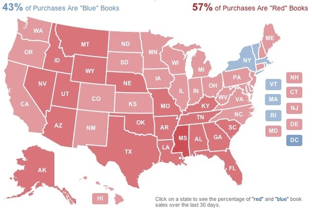
Everyone from Microsoft to Twitter to YouTube has taken to providing their own unique spin on covering the election, and Amazon is no different. The company has released a "2012 Election Heat Map" that shows what kinds of political books Americans are buying. Amazon took its 250 top-selling political books and characterized each one as either red (Republican Party), blue (Democratic party), or neutral, and then determined where those books have been purchased and shipped in the last 30 days. The result is a map that shows whether states are more red or blue based on their reading habits — at the time of writing Republican-leaning books were leading the way, accounting for 57 percent of purchases. Of course, as Amazon points out, "books...

Monday, August 6, 2012

Viz: Google visualizes arms trade

Pretty, but does it inform? 

A new way to visualize the global arms trade

Did you know that 60 percent of all violent deaths are due to small arms and light weapons? Small arms, such as revolvers, assault rifles and light machine guns, and ammunition represent a $8.5 billion industry, and three quarters of the world’s small arms lie in the hand of civilians—more than 650 million civilian arms. As part of the Google Ideas initiative on illicit networks, we’ve created an interactive data visualization of global small arms and ammunition trading to better understand and map the global arms trade.

The tool was produced by Google’s Creative Lab team in collaboration with the Igarape Institute. More than 1 million data points on imports and exports of small arms, light weapons and ammunition between 1992 and 2010 and across 250 states and territories across the world were provided by the Peace Research Institute Oslo (PRIO) small arms database. The visualization reveals patterns and trends in imports and exports of arms and ammunition across the world, making it easy to explore how they relate to conflicts worldwide. More of the implications of this data are discussed in this video from the INFO summit hosted by Google Ideas last month:


You can explore these data points by zooming in and out of the globe, clicking on any country to readjust the view, and using the histogram tool at the bottom to see trading patterns over the years. You can see, for example, that the scale of the global trade in ammunition rivals the scale of trade in actual weapons, an insight underexplored by policymakers today in conflict prevention and resolution.


We built this visualization using the open source WebGL Globe on Google’s Chrome Experiments site; since it is open sourced, we hope to see others use the globe as a platform for bringing other complex datasets to life.

Posted by Scott Carpenter, Deputy Director, Google Ideas

Monday, July 30, 2012

Data: US Census Bureau releases public API for mobile and web developers

Cool. More please. 

US Census Bureau releases public API for mobile and web developers

us census api

The US Census Bureau has released its very first public API, allowing developers to create web and mobile apps based on the government's collection of demographic and economic statistics. The Bureau launched the API Thursday, alongside a new "app gallery" website where users can view and download apps that have already been built.

With the API, developers will have access to two sets of statistical databases: the 2010 Census, and the 2006-2010 American Community Survey. The former includes the latest data on population, age, sex, race, and home ownership, while the latter offers more socio-economic statistics, covering fields like education, income, and employment.

The Census Bureau is encouraging developers to create apps that are...

Monday, July 9, 2012

Viz: Twitter data on soda or pop?

Aggregating Twitter data to answer the age-old question: soda or pop?

via dl.dropbox.com

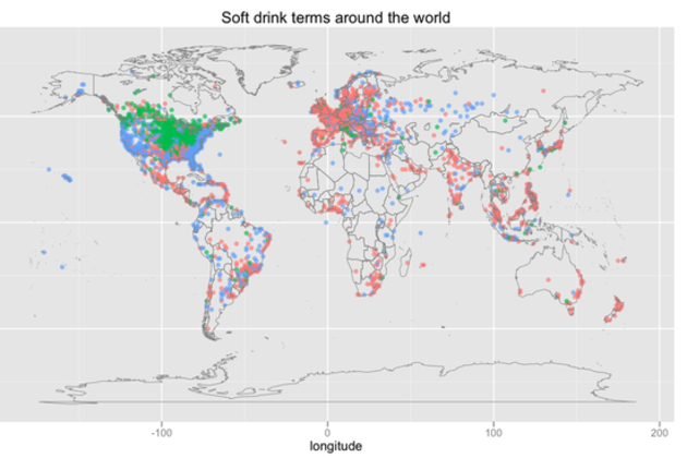
As more people move their conversations online and into the public eye via social networks, gathering information about regional dialects becomes easier than ever. Twitter data scientist Edwin Chen collected and analyzed tweets across the world to map one of the most well-known markers of linguistic difference: how people refer to soft drinks. First, he sampled messages tagged with a location, filtering them for "soda," "pop," or "coke." Then, he used other words in the sentence to make sure they referred to drinks ("drink a pop," for example) and to filter out specific references to Coke as a brand. Lastly, he aggregated the tweets by location and mapped them.

The results are much the same as in similar older work.. In the US, "pop" is...

Friday, April 27, 2012

Viz: trayvon's spread across the us in social media

bitly blog

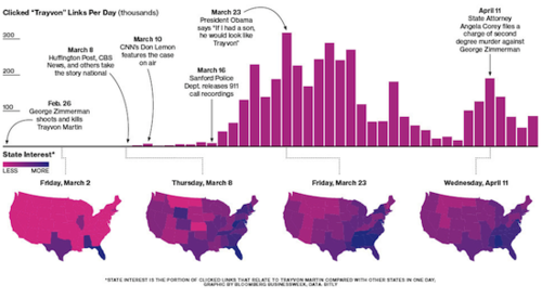
On February 26th, Trayvon Martin was shot by George Zimmerman in Sanford, FL. Martin, 17, was walking home after purchasing a snack from a local convenience store. 

Recently, Bitly collaborated with Bloomberg Businessweek on a visualization showing how the media’s coverage of the shooting went from local to national. We explored how various responses to the event (the release of the 911 tapes, President Obama’s public comments) caused spikes in traffic to online articles related to Trayvon.


#more 

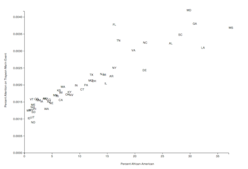
In mid-April Bill Cosby commented that debate of the shooting should not focus on the role race played, but on the role of guns. Using Bitly data we explored how race was correlated with attention paid to the Martin event. US Census data provided the percentage of African-Americans for each state. We plotted these percentages against the attention each state gave to the event from February 26 through April 21. 

We utilized linear regression to model the data. The resulting line had an R-Square value of 0.86. The greatest outlier was the state of Florida (which is reasonable given the local nature of the story). As you can see from the graph, there is a direct correlation between the racial makeup of a state and the amount of attention that state has paid to the story. While Mr. Cosby may want the story to be focused on guns, the data shows that race has been the focus.

We studied this particular story because of the media impact and because we are investigating how stories and ideas spread through social media. We would love to hear your thoughts and questions!

Sent with Reeder

Viz: Is it Legal to Wear Headphones When You're Driving?

Lifehacker

Ever Wonder If It's Actually Legal to Wear Headphones When You're Driving? You know you're supposed to go hands-free with your phone in the car, but did you know in some states it's illegal to wear headphones when you're driving? Is your state one of those? We teamed up with the American Automobile Association (AAA) to get to the bottom of the issue. Find out where you can rock out while you drive and where you should make sure your earbuds are out before you head down the highway.

It's not exclusively a hands-free phone issue, of course. You may also have wondered if you can wear headphones and listen to music while driving—maybe because your radio was broken, or you wanted to listen to something on your phone but had no way to hook it up to your speakers, or maybe because you saw someone else driving with earbuds in and wondered "Hey, is that legal?!"

In some states, wearing headphones is perfectly legal; in others, it's 100% illegal; and in many states, the law is a little less clear cut—for example, in some states it's only legal to wear headphones in one ear, but not two.

Click your state on the interactive map below to see what the law says where you live.

Is It Legal to Wear Headphones While Driving?

      Mostly legal          Mostly illegal          It's complicated

Ever Wonder If It's Actually Legal to Wear Headphones When You're Driving?

Click on any state for details

Our interactive map requires JavaScript; which appears to be disabled in your browser. Here's a non-interactive image instead. Ever Wonder If It's Actually Legal to Wear Headphones When You're Driving?


#more 

If the map above isn't displaying correctly in your browser or you just want a copy to save for later, click here to download the map as an image instead.

Many thanks to the AAA for their help with this post. They point out—and we agree—that regardless of the legality of wearing headphones in your state, listening to music on headphones while driving is a distraction, and can impair your ability to hear the sirens from emergency vehicles nearby and other important traffic sounds that would be audible if you were only listening to the radio. They point out that a headphone cable across your lap could become tangled and present a steering hazard. Whatever you choose to do, make sure you take the law, your safety, and the safety of others on the road into account first.

Sent with Reeder

Wednesday, April 18, 2012

Job: ARA is hiring

Folks, a former student of mine has a few job opportunities at ARA locally.

Best,

Ben

---------- Forwarded message ----------
From: Christopher Sexton ARA/SED <csexton@ara.com>

Hi Ben –


Our company is doing some hiring right now, specifically in the group that I work in. If you’ve got any bright students looking for full time jobs after graduation, I’d love to talk to them.


Specifically, I’m involved with the hiring for 3 postings: SED-2012-101, SED-2012-112 and SED-2012-113.


http://www.ara.com/Careers/ara-job-search.htm


Here’s a short blurb – we’re hiring at a few different levels (junior entry to more experienced).


Applied Research Associates, Inc. (ARA), a national leader in scientific and engineering research and development, is seeking a staff software developer to join our Decision Systems Group in Raleigh, NC. The selected candidate will develop, code, test, and debug new software or enhancements to existing software under direction from senior developers/engineers. Our development approach fosters communication and collaboration across multiple scientific disciplines, and provides all members of our teams opportunities to contribute creatively to our projects. The successful applicant must have skills in analysis and design of software components in an object-oriented environment. This position supports ARA’s growing work in application development for national vulnerability and event analysis.

 Position Requirements:

  • Understanding of the application development life cycle
  • Proficient with C++, Java, and object-oriented analysis & design (OOAD)
  • Possession of an Active DoD Secret Security Clearance or the ability to obtain one
  • Strong oral presentation and written communication skills

Position Preferences:

  • Knowledge of and experience working in a Scrum and/or XP software development environment
  • Experience developing Qt and/or MFC GUIs
  • Experience using modern software configuration management tools (e.g., Rational ClearCase, SVN, Git)
  • Experience using OpenSceneGraph and/or OpenGL
  • Experience with GIS Toolkits
  • Experience using XML SDKs
  • Experience in physics-based modeling, simulation, or distributed component technologies

Description: <a href=http://intranet.ara.com/tools/docs/Logocircle.jpg" width="55" />

Chris G Sexton

Staff Software Developer

Applied Research Associates, Inc.

office: 919.582.3300, direct: 919.582.3318


Sunday, April 15, 2012

Viz: Yikes! I thought march was warm. Warmest in 200 years

Frequent outliers aren't outliers. 

Ars Technica

As record temperatures swept through the Midwest and trees bloomed early across the Northeast, lots of talk focused on what an unusually warm start spring was having. The folks at the National Oceanic and Atmospheric Administration have now crunched the numbers, and found that it wasn't just unusually warm—March was bizarrely hot. With 15,000 record high temperatures set in the US, it was far and away the warmest March in the nation's history, and only a single month—January of 2006—was as far off from the monthly average.

Only one of the 48 contiguous states (Washington) was below normal, and a huge slice down the center of the country was bathed in bright red in NOAA's map, indicative of record high temperatures. The heatwave was partly responsible for moving the first quarter of the year into the top slot of the US record books. The high temperatures also kicked off an unusually early spring cluster of tornadoes in the Midwest.

Neither NASA nor NOAA have managed to do the global monthly averages yet, so it's not clear if our experience was shared by much of the rest of the planet (the US occupies a relatively small fraction of its surface). So far this year, the global means have been pretty mundane. They're above last century's average, but not by a lot, and every month has been above that average since early 1994.

NOAA indicates that it was a specific weather pattern that pushed heat into the central US. One of the key drivers of global temperature, the tropical Pacific's surface temperatures, remain in a cooler, La Niña state, so it's unlikely the rest of the world shared in our warmth.

Sunday, April 8, 2012

Viz: The Media Map: Who's Reading What And Where

Too many colors, especially in the blue range. 

bitly blog
The Media Map: Who's Reading What And Where:

Did you know that The Onion is disproportionately popular in New Mexico? bitly’s data science team had the pleasure of working with Forbes to make a map of which publications are popular in which US States. The results may surprise you!

Find: more on Wind Map

Hmm. Didn't realize this was Wattenberg and Viegas. Digging deeper....

Design Language News
Wind Map:

Fernanda Viégas and Martin Wattenberg’s beautiful animated map of wind patterns in the US. It even shows speed based on the contrast. Oh, and the map is almost in realtime.

Saturday, April 7, 2012

Find: maps.stamen.com is live

Watercolor maps! Stamen strikes again. Sweet. 

Check out Raleigh, or <your city>. This isn't a one off, but a working site. 

maps.stamen.com is live

maps.stamen.com, the second installment of the City Tracking project funded by the Knight News Challenge, is live. These unique cartographic styles and tiles, based on data from Open Street Map, are available for the entire world, downloadable for use under a under a Creative Commons Attribution 3.0 license, and free.

*takes deep breath*

There are three styles available: toner, terrain, and watercolor:

  • Toner is about stripping online cartography down to its absolute essentials. It uses just black and white, describing a baseline that other kinds of data can be layered on. Stripping out any kind of color or image makes it easier to like focus on the interactive nature of online cartography: when do different labels show up for different cities? what should the thickness of freeways be at different zoom levels? and so forth. This project is the one that Nathaniel is hacking on at all hours, and it's great to be seeing Natural Earth data get more tightly integrated into the project over time.

  • Terrain occupies a middle ground: "shaded hills, nice big text, and green where it belongs." In keeping with City Tracking's mandate to make it easier for people to tell stories about cities, this is an open-source alternative to Google's terrain maps, and it uses all open-source software like Skeletron to improve on the base line cartographic experience. Mike has been heading up this design, with help from Gem Spear and Nelson Minar.
  • Watercolor pushes through to the other side of normal, bending the rules of traditional legibility in order to explore some new terrain. It incorporates hand-painted textures and algorithmic rule sets into a design that looks like it's been done by 10,000 slaves in the basement, but is rendered on th...
  • Thursday, March 22, 2012

    Find: A new home for Google Maps API developers

    Looks handy. 

    Google Code Blog
    Author Photo
    By Carlos Cuesta, Product Marketing Manager, Google Maps API

    Cross-posted with the Google Geo Developers Blog

    When we first launched the Google Maps API, it was all about a map, a pin, and a dream. Back then our technical documentation was relatively simple, consisting of a couple of developer docs and some code samples. Since then the Google Maps API has expanded far beyond our expectations, due in large part to the diverse and innovative developer ecosystem that has grown with us.

    With the continuing evolution of the Google Maps API, it became clear that we needed more than just code documentation to convey what’s possible with the Google Maps API. Thus, developers.google.com/maps was born.

    In addition to having all the same developer content that was previously available on code.google.com, the site is designed to highlight and illustrate new features of the Google Maps API through fun and interactive demos. Our goal with developers.google.com/maps is to inspire the next wave of innovation on the Google Maps API, and to connect developers and decision makers with the tools and services that can make their products better.


    #more 

    One of the features of the Google Developers site we’re most excited about is the 3rd party developer showcase, which allows us to celebrate a selection of innovative sites in the Google Maps API ecosystem. Showcase content is carefully curated by the Google Maps API team.

    In order to help users discover relevant apps and topics in the showcase, we’ve devised a tagging system that allows you to filter examples both by theme, and by Google Maps API features used.

    We hope that the showcase and the interactive examples on the new Google Maps API Developers capture your imagination and inspire you with what’s possible using the platform. The imagination of Google Maps API developers has always been what makes the product great and we’re looking forward to seeing what you come up with next.


    Carlos Cuesta is the Product Marketing Manager for Google Maps API. He also enjoys travelling, photography, and collecting vinyl.

    Posted by Scott Knaster, Editor

    Sent with Reeder

    Saturday, March 17, 2012

    Tool: Google and Historypin launch online gallery to celebrate The Queen’s Diamond Jubilee

    Interesting platform for visualizing history in situ. AR please?

    Google
    This year marks the Diamond Jubilee of Queen Elizabeth II, celebrating Her Majesty’s 60 years on the throne. To commemorate this special occasion, we’re teaming up with Historypin to launch an interactive online gallery filled with memories of her time as Queen.


    The Pinning The Queen’s History project will be made up of photographic images, videos and audio clips pinned directly onto a Google Map on the dedicated Historypin site. This will let you see historical images in modern context within Google Maps.

    Throughout her six decades on the throne, The Queen has undertaken hundreds of visits around the United Kingdom and 261 official overseas visits to 116 different countries. Historypin is inviting people from around the world to submit photos, videos and other memories of The Queen during these visits.


    Using Google Maps and Street View, the Historypin platform enables you to pinpoint the exact location of where the imagery was captured. They’ll be overlaid onto Street View, so you can compare glimpses of the Queen’s 60-year reign with how they look today.


    The collection has been boosted by the provision of images from The Queen’s overseas visits taken by press photographers, and by photographs of items from the Buckingham Palace’s Royal Archives. Items from the Royal Archives include the sitar presented to The Queen during her visit to India in 1997, an earthenware vase presented to the Queen by the Prime Minister of Japan and a map showing the air routes around South Australia during the 1954 Commonwealth Tour.

    The interactive gallery is an opportunity for anyone to contribute to and celebrate The Queen’s Diamond Jubilee on one global platform. We’re honoured that Google Maps can form the foundation of this official gallery.

    Submit your memories of The Queen at www.historypin.com/DiamondJubilee/.

    Posted by Ed Parsons, Geospatial Technologist, London

    (Cross-posted from the Lat Long Blog)
    Thursday, February 2, 2012

    Viz: Yikes! Animation Charts Modern Global Warming

    Green Blog: Animation Charts Modern Global Warming
    NYT > Science
    In the animation, reds indicate temperatures that were higher than average during a baseline period of 1951-1980, and blues indicate lower temperatures.

    Monday, January 30, 2012

    Viz: Yikes! Animation Charts Modern Global Warming

    NYT > Science
    In the animation, reds indicate temperatures that were higher than average during a baseline period of 1951-1980, and blues indicate lower temperatures.

    Saturday, January 21, 2012

    Find: @seismologists collect #data, 140 characters at a time

    Twitter and phones collect quake data. 

    Ars Technica

    On August 23, 2011, a magnitude 5.8 earthquake centered 40 miles northwest of Richmond, Virginia had the East Coast abuzz. As you’d expect, social media lit up as people reported the experience. You can actually see the travel of the seismic waves if you map out the tweets containing the word "earthquake." While that’s no match for the beautiful data recorded by the EarthScope seismic network, some researchers see the beginnings of a data revolution.

    Count Richard Allen, a seismologist at the University of California-Berkeley, among those who want to ride the wave. In a perspective article published in Science, he argues that crowdsourced earthquake data is a potential gold mine.

    Wednesday, January 18, 2012

    Data: Vehicles involved in fatal crashes

    FlowingData
    Vehicles involved in fatal crashes
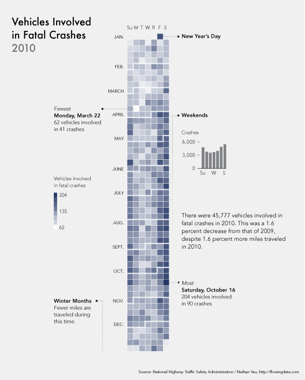
    After seeing this map on The Guardian, I was curious about what other data was available from the National Highway Traffic Safety Administration. It turns out there's a lot and it's relatively easy to access via FTP. What's most surprising is that it's detailed and fairly complete, with columns for weather, number of people involved, date and time of accidents, and a lot more.
    The above shows vehicles involved in fatal crashes in 2010 (which is different from number of crashes or number of fatalities). This data was just released last month, at the end of 2011 oddly enough. It's a calendar view with months stacked on top of one another and darker days indicate more vehicles involved.
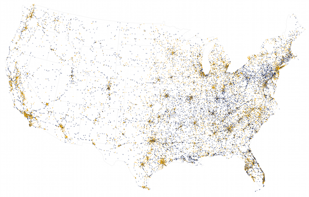
    Nearly every single data point also has location attached to it, so I tried some mapping, but they look like population density more or less. Here's one that shows crashes that occurred on local roads (orange) and those on freeways, highways, etc (blue). Road patterns start to come out for the major interstates.