Showing posts with label sports. Show all posts

Sunday, August 12, 2012

Viz: Tracking athletes' Twitter mentions over the Olympics

Tracking athletes' Twitter mentions over the Olympics

New York Times Twitter olympics mentions infographic


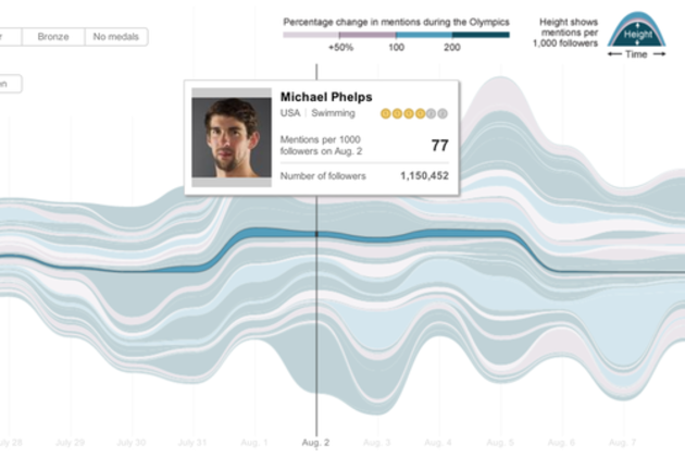
The New York Times is back with another excellent infographic about the 2012 Olympics in London — this time showing Twitter activity on athletes' accounts. The graphic visualizes the number of mentions 140 verified accounts received over the games so far per 1,000 followers, honing in on when different athletes' mindshare peaked on Twitter. So, who won? Malaysian track cyclist Azizulhasni Awang (@AzizulAWANG) looks to have received the the most mentions per 1,000 followers (2,308) after his public apology for failing to obtain any medals. Michael Phelps' mentions, meanwhile, were dwarfed by his over 1,000,000 follower count.

Monday, August 6, 2012

Viz: Usain Bolt vs. 116 years of Olympic sprinters

These are very sweet. 

Usain Bolt vs. 116 years of Olympic sprinters

Usain Bolt New York Times visualization

The New York Times has published an incredible series of visualizations, using 3D models to compare today's top sprinters, swimmers, and long jumpers with athletes from every Olympic Games since 1896. The standout is a video analyzing Usain Bolt's blistering 9.63-second performance in the 100m dash last night, showing just how far ahead he is, not only of the current crop, but also of the top sprinters of yesteryear.

If Thomas Burke, gold medallist at the first modern Olympics in Athens, ran last night, he would have been more than 18m from the finish line as Bolt crossed it — he would even have been beaten by last-placed Asafa Powell, whose groin injury forced him to jog across the line in a disappointing 11.99 seconds. But it's not...

Monday, September 5, 2011

Tool: Venatrack Tracking, Coaching and Graphics

Many say France disaster in 2010 world cup was due the fact that they didnt deserve to play in it, in the first place. It's now in record books that Henry's controversial goal allowed France to get through, agaisnt the odds, over Ireland is a known fact. FIFA is trying to use all possible technological abilities it can, to ensure that no such fracas takes place in future.

I found a tool called Venatrack which might be useful in today's modern era of fast paced football. As mentioned on their site - 'Venatrack is dedicated to delivering the next generation of commercial applications for those working within football.' It offer utility tools that can not only help in post-game analysis but can assist referees in controversial moments of the game. Not only that if this can be incorporated in the current age of 3d and HD televiewing, it can give supporters an insight into work-rate of the professional footballers when it comes to finding out who was the MVP(i know football doesn't have a MVP :P)

What I find interesting is 'Venatrack’s system goes further than providing raw performance data: it sets new standards for the capture and analysis of real time video images and the immediate provision of all resulting in; LIVE player movement, including accurate individual, player positions.'

For example-

in this snapshot that I took from the video one can see how the forward makes a run before the player in possesion of the ball can deliver the pass. This can be very useful in case where one needs to check for offside(player making runs ahead of defender before ball is passed).


Many more such interesting videos can be found on Venatrack site.

The technology that is used by the tool to collect data includes tracking X, Y and Z coordinates of the players real time and its accuracy (the site claims) is unmatched at +/- 100mm at 30 Hz per second and the player identification operating at 98% accuracy. I am trying to find out in more details how the data flows from the pitch to computer in real time and will update this post as soon as I can...

Data: See where UNC, NCSU rank in football revenue

Sunday, September 4, 2011

Viz: On the role of bacon in visualization

A nice critique of a media viz. Note the few ref on color

On the role of bacon in visualization

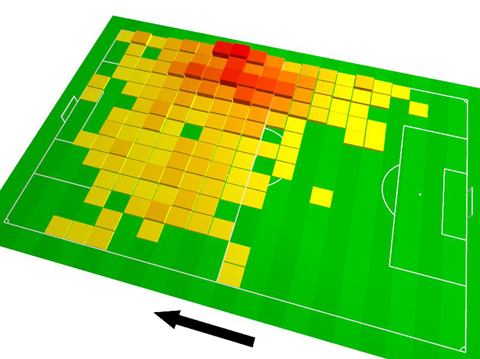
I recently ran across a chart on Spiegel Online, the most popular German site for online news. The chart was a tilted 3D heatmap in fully saturated primary colors, with a thick black arrow aside.


Sunday, August 21, 2011

Viz: NHL playoffs - Stanley cup


Stanley cup visualization captures all the important information regarding the play-offs in NHL dating back to 1927 - the year in which the NHL was formed. It makes a very good attempt of giving a graphic representation using HTML5. With minimum number of mouse clicks by the user, all the information regarding the teams participating in the play-offs, the number of times each time has appeared in the play-offs and whether it won or lost and the time-line of the team are presented. Minimal number of clicks by the user plays an important role in good UI designs as it involves lesser effort from the end user.

The data set required for generating this visualization can be obtained by running data parsing scripts on web based data. The data set for the Stanley cup can be found here.


According the creator of this visualization, the steps involved in building this visualization are as follows:
a) Start with simple HTML markup.
b) Build a timeline with Javascript.
c) Add CSS.
d) Add interactivity.
e) Draw the canvas.

The detailed HOW-TO of the visualization.

Here is the link of the visualization - http://vis.robbymacdonell.com/stanley-cup/

Pros of the visualization -
a) Clear differentiation between each teams participation in the cup and its result represented in blue (won) or red (lost).
b) A text description in the background describing the visual representation presented upon a user's mouse-over action.
c) Only when a mouse-over is performed on the years listed, an action is performed mapping to at most two teams, thus not crowding the visual.
d) Different colour used for representing the time-line and each event mapping to one of the years listed at the bottom.

Possible improvements -

a) The data set which involves the teams participating in the play-offs could have included the scores too.
b) The text representation in the background upon a mouse-over action can be presented with better colours.
c) Upon mouse-over on a teams name, the total number of play-offs won and lost can be presented.
d) Some teams do not have a time-line, either this maybe a faulty action or the data set did not contain records pertaining to that team.

JavaScript and HTML5 continue to be a stronghold for providing good visualizations by taking a data set as an input. This visualization gets a 9.5/10 rating from my side..

References:
a) HTML5 as a visualization resource, http://www.visualisingdata.com/index.php/2011/04/should-html5-be-considered-a-visualisation-resource/.
b) NHL play-offs data set, http://www.nhl.com/cup/champs.html.
c) Robby Mac Donell's HTML5 Stanley cup visualization, http://vis.robbymacdonell.com/stanley-cup/.
d) Visualizing Lord Stanley's Cup: an HTML5 experiment, http://robbymacdonell.com/blog/visualizing-the-stanley-cup-finals-with-html5.